 Nederland
 France
 Deutschland
 Österreich
 United Kingdom
 International
Geen commentaar
Het begon allemaal met een idee...
Een korte, interactieve gids hielp hen hun ontwerpstijl te ontdekken en legde precies vast wat ze nodig hadden.
Brandsupply is een platform waar creatieve professionals en bedrijven samenwerken aan unieke projecten en ontwerpen.
Klanten die bijvoorbeeld een nieuw logo of een huisstijl zoeken, geven een beschrijving van hun wensen. Daarna kunnen ontwerpers via Brandsupply deelnemen aan het project door één of meerdere ontwerpen in te sturen. Uiteindelijk kiest de klant het ontwerp dat zij het beste vinden.
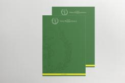
De kosten variëren per type project, van €169 voor een bedrijfs- of projectnaam tot €539 voor een volledige website. De klant bepaalt zelf hoeveel hij of zij voor het gehele project wil betalen.
Designer:
 hypdesign

Looks good! That's what we wanted.
If the white space on the Mailchimp template is fixed, we think that it's all exactly what we're looking for.
We want to be sure that everything is uniform, so would it be possible to have a final check that the cutoff point of the logo is the same for all applicable designs, and that where it makes sense the yellow/green bars are in the same proportions?
To be a bit more specific, the small yellow/green bars for the back of the contact card, the bottom of the blank ppt slide and the paper.
The UPSV.nl bar on the poster, the notebook and maybe the contact card front and green ppt slides.
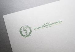
And maybe check that it's U.P.S.V. "Unitas Pharmaceuticorum" everywhere, and that it says opgericht 1894 everywhere.
We think that's it! All the work looks great. We're looking forward to the finish tomorrow.
Thank you.
Everything is now checked and Mailchimp white space was fixed - same link as before
Good, we'll pick you as the winner this afternoon. The competition ends at 15:50 our time, would it be possible to send us the files before 17:00 our time?
Sure, we are at GMT +1. That's the same time zone, right?
Yeah we're in GMT+1 too, you'll get notified this afternoon.
Deze wedstrijd is gesloten. Commentaar geven is niet meer mogelijk.
Regarding Facebook... Did you mean like this?
Exactly what we meant! Looks good.
Deze wedstrijd is gesloten. Commentaar geven is niet meer mogelijk.
Geen commentaar
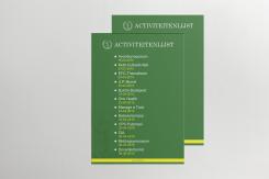
Our mistake, it should be U.P. Activiteitenlijst, other than that it looks great!
Deze wedstrijd is gesloten. Commentaar geven is niet meer mogelijk.
Updated poster...
Dear Hypedesign,
I am going to try to create a list of all the changes we would like to see made to all the material that you have created so far:
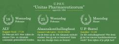
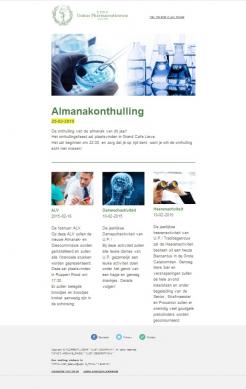
- The activity list is a poster, and should be readable from far away. The logo can be small, maybe even without text. And there should be a bulleted list, clearly readable from far away, with the dates and name of the activity, could you maybe make an example of the activities you included in the list in the mail chimp preview?
- We are going for a continuous design. Could you try to have the same cutoff point in the logo when it's used on the background (e.g. ppt, poster),? This is aimed at everything other than the paper and the contact card, we think it's fine it's a bit different there.
- Instead of "sinds 1894" in the logo, we would prefer it to be "opgericht 1894".
- Could you make a simple Facebook cover picture with same information as this (http://tinypic.com/r/2l6n3a/8)? It would complete all the work.
We have been very fond of your work so far, thank you.
Deze wedstrijd is gesloten. Commentaar geven is niet meer mogelijk.
Geen commentaar
Deze wedstrijd is gesloten. Commentaar geven is niet meer mogelijk.
Geen commentaar
Looks good, we can use this as our activity list. It would be nice if "activiteitenlijst" would come back somewhere visible at the top.
Deze wedstrijd is gesloten. Commentaar geven is niet meer mogelijk.
Here is a Chimp preview, but it will look better if you can tell me which is your account name, so I can share the template with you.
Right now, I can only share it as zoomed out screenshot.
Thank you for your design, I just made an account for testing purposes since we're going to use mail chimp once we use our new design. The account name is assessor2
As for the design, would you know if it's possible to integrate an agenda with about 10-20 dates with the event name accompanying it?
I'll pass the design by the person why sends our mails tomorrow to see what she thinks.
Deze wedstrijd is gesloten. Commentaar geven is niet meer mogelijk.
Removed watermark on the green background
Dear hypedesign, to complete the whole style there's a couple of small designs we would like to see added to what you have already designed for us. This would be:
- A facebook banner with 3 activiteits with description, date and time
- A header/footer for our promotional posters
- A poster of monthly activities, just a simple list in the style of the notebook cover would work well.
Deze wedstrijd is gesloten. Commentaar geven is niet meer mogelijk.
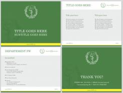
Powerpoint template
Looks very good, though we would really need a mailchip mailing design for our complete redesign.
Deze wedstrijd is gesloten. Commentaar geven is niet meer mogelijk.

Geen commentaar
We really like the work you´ve showed us. We would like to see you design a digital mailing, we use Mailchimp for our mailing. Besides that we´d be interested in a header-footer for our promotional posters and a simple powerpoint slide in this style, like the example in the files. We look forward to your work. Thanks for your designs so far.
What I forgot to mention is that Unitas Pharmaceuticorum needs to be "Unitas Pharmaceuticorum", with the braces.
Deze wedstrijd is gesloten. Commentaar geven is niet meer mogelijk.
Geen commentaar
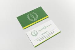
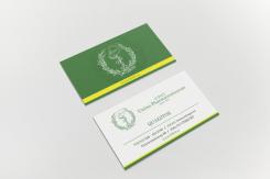
We like the revision of the business card, it looks very slick. We´re not really sure about the enlarged logo behind the white one, could you maybe try something else, we like all else about it.
Deze wedstrijd is gesloten. Commentaar geven is niet meer mogelijk.
Geen commentaar
Furthermore we would like you to design a mailing for our 1400 members. It includes a list of activities with a short description, some social media buttons and some general text. Also it includes an agenda of the activitites of the month, the mailing is sent weekly.
Besides that, we would like to see if you could design some simple powerpoint sheets in this style, and maybe a footer/header for promotional posters. We look forward to your work.
Deze wedstrijd is gesloten. Commentaar geven is niet meer mogelijk.
Geen commentaar
Thank you for the ratings.
Do you have any feedback available, what you like/dislike? What would you like me to change, or to improve?
Kind regards
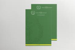
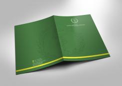
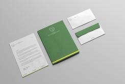
It all looks nice and clean, though the green closing piece of the enveloppe is a bit much, just white would be fine. Furthermore, we do like the "folder" you designed, but we don't really need one. We might want to use it as the front cover of a sketch/notebook, maybe you can take that in mind in a revision?
Thank you for your feedback.
I understand.
Please have a look at my new entries.
Deze wedstrijd is gesloten. Commentaar geven is niet meer mogelijk.

Geen commentaar
We really like the business cards as well, though the name would be the job title in our case, for example: "quaestor". And we feel like there's a little much white space around the name. We look forward to your revisions.
Deze wedstrijd is gesloten. Commentaar geven is niet meer mogelijk.
Geen commentaar
We like the simplicity of your design, and like how you've pulled that through the rest of your designs.
Deze wedstrijd is gesloten. Commentaar geven is niet meer mogelijk.