Geen commentaar
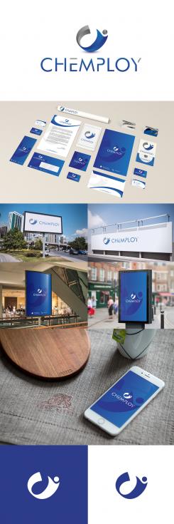
Chemploy Logo & huisstijl
- Wedstrijd van: Gijsvdzanden
- Categorie: Logo & Huisstijl
- Status: Beëindigd
Datum start: 09-10-2014
Datum einde: 24-10-2014
Het begon allemaal met een idee...
Een korte, interactieve gids hielp hen hun ontwerpstijl te ontdekken en legde precies vast wat ze nodig hadden.
Brandsupply is een platform waar creatieve professionals en bedrijven samenwerken aan unieke projecten en ontwerpen.
Klanten die bijvoorbeeld een nieuw logo of een huisstijl zoeken, geven een beschrijving van hun wensen. Daarna kunnen ontwerpers via Brandsupply deelnemen aan het project door één of meerdere ontwerpen in te sturen. Uiteindelijk kiest de klant het ontwerp dat zij het beste vinden.
De kosten variëren per type project, van €169 voor een bedrijfs- of projectnaam tot €539 voor een volledige website. De klant bepaalt zelf hoeveel hij of zij voor het gehele project wil betalen.
wow, it's even cooler than the previous one...!
It's a hard one for me. This design, together with one from lYRA is belonging to the 2 designs that are likely to win the contest.
I assume we can finetune it further in a personal meeting?
Thank you very much for showing your inner reaction of "WOW" which all contest holder wishes but can't get it. In my creative i have given very minimalists and to the point of your companies need. It is in 3 colours and previous in 2 colours which reduces your printing costs too and it can be easily implemented in any printing media and embroideried on the t-shirts or shirts of the employees without loosing any effect of creative this is the best point of the logo.
Best regards
white cat
hi whitecat. having had a closer look, i see that this concept (people holding hands, in a C) has been submitted by another designer, prior to your submission. I am sorry, but that means that I will have to look for another design.
Thanks for your message, i would love to hear whose design is matching to mine. I have seen all designers entry and I couldn't find out whose design I have copied or made same. My Concept is “C” and molecules as human figure related to “chemploy staff and Client” which is Totally different from other designers entry. Giving the creative or concept of logo with the letters of firm’s name is the Rights of all the designer if any designer has misguided you then I would love to make you see the following contest link where the repetition of the last ‘C’ in CMC has been designed with many designer in that contest and no one has any problem as they are real designer and understands the difference and creativity done by others.
http://www.brandsupply.com/contests/logo_stationery/design-logo-and-housestyle-for-new-international-consulting-company-in-the-field-of-international-conflict-management-14447/design/new
Geen commentaar
Hi,
Thank you for your contribution!
I rwally like the design, in all honesty, I have no idea to make it better (hence, directly giving 4 stars for it, indicating that you're in the last selection)
Can i know what is the reason behind derating my entries ........
yes, it has been removed from the shortlist of potentiel winning designs
yes, it has been removed from the shortlist of potentiel winning designs
wasted my time in your contest.... there is none a logo which can stand in front of mine and level of logo world. Wish there was button to withdraw my creative from your contest n your soul but.......
 Nederland
 France
 Deutschland
 Österreich
 United Kingdom
 International


