Geen commentaar
Ontwerp een logo voor Play Learn Change
- Wedstrijd van: JelledeJong
- Categorie: Logo & Huisstijl
- Status: Beëindigd
- Bestanden: Bestand 1
Datum start: 13-02-2015
Datum einde: 20-02-2015
Het begon allemaal met een idee...
Een korte, interactieve gids hielp hen hun ontwerpstijl te ontdekken en legde precies vast wat ze nodig hadden.
Brandsupply is een platform waar creatieve professionals en bedrijven samenwerken aan unieke projecten en ontwerpen.
Klanten die bijvoorbeeld een nieuw logo of een huisstijl zoeken, geven een beschrijving van hun wensen. Daarna kunnen ontwerpers via Brandsupply deelnemen aan het project door één of meerdere ontwerpen in te sturen. Uiteindelijk kiest de klant het ontwerp dat zij het beste vinden.
De kosten variëren per type project, van €169 voor een bedrijfs- of projectnaam tot €539 voor een volledige website. De klant bepaalt zelf hoeveel hij of zij voor het gehele project wil betalen.
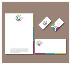
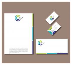
Business card 90x50 mm
Memorandum 297x210 mm
Envelope 230x110 mm
Best regards,
Nikola
Hi Nikola, very nice designs! We had a litte discussion and would chouse the logo with the blue part at the bottom. COncerning the small icons: de ball is good, we prefer the light bulb at the left and the two 'ghosts' at the bottom. Perhaps you could make these icons more iconic, so with less detail. (like the ball) But without any final result yet (that's for tomorrow) we already thank you for all the work!
Best regards,
Jelle
Hello,
I'll start immediately with work!Be sure that i will make changes as soon as it possible.
Best regards,
Nikola
Hi Nicola, we had a new look this morning. We feel we're almost there. In daylight we cahnge our opinion and choose the 'pink' color over the dark blue. We like the lightbulb and the 'yong and yang' icon (although it still moght be a little more iconic, so without the details in the little icons. Like the 'head' icon on the top representing a person for us.) we do want to ask you if you could have a last look at the letterhead. We really like the front of the BusinessCard and would like to ask if you could do something with the design for the letterhead in that direction.
Many thanks,
Jelle
Hello,
I will make that changes today ('pink' and 'yong and yang'). Also, i'll make letterhead with business card elements.
Best regards,
Nikola
Hello,
I will make that changes today ('pink' and 'yong and yang'). Also, i'll make letterhead with business card elements.
Best regards,
Nikola
Hello,
I will make that changes today ('pink' and 'yong and yang'). Also, i'll make letterhead with business card elements.
Best regards,
Nikola
Hello,
I will make that changes today ('pink' and 'yong and yang'). Also, i'll make letterhead with business card elements.
Best regards,
Nikola
Hello,
I will make that changes today ('pink' and 'yong and yang'). Also, i'll make letterhead with business card elements.
Best regards,
Nikola
Hello,
I will make that changes today ('pink' and 'yong and yang'). Also, i'll make letterhead with business card elements.
Best regards,
Nikola
Sorry about all these messages, there was a problem with the connection ...
Geen commentaar
Hello,
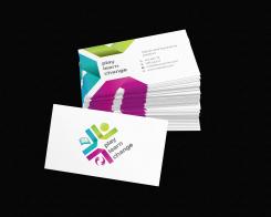
This is my suggestion for business card. I have chosen this logo but if you want some other just say. I'll make soon memorandum and envelope.
Best regards,
Nikola Markovic
Geen commentaar
Hello,
I also made this...
Best regards,
Nikola Markovic
Geen commentaar
Hello,
I am sorry you waited a little.I think that your suggestions are excellent! I made some changes and i hope you like it. I will continue to work on tihis contest and try to find some new idea for icons (learn and changes)!
Best regards,
Nikola Markovic
Geen commentaar
Definitely a good improvement! Just wondering if the little pictures in the corners could become a little bit more connected to the words(although) we understand the intention. Thnx.
Hello,
I am glad that you like the idea! I'll try to make some changes to make it better. I'll replace the ball and cube with some other symbols who have more connections with "Play" and "Learn".
Best regards,
Nikola
Hi Nikola, thank you for your reply. We looked at your logo and have some more feedback.
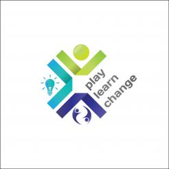
- we turned the logo 45degrees anti clockwise and immediately it triggered our feelings in a positive way.
- If you rotate the logo that way the sphere and green lines become a sort of 'happy person'. We like that1 (keep the sphere ;-))
- what we now question is if you could change the images for 'Learn' (the cube?) and 'Change' (the arrows?). Especially the arrows feel a little bit to linear.
- Perhaps think about three colors that 'interconnect' more. or perhaps a little extra element to make that connection? We would like to change the red color into a little different one.
- If the logo is rotated, the words rotate too. That we like. Could you remiove the dots behind the words?
Don't feel offended by these questions. We see the potential in the logo.
Thanks
Geen commentaar
Hello,
If you want to change something, just tell. I am open for any suggestions!
Best regards,
Nikola Markovic
Hi Nikola, thank you for your suggestion. We think this logo feels bit to common and is not connected to the flow between Play Learn Change.
 Nederland
 France
 Deutschland
 Österreich
 United Kingdom
 International
