Geen commentaar
Ontwerp logo en huisstijl
- Wedstrijd van: Emile
- Categorie: Logo & Huisstijl
- Status: Beëindigd
Datum start: 27-03-2019
Datum einde: 06-05-2019
Het begon allemaal met een idee...
Een korte, interactieve gids hielp hen hun ontwerpstijl te ontdekken en legde precies vast wat ze nodig hadden.
Brandsupply is een platform waar creatieve professionals en bedrijven samenwerken aan unieke projecten en ontwerpen.
Klanten die bijvoorbeeld een nieuw logo of een huisstijl zoeken, geven een beschrijving van hun wensen. Daarna kunnen ontwerpers via Brandsupply deelnemen aan het project door één of meerdere ontwerpen in te sturen. Uiteindelijk kiest de klant het ontwerp dat zij het beste vinden.
De kosten variëren per type project, van €169 voor een bedrijfs- of projectnaam tot €539 voor een volledige website. De klant bepaalt zelf hoeveel hij of zij voor het gehele project wil betalen.
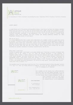
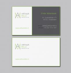
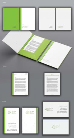
folders, letters, b. cards
hi there Mimi, thanks for the designs. For my taste a bit too simple, sorry to say. The elegance of the logo is great yet we need to get that into the designs of the material. Can you make a variation on the green lines, something more subtle?
Yes, ok!
hi Mimi, Could you do something (instead of the full green color on the letterhead and leaflet) with a variation on the logo perhaps (in gray/white)....would that work?
Yes, ok, I hope tomorrow.
Geen commentaar
this is color in RGB color system/for web/, so it looks different then previous design work, which one is CMYK color system/for print/
OK colors are also ok in RGB, you've nailed it. Good work so far, I'm choosing your design. Can you make the a design for my house style; business card and also letterhead, presentation sheet and folder (A4 size)?
Yes! I need more time for that works, but it will be soon.
here is 3 types of letters/font/ size for name /Arthur Mills/, which one You prefer? You can see, text: people @ their best is the same, but name is shorter
You can send me some contact info
hi there my contact info is: info@arthurmills.nl
I send You an email, I need some info to apply on stationery
logo without grid lines/same graphic as file before/
hi there, can you please make the Arthur Mills words/font smaller (keep the people@their best the same size) so it all gets more compact?
Sorry: the fourth design from the top is the most appealing one for me, so the remark made above goes for that design. Also: please write people @ their best instead of the current writing. Thanks!
yes, ok
You mean people @ their best instead of people@theirbest?
You mean people @ their best instead of people@theirbest?
You mean people @ their best instead of people@theirbest?
Yes: people @ their best
Geen commentaar
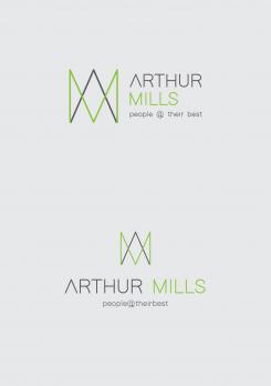
hi there, this top design is almost ready. The change I would like to see is a slightly larger logo and smaller Arthur Mills name. The end result should be that the logo has the same height as the Arthur Mills name and people@theirbest tagline.
Thanks,
Emile
Hi, ok, I understand, today-during the day, I will send You works!
Geen commentaar
hi Mirjanash, the change looks good. I think the people@theirbest tagline is the best. With the logo above the name and tagline however it looks too high. Can you put the logo in front of the name/tagline?
hi Mirjanash, the change looks good. I think the people@theirbest tagline is the best. With the logo above the name and tagline however it looks too high. Can you put the logo in front of the name/tagline?
hi Mirjanash, the change looks good. I think the people@theirbest tagline is the best. With the logo above the name and tagline however it looks too high. Can you put the logo in front of the name/tagline?
yes!
Geen commentaar
hi Mirjanash, I like this design; simple, clear lines, good colors. Would it however be possible to add the business I'm in: recruitment consultancy or the tag: poeple@their best as a sub-line under the name Arthur Mills?
yes, of course, I will continue working for weekend
 Nederland
 France
 Deutschland
 Österreich
 United Kingdom
 International
