 Nederland
 France
 Deutschland
 Österreich
 United Kingdom
 International
Geen commentaar
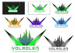
LOGO en huisstijl voor een middelgrote Club/discotheek
Datum start: 03-11-2015
Datum einde: 10-11-2015
Totaal budget: € 375.00
Nieuwste inzending
Het begon allemaal met een idee...
Een korte, interactieve gids hielp hen hun ontwerpstijl te ontdekken en legde precies vast wat ze nodig hadden.
Brandsupply is een platform waar creatieve professionals en bedrijven samenwerken aan unieke projecten en ontwerpen.
Klanten die bijvoorbeeld een nieuw logo of een huisstijl zoeken, geven een beschrijving van hun wensen. Daarna kunnen ontwerpers via Brandsupply deelnemen aan het project door één of meerdere ontwerpen in te sturen. Uiteindelijk kiest de klant het ontwerp dat zij het beste vinden.
De kosten variëren per type project, van €169 voor een bedrijfs- of projectnaam tot €539 voor een volledige website. De klant bepaalt zelf hoeveel hij of zij voor het gehele project wil betalen.
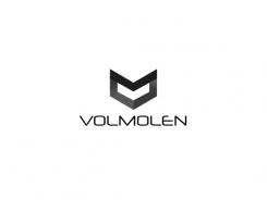
Designer:
 freebird
Deze wedstrijd is gesloten. Commentaar geven is niet meer mogelijk.
Hallo, mijn ontwerp zijn de wieken van een molen die draaien maar dan stylish vormgegeven.
Met vriendelijke groet,
Jeroen Kraneveld
Freebirds Grafisch Ontwerp
not cool, though enough
Deze wedstrijd is gesloten. Commentaar geven is niet meer mogelijk.