 Nederland
 France
 Deutschland
 Österreich
 United Kingdom
 International
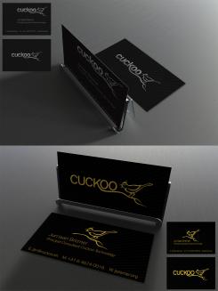
Hello, Here is my design . It is a design for a leetterpress ticket . With patience and precision , the letters are pressed into the paper , creating a raised edge , also called must . This text extremely sharp eyes and get it printed an extremely exclusive appearance. (google on letterpress for more information) In the background the birds in black. Cuckoo pops out and is so different from the other birds. Tight font in gold foil . Dark black natural paper. The cuckoo logo is to small for use in a design that's why its not that tight. But we can arrange that later. Hope to hear from you! Bianca
Cuckoo Sandbox
- Wedstrijd van: jbremer
- Categorie: Illustratie, Tekening, Kledingopdruk
- Status: Beëindigd
- Bestanden: Bestand 1, Bestand 2
Datum start: 30-05-2015
Datum einde: 27-06-2015
Totaal budget: € 279.00
Nieuwste inzending
Het begon allemaal met een idee...
Een korte, interactieve gids hielp hen hun ontwerpstijl te ontdekken en legde precies vast wat ze nodig hadden.
Brandsupply is een platform waar creatieve professionals en bedrijven samenwerken aan unieke projecten en ontwerpen.
Klanten die bijvoorbeeld een nieuw logo of een huisstijl zoeken, geven een beschrijving van hun wensen. Daarna kunnen ontwerpers via Brandsupply deelnemen aan het project door één of meerdere ontwerpen in te sturen. Uiteindelijk kiest de klant het ontwerp dat zij het beste vinden.
De kosten variëren per type project, van €169 voor een bedrijfs- of projectnaam tot €539 voor een volledige website. De klant bepaalt zelf hoeveel hij of zij voor het gehele project wil betalen.
Designer:
 bianca jonker
I like the back and foreground on the top of your design - the one of the bottom not so much. Nice one..
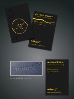
What do you think of the letterpress technique? It is a technique where you use simple colors and let the paper and pression do all of the work. If you would like to see a variation that can be used for a normal printing technique?
al the icons can easily be changed, also after the competition. We can work on untill its totally the design you like!
Would be nice to see some variations of course, but I think the technique looks nice.
Hello,
Sophie jade uses the same technique i told you about. The letterpress technique. This design would look the same as she showed in her design. That's why i put the little square with homer. I only used a more yellow gold foil. You can make your card at: http://www.studio-esteban.com/nl/letterpress-naamkaartjes/colorplan-black
Have a nice evening,
Bianca
Deze wedstrijd is gesloten. Commentaar geven is niet meer mogelijk.