 Nederland
 France
 Deutschland
 Österreich
 United Kingdom
 International
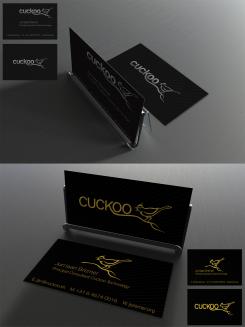
Update for previously uploaded golden foil card.
Cuckoo Sandbox
- Wedstrijd van: jbremer
- Categorie: Illustratie, Tekening, Kledingopdruk
- Status: Beëindigd
- Bestanden: Bestand 1, Bestand 2
Datum start: 30-05-2015
Datum einde: 27-06-2015
Totaal budget: € 279.00
Nieuwste inzending
Het begon allemaal met een idee...
Een korte, interactieve gids hielp hen hun ontwerpstijl te ontdekken en legde precies vast wat ze nodig hadden.
Brandsupply is een platform waar creatieve professionals en bedrijven samenwerken aan unieke projecten en ontwerpen.
Klanten die bijvoorbeeld een nieuw logo of een huisstijl zoeken, geven een beschrijving van hun wensen. Daarna kunnen ontwerpers via Brandsupply deelnemen aan het project door één of meerdere ontwerpen in te sturen. Uiteindelijk kiest de klant het ontwerp dat zij het beste vinden.
De kosten variëren per type project, van €169 voor een bedrijfs- of projectnaam tot €539 voor een volledige website. De klant bepaalt zelf hoeveel hij of zij voor het gehele project wil betalen.
Designer:
 hypdesign
I like it - nice and simple :)
Deze wedstrijd is gesloten. Commentaar geven is niet meer mogelijk.
One more option to reconsider - went through your web site a little, so I figured....
I get your motivation behind this design, and it's nice, but it doesn't really work on my target audience which may not be always 100% technical.
No problem, just a thought. :)
Deze wedstrijd is gesloten. Commentaar geven is niet meer mogelijk.
Geen commentaar
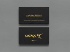
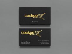
Reworked the layout a little. Bird "fill" and long title is now back.
Definitely potential in this one! :)
Hi Hypdesign,
Nice design! It is a shame that's it's look like mine.
Good luck with the contest.
Toobe.art - Beatrice
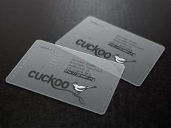
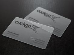
?
This transparent card mock up is available to everyone, not sure what you mean.
http://graphicburger.com/translucent-business-cards-mockup/
Deze wedstrijd is gesloten. Commentaar geven is niet meer mogelijk.
Geen commentaar
I do like this gold color, though ;)
Deze wedstrijd is gesloten. Commentaar geven is niet meer mogelijk.
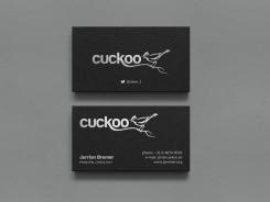
A few more options, silver and gold foil.
Silver is not really my color.
Deze wedstrijd is gesloten. Commentaar geven is niet meer mogelijk.
Geen commentaar
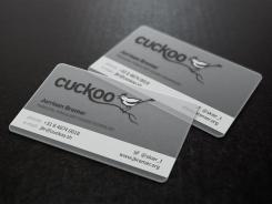
This one is pretty cool (as the other transparant one). But I do still feel more for the other one for the following reasons: the non-transparant bird, partial job title (although the Cuckoo logo sort of makes up for that, but still), maybe would make more sense if the phone/email/site was more consistent/aligned? And you got my name wrong, but that's just a small fix away ;)
Ah, yes. Sorry about that. Will be fixed :)
Deze wedstrijd is gesloten. Commentaar geven is niet meer mogelijk.
Geen commentaar
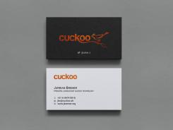
The cuckoo text on the back is not very well readable, I think? The layout of the rest is quite okay, though.
Deze wedstrijd is gesloten. Commentaar geven is niet meer mogelijk.
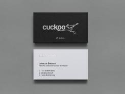
Here is copper and silver foil option.
Would probably have to see the real version to decide - I'm a little bit afraid it doesn't express a professional attitude.
Deze wedstrijd is gesloten. Commentaar geven is niet meer mogelijk.