 Nederland
 France
 Deutschland
 Österreich
 United Kingdom
 International
Dag Jurriaan,
Dank voor de feedback. We houden er van ongecompliceerde visuals te gebruiken, dat straalt rust en professionaliteit uit. Hierbij een tweede voorstel. Zoals je ziet doet een kleine aanpassing heel veel.
Deze stijl is ook direct mooi door te voeren op andere platformen, mocht dat later gewenst zijn. Zo ontstaat een heel krachtige huisstijl.
Vriendelijke groet,
Dylan — Studio Sust.
Cuckoo Sandbox
- Wedstrijd van: jbremer
- Categorie: Illustratie, Tekening, Kledingopdruk
- Status: Beëindigd
- Bestanden: Bestand 1, Bestand 2
Datum start: 30-05-2015
Datum einde: 27-06-2015
Totaal budget: € 279.00
Nieuwste inzending
Het begon allemaal met een idee...
Een korte, interactieve gids hielp hen hun ontwerpstijl te ontdekken en legde precies vast wat ze nodig hadden.
Brandsupply is een platform waar creatieve professionals en bedrijven samenwerken aan unieke projecten en ontwerpen.
Klanten die bijvoorbeeld een nieuw logo of een huisstijl zoeken, geven een beschrijving van hun wensen. Daarna kunnen ontwerpers via Brandsupply deelnemen aan het project door één of meerdere ontwerpen in te sturen. Uiteindelijk kiest de klant het ontwerp dat zij het beste vinden.
De kosten variëren per type project, van €169 voor een bedrijfs- of projectnaam tot €539 voor een volledige website. De klant bepaalt zelf hoeveel hij of zij voor het gehele project wil betalen.
Designer:
 studiosust
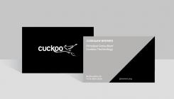
Linksboven en linksonder aan de achterkant staan opzich wel prima zo, maar jbremer.org valt een beetje in 't niets en die streep doet me niet zo heel veel.
Deze wedstrijd is gesloten. Commentaar geven is niet meer mogelijk.
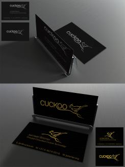
Dag Jurriaan,
Hierbij ons eerste ontwerp. Het metallic effect is iets dat in het print process pas ter pas komt en zou met dit ontwerp heel gaaf staan op de voorkant van het kaartje, waar het logo in metallic wordt gedrukt.
We zijn erg benieuwd naar je reactie.
Met vriendelijke groet,
Dylan — Studio Sust.
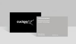
Beste Dylan,
De voorkant is simpel maar doeltreffend. Achterkant vind ik wel wat basic ;)
Deze wedstrijd is gesloten. Commentaar geven is niet meer mogelijk.