 Nederland
 France
 Deutschland
 Österreich
 United Kingdom
 International
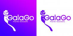
GalaGo
Designers Champions League design voor start up
- Wedstrijd van: GalaGo
- Categorie: Illustratie, Tekening, Kledingopdruk
- Status: Beëindigd
- Bestanden: Bestand 1
Datum start: 02-12-2021
Datum einde: 09-12-2021
Totaal budget: € 369.00
Nieuwste inzending
Het begon allemaal met een idee...
Een korte, interactieve gids hielp hen hun ontwerpstijl te ontdekken en legde precies vast wat ze nodig hadden.
Brandsupply is een platform waar creatieve professionals en bedrijven samenwerken aan unieke projecten en ontwerpen.
Klanten die bijvoorbeeld een nieuw logo of een huisstijl zoeken, geven een beschrijving van hun wensen. Daarna kunnen ontwerpers via Brandsupply deelnemen aan het project door één of meerdere ontwerpen in te sturen. Uiteindelijk kiest de klant het ontwerp dat zij het beste vinden.
De kosten variëren per type project, van €169 voor een bedrijfs- of projectnaam tot €539 voor een volledige website. De klant bepaalt zelf hoeveel hij of zij voor het gehele project wil betalen.
Designer:
 DD TOPENG
Deze wedstrijd is gesloten. Commentaar geven is niet meer mogelijk.
galago
Deze wedstrijd is gesloten. Commentaar geven is niet meer mogelijk.
galago
Deze wedstrijd is gesloten. Commentaar geven is niet meer mogelijk.
GalaGo
Deze wedstrijd is gesloten. Commentaar geven is niet meer mogelijk.
GalaGo
Deze wedstrijd is gesloten. Commentaar geven is niet meer mogelijk.
Galago
Deze wedstrijd is gesloten. Commentaar geven is niet meer mogelijk.
GalaGo
Deze wedstrijd is gesloten. Commentaar geven is niet meer mogelijk.
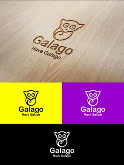
Galago
Deze wedstrijd is gesloten. Commentaar geven is niet meer mogelijk.
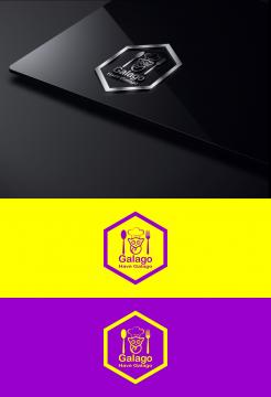
GALAGO
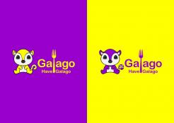
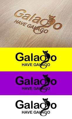
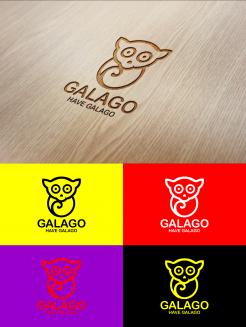
We think the tail is too predominant, the other Galago you used is more basic and recognizable as well. Focus on that one. What we do like about this one is the fact that the letter 'G' in GalaGo is capital or somehow recognizable as mentioned in previous feedback. Yet, we advise you to focus on the other logo you have designer for us. Good luck.
Deze wedstrijd is gesloten. Commentaar geven is niet meer mogelijk.

GalaGo
Deze wedstrijd is gesloten. Commentaar geven is niet meer mogelijk.
GalaGo
Deze wedstrijd is gesloten. Commentaar geven is niet meer mogelijk.
GalaGo
Deze wedstrijd is gesloten. Commentaar geven is niet meer mogelijk.
GalaGo
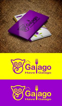
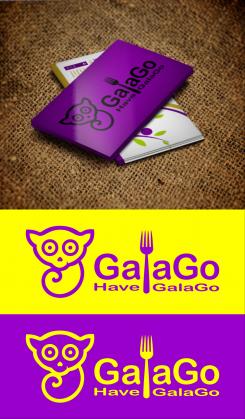
Receiving written feedback makes your design among the better ones submitted so far. Yet, this is Champions League and we look for the Ronaldo in your designer skills.
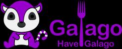
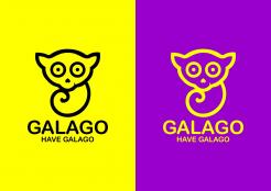
We are ambitious and looking for this little extra that makes it basic, recognizable, yet differ itself from any other company that may call itself GalaGo already or might do so in future. Judging by the time you managed to design this, we are confident you will have even more capacity in you to do so. Compliments for designing the cuteness factor we are looking for, the heart-shaped nose that is turned does it; cute but not too cute.
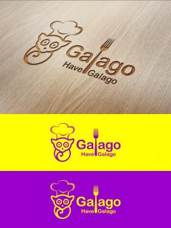
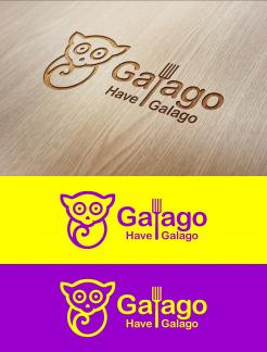
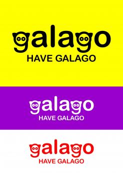
Furthermore, we understand that what we are going to ask you for is complicated since the name is missing any link with the subject, but we are somewhat missing a link with food in all logos so far. It somewhat looks you have been struggling with finalizing the tail and where and how to end it. Possibly, you could use anything related to food in doing so. We will welcome all personal input and inspiration from your side, but will give you the same free tip as we have given someone else; don't use all capital letters since the company is called GalaGo with reason. The letter 'l' in GalaGo could be turned into a subtle fork for example. Don't worry too much about the colours, we like the black and yellow in these designs and could always turn it into white and purple if we decide otherwise. We will look through it, just make sure you keep focus on the logo itself.
Good luck, you have good cards so far. Impress us and show us what differs you from the other good designs submitted so far.
Deze wedstrijd is gesloten. Commentaar geven is niet meer mogelijk.