 Nederland
 France
 Deutschland
 Österreich
 United Kingdom
 International
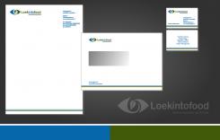
An example of a house-style.
logo for business cards & website, for Loekintofood (see www.loekintofood.com)
- Wedstrijd van: Loekintofood
- Categorie: Illustratie, Tekening, Kledingopdruk
- Status: Beëindigd
Datum start: 25-03-2017
Datum einde: 20-04-2017
Totaal budget: € 129.00
Nieuwste inzending
Het begon allemaal met een idee...
Een korte, interactieve gids hielp hen hun ontwerpstijl te ontdekken en legde precies vast wat ze nodig hadden.
Brandsupply is een platform waar creatieve professionals en bedrijven samenwerken aan unieke projecten en ontwerpen.
Klanten die bijvoorbeeld een nieuw logo of een huisstijl zoeken, geven een beschrijving van hun wensen. Daarna kunnen ontwerpers via Brandsupply deelnemen aan het project door één of meerdere ontwerpen in te sturen. Uiteindelijk kiest de klant het ontwerp dat zij het beste vinden.
De kosten variëren per type project, van €169 voor een bedrijfs- of projectnaam tot €539 voor een volledige website. De klant bepaalt zelf hoeveel hij of zij voor het gehele project wil betalen.
Designer:
 joosttilburg
Deze wedstrijd is gesloten. Commentaar geven is niet meer mogelijk.
Geen commentaar
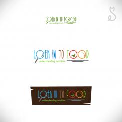
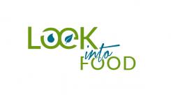
nice, subtle, the O and E - don't know if to subtle.. To make clear further that it can be loek into food, but also looking (in)to food, perhaps separate in from to
Deze wedstrijd is gesloten. Commentaar geven is niet meer mogelijk.
Thanks for your comment and rating.
Enclosed you'll find an other idea.
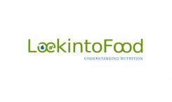
Nice! I am thinking though it is now kind of "marine" and "agri" - not so clear it has to do with food..
To make clear further that it can be loek into food, but also looking (in)to food, perhaps separate 'in' from 'to'
Deze wedstrijd is gesloten. Commentaar geven is niet meer mogelijk.
Geen commentaar
really good. Look/loek is well done. Could work more with the font maybe. Could make the drop blue and the leave green. And perhaps there is a way to show that loekintofood can be loek into food, but also looking to food. And "understanding nutrition" would be good to include
Deze wedstrijd is gesloten. Commentaar geven is niet meer mogelijk.
Geen commentaar
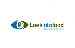
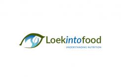
well-done: the eye like a leave. Could work more with the font maybe. So the eye is also a leave, and the blue inside is perhaps water? Latter is not so clear... And perhaps there is a way to show that loekintofood can be loek into food, but also looking to food. And "understanding nutrition" would be good to include
really good. Look/loek is well done. Could work more with the font maybe. And the leaf is also an eye, right? and the blue inside is water? nice, but could be clearer. And perhaps there is a way to show that loekintofood can be loek into food, but also looking to food. And "understanding nutrition" would be good to include
Deze wedstrijd is gesloten. Commentaar geven is niet meer mogelijk.