 Nederland
 France
 Deutschland
 Österreich
 United Kingdom
 International
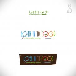
Here's 4 different propositions after reading your comment. #1 is with a fantasy font, #2 and #3 is with a sans serif font and #4 is with a serif font.
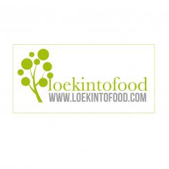
logo for business cards & website, for Loekintofood (see www.loekintofood.com)
- Wedstrijd van: Loekintofood
- Categorie: Illustratie, Tekening, Kledingopdruk
- Status: Beëindigd
Datum start: 25-03-2017
Datum einde: 20-04-2017
Totaal budget: € 129.00
Nieuwste inzending
Het begon allemaal met een idee...
Een korte, interactieve gids hielp hen hun ontwerpstijl te ontdekken en legde precies vast wat ze nodig hadden.
Brandsupply is een platform waar creatieve professionals en bedrijven samenwerken aan unieke projecten en ontwerpen.
Klanten die bijvoorbeeld een nieuw logo of een huisstijl zoeken, geven een beschrijving van hun wensen. Daarna kunnen ontwerpers via Brandsupply deelnemen aan het project door één of meerdere ontwerpen in te sturen. Uiteindelijk kiest de klant het ontwerp dat zij het beste vinden.
De kosten variëren per type project, van €169 voor een bedrijfs- of projectnaam tot €539 voor een volledige website. De klant bepaalt zelf hoeveel hij of zij voor het gehele project wil betalen.
Designer:
 birabanor
Deze wedstrijd is gesloten. Commentaar geven is niet meer mogelijk.
Geen commentaar
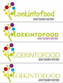
well done. esthetic and subtle. It could be tree, or bunch of grapes etc - cute. Could work more with the font maybe. perhaps blue/ wate can be included, and or yellow sun / and/or red fruitr? And "understanding nutrition" would be good to include - perhaps underneath instead of web addresss
I still like yours, well done. esthetic and subtle. It could be tree, or bunch of grapes etc - cute. Could work more with the font maybe. perhaps blue/ wate can be included, and or yellow sun / and/or red fruitr? And "understanding nutrition" would be good to include - perhaps underneath instead of web addresss
I still like yours, well done. esthetic and subtle. It could be tree, or bunch of grapes etc - cute. Could work more with the font maybe. perhaps blue/ wate can be included, and or yellow sun / and/or red fruitr? And "understanding nutrition" would be good to include - perhaps underneath instead of web addresss
I still like yours, well done. esthetic and subtle. It could be tree, or bunch of grapes etc - cute. Could work more with the font maybe. perhaps blue/ wate can be included, and or yellow sun / and/or red fruitr? And "understanding nutrition" would be good to include - perhaps underneath instead of web addresss
Hi sorry I wasn't available recently, but i'll work on this today, if still ok.
Deze wedstrijd is gesloten. Commentaar geven is niet meer mogelijk.