 Nederland
 France
 Deutschland
 Österreich
 United Kingdom
 International
Geen commentaar
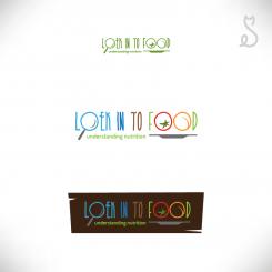
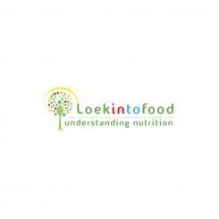
logo for business cards & website, for Loekintofood (see www.loekintofood.com)
- Wedstrijd van: Loekintofood
- Categorie: Illustratie, Tekening, Kledingopdruk
- Status: Beëindigd
Datum start: 25-03-2017
Datum einde: 20-04-2017
Totaal budget: € 129.00
Nieuwste inzending
Het begon allemaal met een idee...
Een korte, interactieve gids hielp hen hun ontwerpstijl te ontdekken en legde precies vast wat ze nodig hadden.
Brandsupply is een platform waar creatieve professionals en bedrijven samenwerken aan unieke projecten en ontwerpen.
Klanten die bijvoorbeeld een nieuw logo of een huisstijl zoeken, geven een beschrijving van hun wensen. Daarna kunnen ontwerpers via Brandsupply deelnemen aan het project door één of meerdere ontwerpen in te sturen. Uiteindelijk kiest de klant het ontwerp dat zij het beste vinden.
De kosten variëren per type project, van €169 voor een bedrijfs- of projectnaam tot €539 voor een volledige website. De klant bepaalt zelf hoeveel hij of zij voor het gehele project wil betalen.
Designer:
 bartous
Deze wedstrijd is gesloten. Commentaar geven is niet meer mogelijk.
Geen commentaar
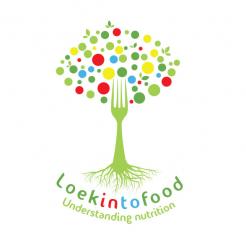
nice! you can keep the different colours 'fruits' in the tree though, that was nice! also the yellow arch. and differentiate 'in' from 'to' in 'into. Because loekintofood can be read as loek into food and looking into food..
And shall we keep for the rest all green..?
and understanding nutrition in italic would be nice
today we need do complete - competition ends tomorrow!
and: use the O in Loek to show a magnifying glass (loep in nederlands), with the handle (perhaps in yellow as well, like the bow around the tree, like you had before) sticking out to 'north-east". To do so, make that O fully round/circular, and make it somewhat bigger than the other letters, to express the 'magnifying". like that we express also visually the 'looking'...
Deze wedstrijd is gesloten. Commentaar geven is niet meer mogelijk.
Geen commentaar
Deze wedstrijd is gesloten. Commentaar geven is niet meer mogelijk.
Geen commentaar
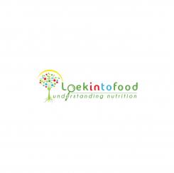
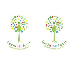
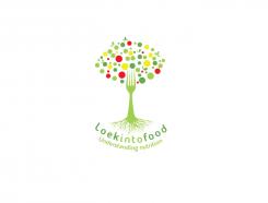
this positioning is better I think. better to put back the fork, as the teeth of the fork kind of mirror the roots.. and the roots you could make less branched, more slick - so they resemble a bit more the teeth of the fork. and see if you can differentiate the font of "understanding nutrition" from "loekintofood". Perhaps understanding nutrition" in italic
all in all better to go back to the original first design.. put back the fork, as the teeth of the fork kind of mirror the roots.. and the roots you could make less branched, more slick - so they resemble a bit more the teeth of the fork. And add "understanding nutrition"
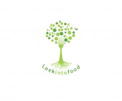
can you put back the fork? as the teeth of the fork kind of mirror the roots.. and the roots you could make less branched, more slick, and a bit bigger than you made them here (now too miniature) - so they resemble a bit more the teeth of the fork.
Note the competition ends in 1-2 days..
can you put back the fork? as the teeth of the fork kind of mirror the roots.. and the roots you could make less branched, more slick, and a bit bigger than you made them here (now too miniature) - so they resemble a bit more the teeth of the fork.
Note the competition ends in 1-2 days..
Deze wedstrijd is gesloten. Commentaar geven is niet meer mogelijk.
Geen commentaar
Deze wedstrijd is gesloten. Commentaar geven is niet meer mogelijk.
Geen commentaar
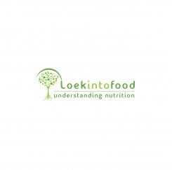
nice! i like the colours, though some friends tell me they like the 'peacefulness" of having just green - but I like the colour I think.
Could you make the roots less detailed, a bit less branched, more 'slick'?
then the font: what other font type would fit wel? this one is so so
thx!
Deze wedstrijd is gesloten. Commentaar geven is niet meer mogelijk.
Geen commentaar
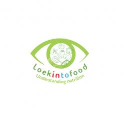
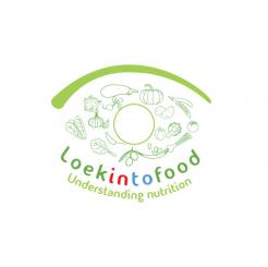
seeing it, I think the eye does not work so well - your trees are much more effective :-)
Deze wedstrijd is gesloten. Commentaar geven is niet meer mogelijk.
Geen commentaar
seeing it, I think the eye does not work so well - your trees are much more effective :-)
Deze wedstrijd is gesloten. Commentaar geven is niet meer mogelijk.
Geen commentaar
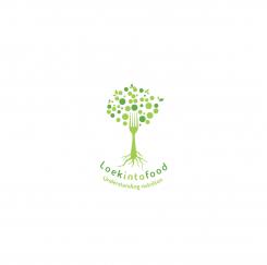
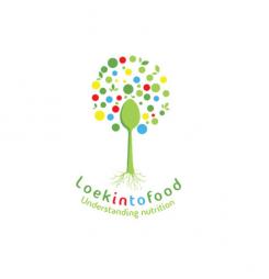
excellent :-) I see now though that it is better to have a 'round' cloud of fruits/dots/leaves; a round tree top rather than the eye shape I had in mind.
and what you think of making the roots more 'simple'? I mean less branched out, smoother?
I do like the green with the colours, then, the red and blue in loekintofood are perhaps to harsh compare to the more subtle green? how would it look to make the green letters darker green?
Finally, now would it look with spoon instead of fork? Or do we then loose the 'symmetry' between roots and fork-pins..?
Deze wedstrijd is gesloten. Commentaar geven is niet meer mogelijk.
Geen commentaar
very good! and if you give "in" and 'to" different colour, it would show you can read loek into food and looking into food..
very good! and if you give "in" and 'to" different colour, it would show you can read loek into food and looking into food.. The top part now has indeed eye shape, but not sure anyone will see that.. let me think about it.. perhaps you have other ideas
very good! and if you give "in" and 'to" different colour, it would show you can read loek into food and looking into food.. The top part now has indeed eye shape, but not sure anyone will see that.. let me think about it.. perhaps you have other ideas
Deze wedstrijd is gesloten. Commentaar geven is niet meer mogelijk.
Geen commentaar
well done - aesthetic and subtle. I am thinking if the top of the tree could even be in eye shape (it is already almost), to represent looking.. indeed all green, or include like yellow (son), blue (water), red (fruit) And perhaps there is a way to show that loekintofood can be loek into food, but also 'looking to food. And "understanding nutrition" would be good to include
Deze wedstrijd is gesloten. Commentaar geven is niet meer mogelijk.