Geen commentaar
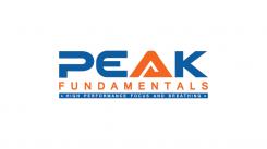
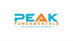
Help ons door een logo te ontwerpen dat professionele atleten de juiste indruk geeft over ons!
Datum start: 16-11-2016
Datum einde: 08-12-2016
Het begon allemaal met een idee...
Een korte, interactieve gids hielp hen hun ontwerpstijl te ontdekken en legde precies vast wat ze nodig hadden.
Brandsupply is een platform waar creatieve professionals en bedrijven samenwerken aan unieke projecten en ontwerpen.
Klanten die bijvoorbeeld een nieuw logo of een huisstijl zoeken, geven een beschrijving van hun wensen. Daarna kunnen ontwerpers via Brandsupply deelnemen aan het project door één of meerdere ontwerpen in te sturen. Uiteindelijk kiest de klant het ontwerp dat zij het beste vinden.
De kosten variëren per type project, van €169 voor een bedrijfs- of projectnaam tot €539 voor een volledige website. De klant bepaalt zelf hoeveel hij of zij voor het gehele project wil betalen.
Geen commentaar
Thank you Yozana! can you try to tilt the PEAK, so give it a slight slanted letters and maybe the A too, see if it works?
colours are great now.
Thank you for feedback Sir.
I have new revision, please check..
Best Regards
Hi Yozana, I just talked to my partner I think were getting really close now. We also would like to see one without the small blue triangle, so slanted like the instuctions above but one with and one without the blue triangle. great! looking forward to it! the coulours are heaps better! if you are at it can you do one of the two, with a blue that is a fraction less purple, same darkness of blue but just a little. were close though.
yes great but maybe the next one only PEAK slanted and fundamentals and the subtext just normal
i have unrated the first few designs so you can delete them, so you dont get to your maximum number.
thanks so much!
i have unrated the first few designs so you can delete them, so you dont get to your maximum number.
thanks so much!
i have unrated the first few designs so you can delete them, so you dont get to your maximum number.
thanks so much!
Geen commentaar
thanks Yozana, i will discuss with my partner, we like your designs!
Geen commentaar
Hi Yozana, we like your design but we want to try something, can you try one with the P closed, and do you have an E which is the same style but not quite so bend a little straighter? also can you make the orange a little darker and more red/fluerescent? and the blue maybe just a little bit darker. and the stripe with the subtext can be wider and the letters a little bigger if possible. thanks!
Geen commentaar
Thanks Yozana, looks good. Maybe can change the A to the other one you did, without the white stripe. Maybe a little bit thicker, or with a different accent. It is the symbol of our business. We provide people with a solid foundation on which they can have a higher peak so it is an important part of the logo.
Geen commentaar
Hi Yozana! Thanks for your designs, we like this one, can you do some modifications?
For the colours can you look at aditasingh, she is close on that.
Can you do something with the E so the bottom line of the E doesn’t look a bit fat? See if that works (maybe shorter?)
Maybe you have another suggestion, to give the tekst some movement, just subtle, don’t go overboard. Maybe just by the edging of the letters somehow like you did with the front upperside of the E, just to see if there is some improvement possible here. We like the P!
Maybe even a variation with some more rounded off letters? I’ll leave it up to you.
Can you also try to do something with the A so it seems less edgier? We miss something in the A maybe we don’t like the sharp corners it has, like the top has been chopped off or something, can you improve the A, make it something to show for?
Could you make a stripe below , a thick blue stripe, maybe a darker blauw than the tekst above, and put the subtekst in here so the white letters in the subtext will “jump” out. The letters of the subtekst can be a few notches bigger.
Looking forward to your update!
Cheers,
Bryan
 Nederland
 France
 Deutschland
 Österreich
 United Kingdom
 International
