Dear Ch.
I was read your brief.
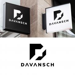
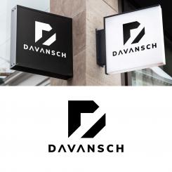
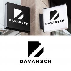
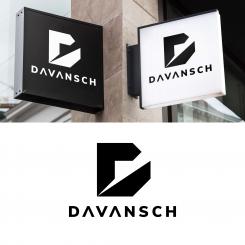
Let me explain my logo.
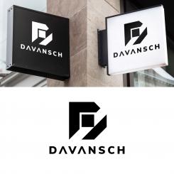
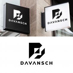
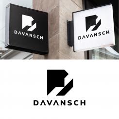
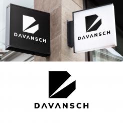
In this logo was made very MASCULINE there is no curve in the brandmark, and all black because black is CLEAR, DEEP, GLAMOR, SERIOUS.
With black this logo will LEGIBLE in the watch.
Black is color of class, black is WE ARE WHO WE ARE
This logo contain brand mark and letter mark.
The brand mark high and wide is same.
The wide of lettermark is 2x following wide of brand mark.
For the negatif space between brand and letter is 0,88 of letter hight.
I try to balance when brand and letter togheter.
You can use this logo for brand or letter alone, or combine whith the rule i gave.
Best regard
Datum start: 10-02-2020
Datum einde: 01-03-2020
Het begon allemaal met een idee...
Een korte, interactieve gids hielp hen hun ontwerpstijl te ontdekken en legde precies vast wat ze nodig hadden.
Brandsupply is een platform waar creatieve professionals en bedrijven samenwerken aan unieke projecten en ontwerpen.
Klanten die bijvoorbeeld een nieuw logo of een huisstijl zoeken, geven een beschrijving van hun wensen. Daarna kunnen ontwerpers via Brandsupply deelnemen aan het project door één of meerdere ontwerpen in te sturen. Uiteindelijk kiest de klant het ontwerp dat zij het beste vinden.
De kosten variëren per type project, van €169 voor een bedrijfs- of projectnaam tot €539 voor een volledige website. De klant bepaalt zelf hoeveel hij of zij voor het gehele project wil betalen.
Dear Ch.
I was read your brief.
Let me explain my logo.
In this logo was made very MASCULINE there is no curve in the brandmark, and all black because black is CLEAR, DEEP, GLAMOR, SERIOUS.
With black this logo will LEGIBLE in the watch.
Black is color of class, black is WE ARE WHO WE ARE
This logo contain brand mark and letter mark.
The brand mark high and wide is same.
The wide of lettermark is 2x following wide of brand mark.
For the negatif space between brand and letter is 0,88 of letter hight.
I try to balance when brand and letter togheter.
You can use this logo for brand or letter alone, or combine whith the rule i gave.
Best regard
 Nederland
 France
 Deutschland
 Österreich
 United Kingdom
 International
