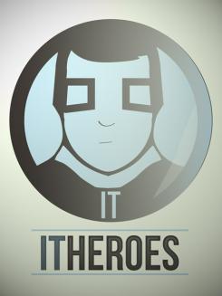
Hi Pitr, this is my design for IT Heroes, inspired by comic books and superheroes. :)
Datum start: 19-10-2013
Datum einde: 16-11-2013
Het begon allemaal met een idee...
Een korte, interactieve gids hielp hen hun ontwerpstijl te ontdekken en legde precies vast wat ze nodig hadden.
Brandsupply is een platform waar creatieve professionals en bedrijven samenwerken aan unieke projecten en ontwerpen.
Klanten die bijvoorbeeld een nieuw logo of een huisstijl zoeken, geven een beschrijving van hun wensen. Daarna kunnen ontwerpers via Brandsupply deelnemen aan het project door één of meerdere ontwerpen in te sturen. Uiteindelijk kiest de klant het ontwerp dat zij het beste vinden.
De kosten variëren per type project, van €169 voor een bedrijfs- of projectnaam tot €539 voor een volledige website. De klant bepaalt zelf hoeveel hij of zij voor het gehele project wil betalen.
Hi Manifest, can you tell me more about this logo? Do you think this will work in black/white on paper? I am a little bit afraid that this logo might be a bit too much of a copy of other logo's, but that's also because it is a very basic shape.
Hi Pitr,
Thanks for interest in my work,
the idea behind logo is to present an IT industry hero in a funny and understandable maner. He's professional, informed and highly specialized, apart from being a superhero, and a combination of those performances can help him crose any barrier or IT problem. I didn't want to go for a classic ble color scheme caracteristc for IT industry, so I tried to go for a more compic-book type feel.
I think it works in black and white version as well, you can see an example on the following link:
http://i110.photobucket.com/albums/n105/MrznjA/itlogobw_zpsaa96982c.jpg
As for your worries, I went for basic readable typography (having in mind that you'll probably have to scale this for business cards also, so we need to keep it clear and readable, also, clients shouldn't try to hard to read name of the company) and my own stylization of the superhero figure designed specially for this competition, so, for that matter I can't say that this is a copy in any way. And, yes, it's very basic since my oppinion is that anything more detailed than this wouldn't be a trademark or logo, yet it would become an illustration, which is very complicated to apply on anything smaller than web banner.
Feel free to contact me for everything you'd like to know about this logo.
Nice one, but it is very similar to this logo: http://superheroesanonymous.com/wp-content/uploads/2010/04/SA-shirt-front-300x300.jpg. I am almost sure it have been copied/inspired from it. Just look it carefully.
Let's not jump to conclusions about copying, please. As I said, it's my stylization. Both signs share similar elements, in the end, it's a superhero...too bad they obviously had it before us, good sign, you'll agree. :) Are you still interested in this design, I can modify it?
This is the first image when you search for "superhero logo" on google image. I stacked them into photoshop and they are almost the same. Look at the hair, the shape, the proportion. Anyway, good luck!
You are very persistent about that. Generic shapes often match, but nevermind. Thanks, and good luck to you too, looking forward checking out your entries as well.
Hi Manifest,
Although I love the logo, the similarities to Superheroes Anonymous' logo are too overwhelming. I am not concluding you copied it or based your submission on their logo, but these similarities force me to downgrade the logo to 1 star.
Kind regards,
Pieter
 Nederland
 France
 Deutschland
 Österreich
 United Kingdom
 International

