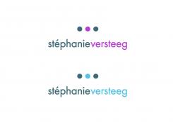
Dear Stephanie,
This a alternative version from the first concept. If you have enough time until the end of the competition, I would love to get your feedback.
Kind Regards
Jordan Raeside
Logo voor journalist
- Wedstrijd van: Stephanie Versteeg
- Categorie: Logo
- Status: Beëindigd
Datum start: 05-02-2013
Datum einde: 19-02-2013
Het begon allemaal met een idee...
Een korte, interactieve gids hielp hen hun ontwerpstijl te ontdekken en legde precies vast wat ze nodig hadden.
Brandsupply is een platform waar creatieve professionals en bedrijven samenwerken aan unieke projecten en ontwerpen.
Klanten die bijvoorbeeld een nieuw logo of een huisstijl zoeken, geven een beschrijving van hun wensen. Daarna kunnen ontwerpers via Brandsupply deelnemen aan het project door één of meerdere ontwerpen in te sturen. Uiteindelijk kiest de klant het ontwerp dat zij het beste vinden.
De kosten variëren per type project, van €169 voor een bedrijfs- of projectnaam tot €539 voor een volledige website. De klant bepaalt zelf hoeveel hij of zij voor het gehele project wil betalen.
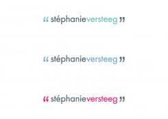
Alternative version of concept 1, and layout and different lettertype.
Kind Regards
Jordan Raeside.
Alternative version of concept 1
Kind Regards
Jordan Raeside.
Alternative version of concept 1, and layout.
Kind Regards
Jordan Raeside.
Dear Stephanie,
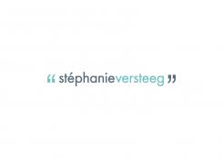
This is the second concept for your company. Again I'm using the characters within the written language however this time it's using the inverted commas or quotation marks (Aanhalingsteken). When I think about a journalist I imagine that your wanting to say something and that's where the inspiration came from. In this case it about your voice being heard.
I've kept the same mint colour because it fresh, clean yet still maintains a professional feeling.
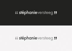
Again I've provided a colour, black and white version and colour alternative. If you have any suggestions please don't hesitate to ask.
Kind Regards
Jordan Raeside,
Graphic designer en Creative director U23
Black and White versions - concept 2
Dear Stephanie,
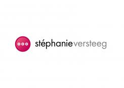
Here is the first logo concept for your company. The logo is based on the idea around the glyph characters (Glief) within the written language
The three dots above the lettertype has two meanings.
1. They represent the 'ellipsis' in the written language (Beletselteken I believe in dutch), giving the idea you have more to write or say.
2. They represent the three types of areas you write for which are editorial, press, foodies (redacties, pers, foodies)
I've kept the font clean and professional while the colour choice (mint) keeps it fresh.
There are two version of this idea.
One version has full dots and the other version the dots are thick lines. The change is very small, but I think it make a different in look and feel.
I've provided it also to see in black and white, alternative colour versions and if you want to see any other versions please don't hesitate to ask.
Jordan Raeside,
Graphic designer en Creative director U23
 Nederland
 France
 Deutschland
 Österreich
 United Kingdom
 International
