Dear Lumiq,
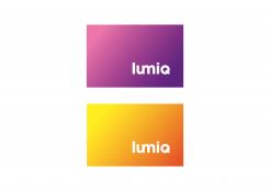
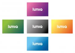
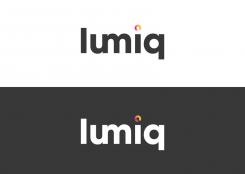
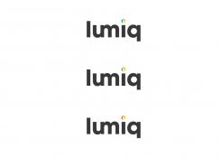
Here are the two colours you requested with the lumiq text to the right . I've placed the text to the right while giving it space to breath around the colour.
Kind Regards'
Jordan
U23
Logo voor lumiq; innovatief bedrijf in verlichting
Datum start: 13-02-2013
Datum einde: 06-03-2013
Het begon allemaal met een idee...
Een korte, interactieve gids hielp hen hun ontwerpstijl te ontdekken en legde precies vast wat ze nodig hadden.
Brandsupply is een platform waar creatieve professionals en bedrijven samenwerken aan unieke projecten en ontwerpen.
Klanten die bijvoorbeeld een nieuw logo of een huisstijl zoeken, geven een beschrijving van hun wensen. Daarna kunnen ontwerpers via Brandsupply deelnemen aan het project door één of meerdere ontwerpen in te sturen. Uiteindelijk kiest de klant het ontwerp dat zij het beste vinden.
De kosten variëren per type project, van €169 voor een bedrijfs- of projectnaam tot €539 voor een volledige website. De klant bepaalt zelf hoeveel hij of zij voor het gehele project wil betalen.
Dear Lumiq,
Here is an updated version of the lettertype.
Kind Regards
Jordan
Second version.
Q is less readable than other versions we think.
Dear Lumiq,
I have looked at your example that you have uploaded on the website. I have made two more versions using a lettertype that is more feminine. With this lettertype I have also played with the q in each version.
Look forward to your reaction
Jordan Raeside
U23
Beatifull type.Female yet bold. However we feel that the combined u and m still works better in your previous version
No problem. I can change that.
Regards
Jordan
Dear Lumiq,
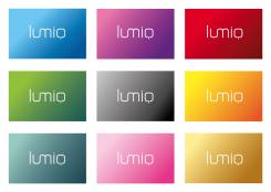
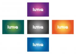
In response to your question, you will definitely notice the subtlety of the colours when printed. I've made sure that there is a significant contrast with the two blended colours. It's always good though to test the colour ( print proof) from the person your going to print it from. That way if there are any problems you can adjust things slightly before your real print.
Furthermore I have added the dot above the I to make it clearer and also added more variety of colour to show you how adaptable it is.
Look forward to your reaction
Kind Regards
Jordan Raeside
U23
Better contrast than previous versions. Previous color combination (orange, light blue, green and purple) was already perfect. No additional colors needed. If we finally choose one color version it will be the purple or orange one in this logo. We will test these with our targetgroup on short notice.
Dear Jordan,
Can you show us, only on the orange and purple variant, how it would look if you would place the name in the lower right corner (so not in the middle). We expect that it will add to the contrast and therefor readability, make the background a more integral part of the design and adds a little tension.
Dear Lumiq,
I have two versions with an hoofdletter q.
The first version uses a simple 45 degree stoke though the letter. The second version has a curved stroke, flowing through the middle of the letter.
These two versions are very subtle but have different feelings I think. The first version is more clear and stronger in my opinion.
You will notice that there isn't any colour dot. I've completely removed it because it was too subtle like you said in your previous reaction. Instead I thought it was better to use this lumination or "moving through different atmospheres" as a background colour.
1. As a straight colour blend (overloop) seen in version one
2. As a circular blend of colours seen in version two (more a kind of spotlight effect)
When either version sits on top of the colour it's still very clear and professional.
Look forward to hearing your reaction
Kind Regards
Jordan Raeside
U23
First version - Straight blend of colours (overloop)
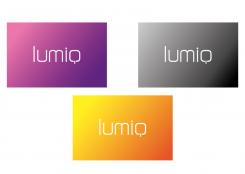
Beautifull. Used type is good. The Q is ok as well. We prefer this straight blend of colour. Challenge is to keep the contrast/ readability strong enough, especially in the gray and orange version. The l is not very readable here.
How will the sublte change of colour in the background work when printed you think?
We look forward to the last adaptations, since we want to test this logo with our targetgroup as one of the options.
Second version – black and white
Circular blend of colours (more a kind of spotlight effect)
Dear Lumiq,
Here is the first concept for your company, which is based on the lumination. The circle on top of the i represent moving through different atmospheres which different types of lighting can create.
The lettertype is readable and clear, yet has a professional, trustworth and chic feel. The whole logo or the circle symbol can be placed also on your products.
Included is the 1 version on black and white. The second image are different colour version.
I want to let you know also that I have different styles, playing with the circle and the letter i itself.
I would be great to hear you reaction and if there are any suggestions I can certainly show them.
Kind Regards
Jordan Raeside
We like the linked U and M, it makes the logo unique and ownable in a contemporary way. The colors in the dot might be to subtle, as the dot is very small. We like the idea behind it. The undercast Q is an issue for us, since we simply don't like the graphics of that letter in many cases. Also it comes very close to an A. Maybe you help us with some alternative ways/suggestions on how to make the Q more attractive
I do have some alternatives already. However I will have a think about how to manage the Q and upload them.
Regards
Jordan
 Nederland
 France
 Deutschland
 Österreich
 United Kingdom
 International

