Geen commentaar
Het begon allemaal met een idee...
Een korte, interactieve gids hielp hen hun ontwerpstijl te ontdekken en legde precies vast wat ze nodig hadden.
Brandsupply is een platform waar creatieve professionals en bedrijven samenwerken aan unieke projecten en ontwerpen.
Klanten die bijvoorbeeld een nieuw logo of een huisstijl zoeken, geven een beschrijving van hun wensen. Daarna kunnen ontwerpers via Brandsupply deelnemen aan het project door één of meerdere ontwerpen in te sturen. Uiteindelijk kiest de klant het ontwerp dat zij het beste vinden.
De kosten variëren per type project, van €169 voor een bedrijfs- of projectnaam tot €539 voor een volledige website. De klant bepaalt zelf hoeveel hij of zij voor het gehele project wil betalen.
Hello Sir
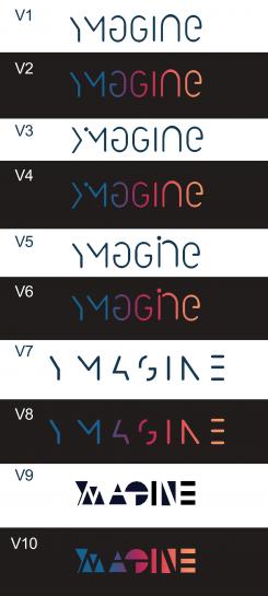
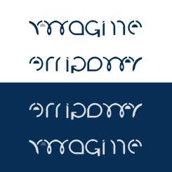
I present you the last conception which contains 10 versions taking into consideration your comment, I already deposited 15 so I am not entitled to any more ways I hope to have reached your expectations and it was a really a pleasure to work with you.
THANK YOU
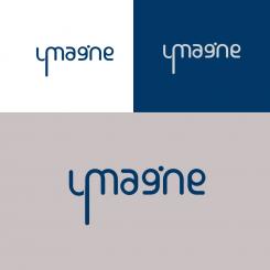
Hi, I really like the “agine” in your V1 logo, the YM however come across as being part of a different logo. Perhaps a round m and the same n upside down to make a y.
But I also understand that you’re done making proposals.
Hi
Thank you again for your comment .I would have liked to improve and carry out this design according to your expectations but I reached the ceiling of the proposals set by the site.
Thank you
Geen commentaar
Definitely creative, although I miss some coherence and consistency across the overall letters in the logo. For example, the M is really big (which looses attention on the Y) and the I, N, E are fairly cramped. It may be stronger with the i just as a straight up black bar, the N a bit wider and the E with just 3 horizontal black bars...
Geen commentaar
The "agine" part of the logo is nice. So I see potential. However the Y and M are not being understood.
From a style perspective an n rather than N may fit better in overall picture
Geen commentaar
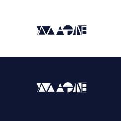
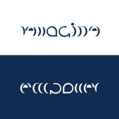
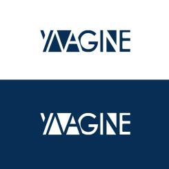
On this logo I made the imagination more complicated, that is to say three letters read at a time: letter Y with his head and in the middle of letter M, and the letter M in negative created with his triangle on the right the letter A and the resulting set is thus YMA and then the rest is treated in a simple way. Here the concept imagination here was a little complicated.
Like the effort of reduction and aiming to simplify. However the first part of the word becomes hard to read
Geen commentaar
find it too straightforward, not enough imagination that comes across
Geen commentaar
Hi,
I really like that this triggers imagination! It seems you read my short brief and the comments made so far well.
Although I like it, the overall image feels a bit retro. I don't know how to pinpoint it exactly but wonder how it could become more contemporary...
In my opinion, definitely one of the most creative so far!
 Nederland
 France
 Deutschland
 Österreich
 United Kingdom
 International
