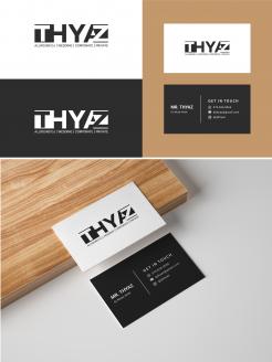
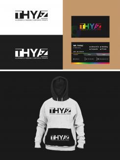
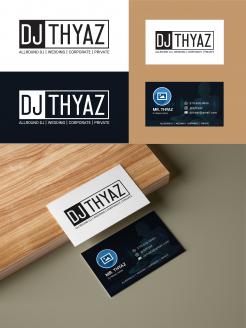
Please have a look... I have updated the business card as you told. Please let me know your opinion. Thank you
Ontwerp een Logo visitekaartjes voor een DJ THYAZ
Datum start: 24-09-2021
Datum einde: 01-10-2021
Het begon allemaal met een idee...
Een korte, interactieve gids hielp hen hun ontwerpstijl te ontdekken en legde precies vast wat ze nodig hadden.
Brandsupply is een platform waar creatieve professionals en bedrijven samenwerken aan unieke projecten en ontwerpen.
Klanten die bijvoorbeeld een nieuw logo of een huisstijl zoeken, geven een beschrijving van hun wensen. Daarna kunnen ontwerpers via Brandsupply deelnemen aan het project door één of meerdere ontwerpen in te sturen. Uiteindelijk kiest de klant het ontwerp dat zij het beste vinden.
De kosten variëren per type project, van €169 voor een bedrijfs- of projectnaam tot €539 voor een volledige website. De klant bepaalt zelf hoeveel hij of zij voor het gehele project wil betalen.
Please let me know your opinion if you want any updates or changes... Thank you.
Hi!
Thanks for submitting. Logo looks good! wouldn't change that anymore. Jumps into my top 3.
If I would change something, it would be the business card.
Not the biggest fan of the design/colors used in the front.
The backside is too busy for me. Also not a fan of the 4 wedding corporate etc boxes. For me, it's not needed to write that again on the back, because it's part of the logo in the front. Less is more.
Your 'get In touch' mark is something genius! Simple, but very clear and effective. Well done with that.
in overall: if you can redesign the business car (with the same front logo ofc) this is a very very good one. Thank you
Design updated...please have a look and let me know your opinion. Thank you
 Nederland
 France
 Deutschland
 Österreich
 United Kingdom
 International


