Geen commentaar
ontwerp een spannend speels logo voor Economy Transformers
Datum start: 11-04-2017
Datum einde: 25-04-2017
Het begon allemaal met een idee...
Een korte, interactieve gids hielp hen hun ontwerpstijl te ontdekken en legde precies vast wat ze nodig hadden.
Brandsupply is een platform waar creatieve professionals en bedrijven samenwerken aan unieke projecten en ontwerpen.
Klanten die bijvoorbeeld een nieuw logo of een huisstijl zoeken, geven een beschrijving van hun wensen. Daarna kunnen ontwerpers via Brandsupply deelnemen aan het project door één of meerdere ontwerpen in te sturen. Uiteindelijk kiest de klant het ontwerp dat zij het beste vinden.
De kosten variëren per type project, van €169 voor een bedrijfs- of projectnaam tot €539 voor een volledige website. De klant bepaalt zelf hoeveel hij of zij voor het gehele project wil betalen.
Hello, let me remind you that the pigeon is the symbol not only of peace but also of competitiveness and independence
yes could be but still it doesnt work for us unfortunately. we love your letters:). so if you can try with a different animal then great
Good evening, it is not serious I am at your disposal if you want other modification on the logo, and about the contact here is my e.mail: bartousk@yahoo.fr
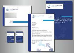
thanks, are you able to work this into some kind of a huisstijl? so we have a clue where this logo could take us to? we like it.. although the piggion might be to much of a symbol for peace. and ofcourse we want peace with our new economy but not sure if that is wise. thanks!
Could you replace the pigeon for a frog for instance? we have one more day.. hope you are available to give us a clue on the housestyle.. thanks, Damaris
Could you replace the pigeon for a frog for instance? we have one more day.. hope you are available to give us a clue on the housestyle.. thanks, Damaris
Geen commentaar
we like thisone, sorry at this late hour and tomorrow is the deadline. can you give us a clue on the huisstijl this logo could move to? so we can connect to that and make our choice? We love thisone together with 2 other logo's. Hope you are able to make something before tomorrow afternoon. Quess that is the deadline for us? no idea how the process will go after that. Are we then able to connect in person?
Geen commentaar
Good evening, here are different variants that evokes the dynamism
Geen commentaar
bonsoir, ok je vais essayer autre piste
Geen commentaar
it seems to complex and mechanic to us.. and we don't need the E necessarely:). I love your letters. not sure if putting everything in the same colour makes it better.
it seems to complex and mechanic to us.. and we don't need the E necessarely:). I love your letters. not sure if putting everything in the same colour makes it better.
I still wish to continue and pull out more of your crativity, is that possible? Something a bit more organic or based on the mineral world.. diamant, cristals.. I dont know
moreover.. i am now communicating with 3 designers to further develop. You are one of those..
Geen commentaar
Yes i love the way you style the letters. The image doesnt get better this way. sorry. i feel a combination of logo's coming up. Is that ever done before, could we try? the image of cedric we love. and your letters. you can see the other images right?
Geen commentaar
Here is another style that evokes more the transformation
yes, i like it. but also i find it to thick, firm somehow. i like the words this way. and the circle around the star. not happy with how it is done yet. can you try to work with it a bit?
yes, i like it. but also i find it to thick, firm somehow. i like the words this way. and the circle around the star. not happy with how it is done yet. can you try to work with it a bit?
yes, i like it. but also i find it to thick, firm somehow. i like the words this way. and the circle around the star. not happy with how it is done yet. can you try to work with it a bit?
yes, i like it. but also i find it to thick, firm somehow. i like the words this way. and the circle around the star. not happy with how it is done yet. can you try to work with it a bit?
 Nederland
 France
 Deutschland
 Österreich
 United Kingdom
 International
