Geen commentaar
Ontwerp een strak en ruig logo voor een nieuwe CrossFit box
- Wedstrijd van: CrossFitHeerlen
- Categorie: Logo
- Status: Beëindigd
- Bestanden: Bestand 1, Bestand 2, Bestand 3
Datum start: 02-02-2016
Datum einde: 20-02-2016
Het begon allemaal met een idee...
Een korte, interactieve gids hielp hen hun ontwerpstijl te ontdekken en legde precies vast wat ze nodig hadden.
Brandsupply is een platform waar creatieve professionals en bedrijven samenwerken aan unieke projecten en ontwerpen.
Klanten die bijvoorbeeld een nieuw logo of een huisstijl zoeken, geven een beschrijving van hun wensen. Daarna kunnen ontwerpers via Brandsupply deelnemen aan het project door één of meerdere ontwerpen in te sturen. Uiteindelijk kiest de klant het ontwerp dat zij het beste vinden.
De kosten variëren per type project, van €169 voor een bedrijfs- of projectnaam tot €539 voor een volledige website. De klant bepaalt zelf hoeveel hij of zij voor het gehele project wil betalen.
If you need any changes let me know
My private email : arik_gilles@yahoo.fr
Geen commentaar
Looks great already but I think it will look even better when the outline is better finished between the kettlebell and the outline, and between the barbell and the outline. See heartistique's design for example
Geen commentaar
Hi,
any changes ?
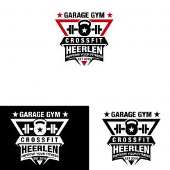
Can you make the kettlebell maybe a littekens bit bigger to fill the white area and than put 'Garage Gym' in the kettlebell (maybe inspired by the third design of designer AbsoluteDesign, I liked that kettlebell very much) and put 'EST 2016' between the barbell plates. I don't like a lot of white
Geen commentaar
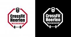
Now we have all the tagloines in Impact font and the trademark is thicker, bolder.
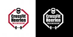
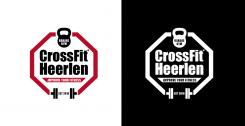
Also the third logo is surrounded by a octagon.
Thanks you! Be inspired by the design of designer heartistique. Maybe change the kettlebell and barbell position.
I mean, while editing logo 3 with the contagon
Geen commentaar
Hi, the font is now "impact" on the trademark.
And it's now EST 2016.
Best,
That's better, but can you make it bold also? See file 2 (our current logo), the registered trademark symbol looks more obvious
- can you change the font of 'EST 2016' also into Impact?
- what's the font of the other two taglines?
- can you change the outlining of logo 3 (on the right) to a octagon?
Because the outlining of logo 3 is not what we are looking for. We still doubt regarding the outlining
Geen commentaar
Thanks for feedback.
If you want tu see just one in colors and black/white let me know.
Best
Looks already great, but is it possible to make the registered trademark more bold/thicker/clearer? Or just leave it.
- I made a terrible mistake: it must be 'EST 2016' instead of 'EST 2015'
I mean, the registered trademark symbol is not so obvious. Is it Impact (font)?
Geen commentaar
See last feedback
Geen commentaar
See last feedback
Geen commentaar
Thank you!
- Delete -/ in improve but keep 'im' Italic
- can you show me how the logos look in white on a black background?
Geen commentaar
Hi,
hereby you have two versions of the outline.
The second one is referring more to a man torso, kind of a triangle.
I have changed the font of the taglines, i think that font brings more power and strength
to it.
Let me know what you think.
Best,
A
+ overal design
- the barbell will look more realistic when the outside parts where the plates are on are thicker than the middle of the barbell. Please have a look at a picture of a barbell with plates on it to understand what I mean.
+/- I like that you used another font for the taglines to emphasize the strong look and feel but I don't like the font.
+/- I'm wondering if the wordplay of improve in 'improve your fitness' will look better when 'im' in 'improve' is written Italic
Geen commentaar
Hi,
thanks for your feedback and rating.
I added all the elements you have asked for.
If any changes, don't hesitate to ask.
Best,
A
Great design!
+ contains everything we're looking for
- 'Since 2015' instead of 'EST 2015'
- Text effect of tagline ('Since 2015')
- edges of the barbell are too rounded and the edges of the barbell plates not at all / (small) rounded edges will look more realistic
- try a wordplay with "IMPROVE YOUR FITNESS", i.e. "(IM)PROVE YOUR FITNESS" or "IM-/PROVE YOUR FITNESS"
+/- Outling doesn't have to be exactly the same as the CrossFit Games logo. It must emphasize the strong look and feel.
You're close! Please use your creativity! You're good at it :)
Hi,
thanks again for your feedback and rating.
I'll do the changes :)
A
Geen commentaar
Hi,
is it what you are looking for ?
Thanks for your feedback
A
+ registered trademark symbol (®)
+ Impact font
+ Kettlebell graphic
+ Barbell graphic
+ outlining
- no taglines 'EST 2015', 'Garage Gym' and '(Im)prove your fitness'
- barbell graphic is not realistic (barbell plates have the same height, they only differ in thickness if plates are heavier)
- Spacing between text and border (looks like text is not centered)
Geen commentaar
+ outlining (see file 3 for better example)
+ font
+ use of graphics
- no registered trademark symbolisch
- poor graphic design
Geen commentaar
+ font
+ use of graphics
- no registered trademark symbol
- not what we're looking for
+ font
+ use of graphics
- no registered trademark symbol
- not what we're looking for
See file 3 for better example with outlining and look and feel we're looking for
 Nederland
 France
 Deutschland
 Österreich
 United Kingdom
 International
