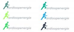
Hello Mark,
i did a little presentation of our development.
I hope you like the outcome and i wanna say a huge thanks for your awesome feedback it was a great experience :)
With the Best regards
Kevin from GreenCinemaStudios
Ontwikkel een modern logo voor een nieuw concept: Hardloopenergie
Datum start: 14-12-2018
Datum einde: 21-12-2018
Het begon allemaal met een idee...
Een korte, interactieve gids hielp hen hun ontwerpstijl te ontdekken en legde precies vast wat ze nodig hadden.
Brandsupply is een platform waar creatieve professionals en bedrijven samenwerken aan unieke projecten en ontwerpen.
Klanten die bijvoorbeeld een nieuw logo of een huisstijl zoeken, geven een beschrijving van hun wensen. Daarna kunnen ontwerpers via Brandsupply deelnemen aan het project door één of meerdere ontwerpen in te sturen. Uiteindelijk kiest de klant het ontwerp dat zij het beste vinden.
De kosten variëren per type project, van €169 voor een bedrijfs- of projectnaam tot €539 voor een volledige website. De klant bepaalt zelf hoeveel hij of zij voor het gehele project wil betalen.
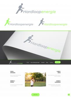
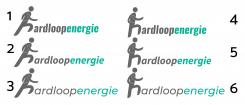
Hello Mark,
thanks again for the great feedback =)
here is the version with the text in grey and the runner in color. I will upload the other ones in separate entries so you have a better overview
Best regards
Kevin from GreenCinemaStudios
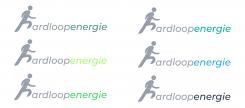
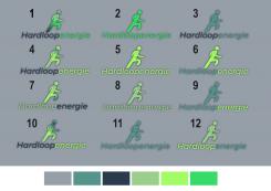
Hello Mark,
Thanks for the feedback, I did some color versions with the "creativ drop" color pattern. Unfortunately i cant find the other color pattern (with Green and blue.
Best regards
Kevin from GreenCinemaStudios
btw i also added a light shadow behind the logos so that there is a bit more depth and it makes the logo a bit more "active and more colorfull"
btw i also added a light shadow behind the logos so that there is a bit more depth and it makes the logo a bit more "active and more colorfull"
Hi Kevin,
thanks
Could you try the number 3 of the earlier designs (the runner in the text instead of above)?
I'm not really fan of the shadow :) Makes it less clean, prefer your earlier designs.
So my suggestions:
- start with number 3 of the design below
- try one thing at a time, to help me see what works and what not
1. text grey (completely) and runner in a color (If you could show different colors, great)
2. runner in grey text in color completely
3. runner in grey only 'energy' in color
It really helps a lot if you show step by step, if too many things change at once, its difficult to see that one step was actually good but the others not.
Hope you can go on like this!
Hello Mark
Thanks for the great feedback.
I used the number 2 and 3 "runner/h" and thinned out the legs and removed the smile i also added the text with 3 fonts to it
Best regards
GreenCinemaStudios
Hello Greencinema,
I like option 3 the best. Could you
- have a look at the briefing, I have just put two links for color inspiration. Because I'm not sure yet of the green color as it is. Would be great if you could play a bit with different colors for this design.
- use the runner H also as a separate image, like a social media icon. How would it look like (again in different color settings)
Would be great if you could make this steps still!
Hello Mark,
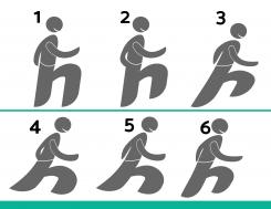
Thanks again for the great feedback. I did a few new versions of the "Runner/h" so you have some options what you like the most. Text will then be added in the next stage :)
Best regards,
GreenCinemaStudios
Hello GreenCinemaStudios,
thanks for your improvements!
I'm sorry, but its really hard to make a choice, since it will be the start of the word Hardloopenergie, its difficult to decide on wich version of the runner.
Could we give it a try with 2 and 3? (5/6 def not) . The legs could be thinner maybe, but I would have to see it combined with the text.
Good step forward!
Curious to your new improvements!
best
Mark
In addittion, could you also try a version (of the next step) without a smile. I do like it, but I would like to see what the difference would be.
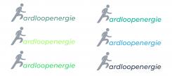
Hello Mark,
thank you for the great feedback.
I changed the "h" so its integrated in the text and more readable and at the same time its a "runner"
Best regards
GreenCinemaStudios
Hello Greencinemestudios,
thanks for your improvements!
My preference is the one color (grey or white) logo.
Some improvements I'd still like to see:
- the h is still a bit to skew, makes the runner also look a bit weird :)
- how could it look like if the runner was running a bit more relaxed, enjoying his run, having a good day, feeling a good vibe etc?
would be great if you could make some design options for the runner h .
Regarding fonts, I like these kind of fonts:
Source sans pro
Eb garamond
Oswald
Catamaran
Abel
Exo 2
Montserrat
Ubuntu
Hope you can make some steps still!
best
Mark
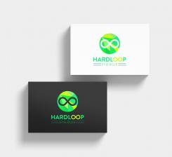
Hello
this is my entry to your contest
Best regards
GreenCinemaStudios
Thanks GreenCinemaStudios!
I like it that you took a look at my website to see what would fit.
What I would like to adjust/improve
- the runner H is not really wel readable as a H. Its a mix between a runner and a H, I get that, but I would try to make it more of a runner and at the same time more of a H.
- Right now the runner H would be like the mark (for like social media), therefore it should be telling more.
- I'm not really charmed of the glossy/3d look of the H
I hope you can make some next steps! If you have any questions, let me know.
 Nederland
 France
 Deutschland
 Österreich
 United Kingdom
 International
