Hi Yevhen!
Thank you for the feedback so far. I think we are really getting somewhere!
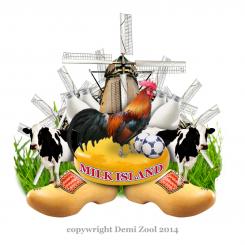
You were not a big fan of the last design because it was a bit minimalistic. So this time I went with a maximalistic approach. There is a lot of detail in the new logo. That way you really stand out from your competitors!
Also there are a lot of Dutch elements in the picture. Everyone will look at this logo and say: “hey… that is from holland!”. There is cheese of course but also other dutch things. Also I put a cock in the center because you see them a lot on farms. The balls are there to make the logo playful, otherwise it all becomes a bit too serious I think.
p.s. the windmill is a stick image. That means if you choose the logo I will have to buy the photo 8 times (8 windmills in the logo). I could also remove a few windmills to keep the price down.
Your friend,
Demi
Redesign of the logo Milkiland. See the logo www.milkiland.nl
Datum start: 27-03-2014
Datum einde: 25-04-2014
Het begon allemaal met een idee...
Een korte, interactieve gids hielp hen hun ontwerpstijl te ontdekken en legde precies vast wat ze nodig hadden.
Brandsupply is een platform waar creatieve professionals en bedrijven samenwerken aan unieke projecten en ontwerpen.
Klanten die bijvoorbeeld een nieuw logo of een huisstijl zoeken, geven een beschrijving van hun wensen. Daarna kunnen ontwerpers via Brandsupply deelnemen aan het project door één of meerdere ontwerpen in te sturen. Uiteindelijk kiest de klant het ontwerp dat zij het beste vinden.
De kosten variëren per type project, van €169 voor een bedrijfs- of projectnaam tot €539 voor een volledige website. De klant bepaalt zelf hoeveel hij of zij voor het gehele project wil betalen.
Hi Demi,
we are far from buying the photos at the moment.
Thank you for max. vision.
I would say it's funny, I'm not sure we can go so far from serious matters.
You know, cheese is a conservative thing. Here rules tradition.
Let's see what we are going to have further.
Thanks,
Yevhen
Thanks for you reaction Yevhen! i also have this one lying on the plank, maybe this is more in your flavor.
I choose natural colors but with a minimalistic outline so it had a modern and still authentic feel'n look
Let me know what you think of this style
Forever yours,
Demi
No it could not go, sorry. too minimalistic
Hallo Yevhen,
When I see this competition I say to myself: "wow, that is one for me!”. When I was a child I grow up on the farm and play with the cows. I even helped my father pull the cows.
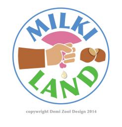
Now for the logo: the theme of the logo is ‘milking’. This is a very natural concept and it brings the brand close to the fields. In the logo you can see the farmer milking the cow. I believe that is what people want right now: not electrical pulling but real handwork. To make it complete I add two extra nuts.
When I started the experimentation fase I tried a photo-realistic approach. But then I thought: “lets make it modern”. So then I removed a lot of details to keep the design simple and clean. That way, you can also use the logo for a iPhone icon or placemats.
If you want I can experiment more with different colours for the farmer’s hand. Right now the farmer is white, but I can try different colors. What do you think?
I look forword to your opinion!!
Demi
Hello Demi,
I don't agree that modernity is handmilkilng.
I don't see how to experiment within your concept.
Try to get something different please
Best wishes,
Yevhen
 Nederland
 France
 Deutschland
 Österreich
 United Kingdom
 International


