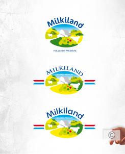
Hello Yevgen, here's another try. Needs still some work.
Thanx, Paul.
Redesign of the logo Milkiland. See the logo www.milkiland.nl
Datum start: 27-03-2014
Datum einde: 25-04-2014
Het begon allemaal met een idee...
Een korte, interactieve gids hielp hen hun ontwerpstijl te ontdekken en legde precies vast wat ze nodig hadden.
Brandsupply is een platform waar creatieve professionals en bedrijven samenwerken aan unieke projecten en ontwerpen.
Klanten die bijvoorbeeld een nieuw logo of een huisstijl zoeken, geven een beschrijving van hun wensen. Daarna kunnen ontwerpers via Brandsupply deelnemen aan het project door één of meerdere ontwerpen in te sturen. Uiteindelijk kiest de klant het ontwerp dat zij het beste vinden.
De kosten variëren per type project, van €169 voor een bedrijfs- of projectnaam tot €539 voor een volledige website. De klant bepaalt zelf hoeveel hij of zij voor het gehele project wil betalen.
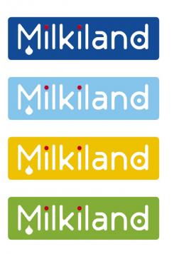
Do not be so minimalistic please
Hello Yevhen,
my russian is a bit rusty so I prefer to write in english.
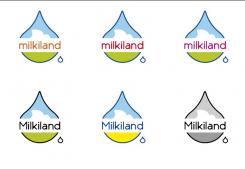
Here're some new examples of the logo. I stylised the dutch flat landscape, with a white cloud, the name in dark type and some tests with colour. Hopefuly we can work further from the ideas as shown. If we use red and dark blue it will quickly look like a Pepsi logo instead of milk. I still the droplet to indicate the origin of cheese which is milk (moloko I now remeber!). But as you said, if your core business is cheese, we shoul consider yellow(s) as the main colour?
Bye, Paul.
Hello Paul,
thanks a lot, moloko is a right word. In Ukrainian and Russian it is the same. We do not have to use it now of cause.
We have it used in the other project. See the logo at http://www.moloko-kraina.com.ua/en/
It was created 2-3 years ago by Dutch guy. It was "redesignme" community.
About your logo.
Cheese is our prime product. What you have done is rather milky.
That milk drop shape is rather unstable.
Cheese is stable, mature.
Please try to rework the shape of it.
Bye,
Yevhen
Hello there!
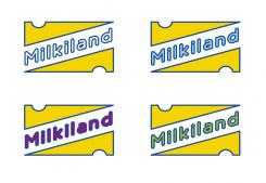
Here's my first sketch of a new logo for Milkiland.
Colours are to be detailed later on, so for now I focused on the name and your other wishes compared with the competition in the rest of the EU. I avoided using red white and blue since those colours are also in the russian flag, and not that loved in the Ukraine. I did not use an image for Asiatic countries could be of islamic beliefs.
Looking forward hearing form you, cheers,
Paul van der Groen
www.pcvdg.com
Thank you Paul,
The version is interesting. You've caught the idea of milk. Ok. You've been absolutely right when you put the word Milkiland into the "box". We need to have simple outline of the logo to use it against the different backgrounds.
I'm not sure that having the word "Milkiland" written in white is very good. We'd rather have it dark (blue or other) against the white background.
Although I do not want to limit the range of ideas. Every fresh view is valuable.
Some more comments.
Our main product for the brand is cheese. We are not so much milky we are rather cheesy for more than the half.
The Russian flag's colours are not good conbination for sure. We do not want to have much red, but could have it slightly or do not have at all.
Our main competitor at the segmnet Hochland has a red outline in the logo.
You could use traditional Dutch colours, if not red or some red.
You could also try to express the idea of land using the sketch of land, valley, sky
Thanks a lot. I hope to see your futher ideas.
Yevhen
Hello Yevhen,
Are you of russian birth? Kak dela? I studied russian for a year, so ;-)
I will design a dutch landscape en have the logo in white plus more emphesis on chess production. Da swidanja!
Paul.
Hi Paul,
I'm Ukranian, born in the USSR (Russian Empire which I hope is going to die). I speak Ukrainian as well as Russian. If you find it's better to write you in Russian I could do it easily.
Looking forward to see more of your ideas.
Best wishes,
Yevhen
 Nederland
 France
 Deutschland
 Österreich
 United Kingdom
 International


