Geen commentaar
De Both Consultancy zoekt hulp bij het ontwerpen van een professionele huisstijl (inclusief bedrijfslogo)!
- Wedstrijd van: Meike de Both
- Categorie: Logo & Huisstijl
- Status: Beëindigd
Datum start: 01-11-2016
Datum einde: 15-11-2016
Het begon allemaal met een idee...
Een korte, interactieve gids hielp hen hun ontwerpstijl te ontdekken en legde precies vast wat ze nodig hadden.
Brandsupply is een platform waar creatieve professionals en bedrijven samenwerken aan unieke projecten en ontwerpen.
Klanten die bijvoorbeeld een nieuw logo of een huisstijl zoeken, geven een beschrijving van hun wensen. Daarna kunnen ontwerpers via Brandsupply deelnemen aan het project door één of meerdere ontwerpen in te sturen. Uiteindelijk kiest de klant het ontwerp dat zij het beste vinden.
De kosten variëren per type project, van €169 voor een bedrijfs- of projectnaam tot €539 voor een volledige website. De klant bepaalt zelf hoeveel hij of zij voor het gehele project wil betalen.
Hello Meike,
A very Good Morning!
Here is your Design Set, had to replace the style of the words "Together in Key". It's nearly 2.2 times bigger than earlier. Have used a more stronger but less bold font style for the wording to provide it a balanced look with the Logo. As you shall see now, it's perfectly visible and also doesn't over shadow the logo or any other design.
First I tried to put in the slogan separately like you can see in submission Entry Image for Logo Design (the #2 Design), but that only works with the design style with straight line patterns. The Design style here is curvy and so I tried to put it in a semi-circle around the logo icon but it didn't work. Than I tried to adjust the slogan among the curves of design but than it disturbed the look and style of design.
Lastly I decided to change the entire font style and it's appearance. Earlier used style was a bolder style due to which it's size had to be kept very small to balance it with the logo. Now I have used a more lighter, more rounded and 2.2 times bigger font style.
This matches and balances perfectly with Logo and does not disturb any other designs.
Kind Regards,
Rusty
Hi Rusty, thanks a lot for your new design and your explanation of what's changed. I'll start to make up my mind about all the received designs! Keep you posted.
Okies!
Thankyou!
Hello Meike,
Sorry for late reply, I just checked your comments at Dutch Design. We don't get updates when other designer post comments, so didn't see it.
I commented their because you he clearly tried to copy my style. Although he copied the style the font style style doesn't go with it.
Well, I just logged in my account to tell, that I was trying to come up with some different style but everytime I changed the size of any thing in the logo the balance of whole design use to disturb.
* Tried making the Icon size smaller, doesn't work.
* Tried removing the curves from top and using only logo,
it leaves too much blank wasted space over the top.
* Tried out different style but that it gives a sporty look to design.
So finally, this seems to be the best design for this Logo and style or else with straight line you can use it, but as you said earlier you prefer curves, so this seems to be the best option with this style.
Regards,
Rusty
Geen commentaar
Hello Meike,
Good Morning,
Here is the updated Design for you.
Do let me know if you wish for any alterations.
Kind Regards,
Rusty
Hi Rusty, thanks a lot again. I still like your design very much and have one more question regarding an alteration; what if the Together in Key will be excluded from the logo of De Both Consultancy and is still (re)designed in the corporate design set so that it becomes a more powerful slogan in the total design? Much appreciated!
Sure! Shall update it and present you the design soon. Shall incorporate the slogan in the designs as they best compliment it.
Geen commentaar
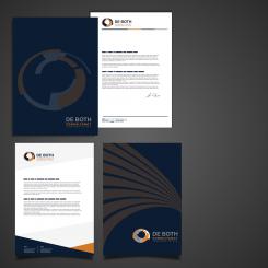
Letter heads and file / letterhead holder
Geen commentaar
Hello Meike,
Good Morning!
Please have a look at the size of slogan.
Have provided you the size comparison of earlier size and current size. Have separated the set so you can get clear view.
Hi Rusty, I like the 'current increased size' and prefer the design with the curved lines over the straight lined design. Can you provide me with a set of only the curved design? Many thanks!
Sure!
Shall update and give you only design with curved set.
But having another style set is good na, as it might come in handy in near future. If you wish to have a change of style.
Shall provide you with only curved set, If that what you wish.
But it seems,
You have finalised your Design choice.
Why ask me to make changes?
I didn't finish at all. Thanks for telling me that that's the sign with the 5 stars because it is definitely not the message I would like to sent out. I changed it directly. There're more likely candidates and you're amongst them ;-).
OH! Thanks, for letting me know.
5 star means done! You have your choice. Than other will stop trying to beat competitors.
Shall update the design for you.
Please review what all changes you want, as maximum number of submission is 15. and once reached that can't submit any more designs. Also you can remove the ratings from the designs were you haven't mentioned any comments, so I can delete those entries and regain some extra space for re-submission.
OK thanks Rusty! I've tried to remove the stars of the ranking but I couldn't find how to do this. Do you know?
I don't know!
It should be same process, like the one you use while rating; just click to undo rating, I guess!
I can delete the only designs which does,not have any ratings and no comments by you.
I have four entries yet that i can upload, so no worries for now. Shall update the design soon.
Got it done! Deleted some of your one-star designs.
Yes,
Deleted the Designs, got 3 more submission space increased.
Geen commentaar
Hi Meike,
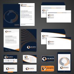
Here is the design set with the slogan added.
Could the 'Together in Key' a bit bigger/more present? Apart from barely seeing it because the maximum zoom, the slogan may be a bit more present. Thanks!
Of course shall make it bigger, and upload it for your visualisation.
Geen commentaar
Hi,
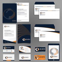
Here is the updated design set with deeper blue colour.
Looks great! What about adding the 'Together in key' slogan to the design?
Yes Sure! Shall update it and present you tomorrow.
Geen commentaar
Hi,
Here is the updated design with darker blue.
Geen commentaar
Hello Meike,
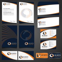
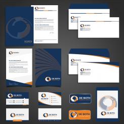
Here is the complete set design.
The files are fully scalable, so you can resize each and every file, elements, logo as per your requirements without losing the quality and clarity.
Have retouched the logo design a bit and made it more balanced.
Awaiting your response,
Kind Regards,
Rusty
Hi Rusty, I like the design of the second one very much. Is it possible to change the blue color into a even more deep darker blue? And could you show me a total corporate design of this 2nd design format? Really appreciated, thanks!
Second Design Format? I don't understand.
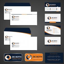
This complete set is for you. Can use the designs as you wish. 2 Letter head designs, two folder / file designs, 2 envelope designs, 4 business cards, two favicon / logo icons.
Can deepen the blue, color change takes only few minutes.
Geen commentaar
Hi Meike,
Here is my updated Design.
Do let me know your views and rate the design, so can present you with my Corporate Identity Design Set.
Awaiting your response,
Kind Creative Regards,
Rusty
That would be really nice Rusty! I'm looking forward to the corporate identity design set.
Working on it, shall upload it soon. Also refining the logo design a little.
Geen commentaar
Hello Meike,
Here is my Design proposal for your Logo.
Have mailed you, please do provide me with the research for designing your corporate identity set.
Do let me know if you need any different colour combination in the design. Please feel free to provide any feedback / suggestions if you have for the Design.
Awaiting your response,
Kind Creative Regards,
Rusty
Hi Rusty, thanks for your message. This design seems to me a bit too 'straight'. More like a Home Depot logo and less unique. Although the color combination is perfect, I would suggest the grey a bit lighter and the blue color some more deep blue.
Here you'll find my pre-research on a Pinterest moodboard: https://nl.pinterest.com/meikedeboth/de-both-consultancy-huisstijl-logo/
Thankyou!
Shall improve on the Design and come up with something interesting for you.
 Nederland
 France
 Deutschland
 Österreich
 United Kingdom
 International
