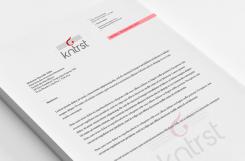
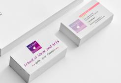
Copy logotype number one (1) put on documents
HUISSTIJL & LOGO VOOR KNTRST.
- Wedstrijd van: Robbiieerob
- Categorie: Logo & Huisstijl
- Status: Beëindigd
Datum start: 14-06-2013
Datum einde: 14-07-2013
Het begon allemaal met een idee...
Een korte, interactieve gids hielp hen hun ontwerpstijl te ontdekken en legde precies vast wat ze nodig hadden.
Brandsupply is een platform waar creatieve professionals en bedrijven samenwerken aan unieke projecten en ontwerpen.
Klanten die bijvoorbeeld een nieuw logo of een huisstijl zoeken, geven een beschrijving van hun wensen. Daarna kunnen ontwerpers via Brandsupply deelnemen aan het project door één of meerdere ontwerpen in te sturen. Uiteindelijk kiest de klant het ontwerp dat zij het beste vinden.
De kosten variëren per type project, van €169 voor een bedrijfs- of projectnaam tot €539 voor een volledige website. De klant bepaalt zelf hoeveel hij of zij voor het gehele project wil betalen.
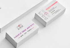
Copy logotype number one (1) put on a Business(Calling) Card
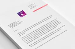
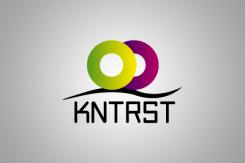
Copy logotypenumber two (2) put on documents
Copy logotype number two (2) put on a Business(Calling) Card
DESCRIPTION
The representational elements:
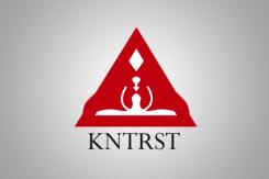
· 1/We have in this logo two human beings' heads which face to symbolize the artistic thought, the creativity, the love, the discussion
· 2/The triangle with its three points of extremities represents the opening, the agreement, the division(sharing) of the company.
· 3/If you consider good in the middle of both human beings' heads you go to perceive a shape of guitar that I drew to represent the musical creativity.
· 4 / La used typography(typeface) is by default in all the systems of Windows, he(it) is simple, fascinating and attractive.
The description of this logo is the same that the second.
I just changed the symbol which was in the middle by adding it a guitar to suggest the musical, artistic creativity.
Hello !
DESCRIPTION:
The representational elements:
The pink color is the axis symbolizing the creativity, the beauty, the purity, the division(sharing), the opening and the freedom.
The color moves assure(insure) a maximum legibility of the characters, It is a security of modernity.
The used typography(typeface) is by default in all the systems of Windows, he(it) is simple, fascinating and attractive.
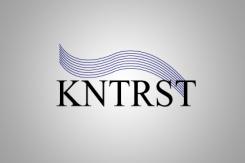
1/The symbol in the middle represents the musical as well as artistic creativity, it clears(releases) a maximal purity of the mark(brand), it gives him(her) a unique(only) and attractive identification.
2/lines below the symbol represents the artistic training(formation), they suggest a diversity in the art that is they suggest all the words which define the art such as the freedom, the thought, the creativity, the love, the life...
The visual identification of the company KNTRST is the result(profit) of an artistic work which emphasizes, in a particular way, the following elements: the name of the company, her mission (target), its purity, its peculiarity a typographic style, symbols and distinctive colors.
It is the symbolic representation of the company. It becomes the expression of its image, its trademark, its identification. He has to vibrate by his design, the strength of his symbols, his colors. He(it) creates a link of pride, membership, reunification.
The typographic signature cannot be translated. The visual identification has to throw(plan) a coherent image of the organization. To protect the image of the company and to spread(broadcast) it is a responsibility which must be shared by all the members
Colors
The grey
The grey color:
· Security of seriousness
· Suggestive of the simplicity, the modernity
· The grey is not color playful: he(it) is synonymic of seriousness and sobriety. He(it) is a member(part) of dark colors which we choose as an elegant suit(costume), a tailor(suit), for an official car. The color is a mark(brand) of the professionalism, the adulthood, when the yellow or the blue(bruise) evoke a more childish and cheerful universe.
· The grey suggests besides the universe of the modernity, the simplicity and the technologies. It is the contents which corresponds completely to the job(business) by the mark(brand) " KNTRST " and which creates a considerable homogeneity.
The symbol is of red color. The choice of the color is not neutral: the red color carries(wears) two main symbolic values
 Nederland
 France
 Deutschland
 Österreich
 United Kingdom
 International
