Geen commentaar
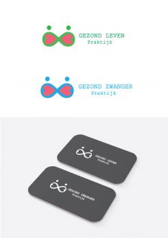
logo + huisstijl voor natuurgeneeskundig praktijk + merk
- Wedstrijd van: GezondZwangerPraktijk
- Categorie: Logo & Huisstijl
- Status: Beëindigd
- Bestanden: Bestand 1
Datum start: 01-11-2016
Datum einde: 21-11-2016
Het begon allemaal met een idee...
Een korte, interactieve gids hielp hen hun ontwerpstijl te ontdekken en legde precies vast wat ze nodig hadden.
Brandsupply is een platform waar creatieve professionals en bedrijven samenwerken aan unieke projecten en ontwerpen.
Klanten die bijvoorbeeld een nieuw logo of een huisstijl zoeken, geven een beschrijving van hun wensen. Daarna kunnen ontwerpers via Brandsupply deelnemen aan het project door één of meerdere ontwerpen in te sturen. Uiteindelijk kiest de klant het ontwerp dat zij het beste vinden.
De kosten variëren per type project, van €169 voor een bedrijfs- of projectnaam tot €539 voor een volledige website. De klant bepaalt zelf hoeveel hij of zij voor het gehele project wil betalen.
I agree with your opinion. So I threw out the background color. I think I now clearly see the logo in gray and the colored version.
http://www.freepik.com/free-vector/logo-with-red-infinity-symbol_962572.htm#term=infinity&page=1&position=3
This is not okay!
Ouch... no, this is not okay. I don't want to pay for something that I could have downloaded for free... I understand not everybody designs from scratch, but this is an exact copy, which is adjusted by myself. Maybe you can design something by yourself, but this design is out of the race.
Geen commentaar
I agree with your opinion. So I threw out the background color. I think I now clearly see the logo in gray and the colored version.
Geen commentaar
I have a new combination against your suggestions. I threw a shadow and added color you wanted. I'm trying to figure out how it looks like wallpaper. Did you like this combination?
I have a new combination against your suggestions. I threw a shadow and added color you wanted. I'm trying to figure out how it looks like wallpaper. Did you like this combination?
Can you make one with a mint colored letter (leven) and both logo's with a white background? I think the logo is less strong on a colored background, the color is distracting (is my opinion). And the wallpaper with the colored background is also too much. Maybe you can make one with very light grey logo on a white background. I hope it's not too much effort, but I'm really enthousiastic about your design!
and my last question: Can you give the logo (the figure "eight") some color: pink (zwanger) and mint (leven)? and the background and filling (hearts) white?
Geen commentaar
I have a new combination against your suggestions. I threw a shadow and added color you wanted. I'm trying to figure out how it looks like wallpaper. Did you like this combination?
Geen commentaar
Thank you very much, for your request I have changed the previous logo in black / white versions. If you like this can easily change the color and shade you want.
*If you like this, I can easily change it into a color version and shade it like you want.
Thanks voor the changes. I really love the simplicity of the logo! Maybe you can add color to the name of the brand (like: Zwanger - pastel pink and Gezond - pastel mint). Can you also make one design with my url: www.gezondzwangerpraktijk.nl and www.gezondlevenpraktijk.nl? That's more convenient for advertisements.
I was thinking: maybe you can make the logo without the dept? So without the shading/double line on the bottom. And the color of the logo pink (zwanger) and mint or green (leven. And maybe you can also make a background for writingpaper and my website. A pattern of the logo (very light grey) and in the centre the logo in color (pink and green or mint).
Geen commentaar
Thank you very much, for your request I have changed the previous logo in black / white versions. If you like this can easily change the color and shade you want.
Geen commentaar
Hi, Thanks for your design. I really like the logo in black and white. The drawing of the 8 with the hearts within is powerfull and speaks for itself. I really like it. But I'm not sure about the design in colour. The dots are too much or the colours too bright. Can you make another design without the dots, maybe the 8-figure a little bit bigger and something with the colours?
Maybe you can make the hearts white? So the logo more open, less compact (like my advice to my clients: it gives them more "air", more space to life the live they want). Can you also make examples for (writing)paper?
Maybe you can check my website (www.gezondzwangerpraktijk.nl) for the logo I use now. That logo is out of date, because it doesn't represent what I want nowadays (not serious enough, not business-like). But it has similarities with your logo. Maybe you can use/mix something of my present logo?
 Nederland
 France
 Deutschland
 Österreich
 United Kingdom
 International
