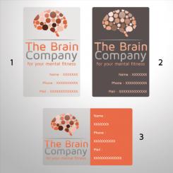
Just a test with another color.
Professioneel logo & huisstijl voor The Brain Company – for your Mental Fitness!
- Wedstrijd van: tessastassen
- Categorie: Logo & Huisstijl
- Status: Beëindigd
Datum start: 05-12-2012
Datum einde: 19-12-2012
Het begon allemaal met een idee...
Een korte, interactieve gids hielp hen hun ontwerpstijl te ontdekken en legde precies vast wat ze nodig hadden.
Brandsupply is een platform waar creatieve professionals en bedrijven samenwerken aan unieke projecten en ontwerpen.
Klanten die bijvoorbeeld een nieuw logo of een huisstijl zoeken, geven een beschrijving van hun wensen. Daarna kunnen ontwerpers via Brandsupply deelnemen aan het project door één of meerdere ontwerpen in te sturen. Uiteindelijk kiest de klant het ontwerp dat zij het beste vinden.
De kosten variëren per type project, van €169 voor een bedrijfs- of projectnaam tot €539 voor een volledige website. De klant bepaalt zelf hoeveel hij of zij voor het gehele project wil betalen.
I really like it! My partner thinks that the logo is a bit too sixties. But that is just why I like it. Funny! We have to debate about that, haha.
haha ;)
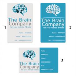
For the first card I left just a transparent background. For the second, just logo and texts are transparent. And third, just the background of the left side is transparent.
I do not think you can print on both sides without interfering readability
Good! I had doubts about doubleprinten on transparant parant, also. I like the design, realy. My partner has his doubt about colors, but this is something we can adjust at a later stage. Thanks so much, Florent.
Thank you, of course it will be easy to change colors. if you see a color you like (in particular Pantone color), don't hesitate to send me a reference. I wish you a nice weekend.
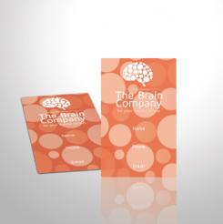
I imagined this card, made with transparent PVC
HI Florent,
I realy like transparant cards, so that is perfect.
But the card is much so 'busy' now. It needs to be calmer. Maybe the card can be simple, with the logo really big in the front of the card, just as you designed it. And then all the info on the back. What do you think?
I try to propose you something in the evening
Geen commentaar
Hi Florent, very nice change! This is a very good logo! The colours are good also. Nice! Maybe it needs to be a bit more 'business wise' but the design is realy good! We are happy with this! Pleae give us about 2 or 3 days to make a final choise. Thanks so much!
I'm happy if you like the logo. I'm thinking about a new design business, during the few days of competition remaining.
Have a nice day
Geen commentaar
HI Florent, do you have thought about a special business card? I want something that stands out. NOt too much white and with something special. This 'special thing' can be in the design, the paper, or that shape of the card itself. Looking forward to your reply!
Here is a new logo with circles representing brain neurons, which grow and take strength from the mental fitness.
Geen commentaar
I realy like the colors and it is bright. Good! But I do miss the right feeling. Now it could also be the logo of an energy supplier.. Not being funny! The logo is a bit big, also. Could you try to integrate this more in the company name? Do you have any thoughts?
In the new logo, the brain takes the form of a light bulb. This bulb has a symbol of strength and energy.
Hi Florent, very creative! The lightbulb is a good idea. The colours are a bit to bright for me, but that can be changed. :-) The light beams/ stripes are a bit to much for me. But I am going to show it to my business partner and ask his opinion! Thanks very much
In the new logo, the brain shines. Rays of light gives the impression of a brain in good shape.
Geen commentaar
As emaild to you, I dont like the striped, but the overal design is very good!
 Nederland
 France
 Deutschland
 Österreich
 United Kingdom
 International
