Hi,
What do you think about this one?
Logo & Huistijl Design voor innovatieve Startup genaamd QwikSense
- Wedstrijd van: Rino001
- Categorie: Logo & Huisstijl
- Status: Beëindigd
Datum start: 22-01-2013
Datum einde: 22-02-2013
Het begon allemaal met een idee...
Een korte, interactieve gids hielp hen hun ontwerpstijl te ontdekken en legde precies vast wat ze nodig hadden.
Brandsupply is een platform waar creatieve professionals en bedrijven samenwerken aan unieke projecten en ontwerpen.
Klanten die bijvoorbeeld een nieuw logo of een huisstijl zoeken, geven een beschrijving van hun wensen. Daarna kunnen ontwerpers via Brandsupply deelnemen aan het project door één of meerdere ontwerpen in te sturen. Uiteindelijk kiest de klant het ontwerp dat zij het beste vinden.
De kosten variëren per type project, van €169 voor een bedrijfs- of projectnaam tot €539 voor een volledige website. De klant bepaalt zelf hoeveel hij of zij voor het gehele project wil betalen.
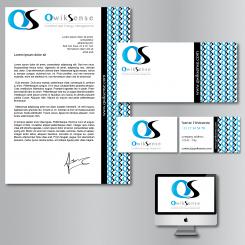
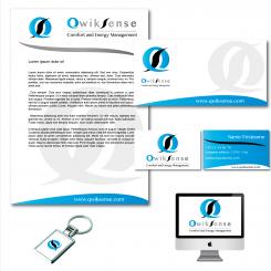
This one is to much. My focus goes to the right side of the paper. That's confusing because the focus has to be on the logo and the text of the letter.
Maybe you can explain your choice?
My choice was just aesthetic and for a no ordinary corporate identity... But if you don't like it, I will work on something different.
I like the way you think, a no ordinary corparate indentity is exactly what we are looking for. Only this design is not it.
Hope to see another design form you.
Here it is. It was longer because I had to find the right place for the S and change the shape of it.
I agree. the first one with the S inside is better. But personally I prefer the one with the S beside. I will see what I can do for a different design.
Thank you
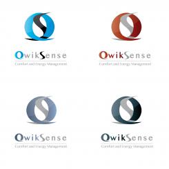
Thanks again! This design does not meet our expectations. If we place the S inside the first one is better. And the second with de S outside the Q is also nice.
Maybe you have more inspiration for a totally other design?
Thanks a lot
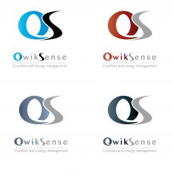
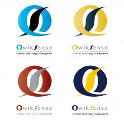
Another logo with the letter S more rounded and beside. Different colors too.
Can you put the S inside of the Q, like the first logo? Then i can see the difference. Thnx
different colors with the same logo.
Geen commentaar
Hi Stephen,
Is it possible to make this branding more trendy and with the logo were the S is beside the Q?
I am curious how it would look like.
Thanks!
Ciao,
Rino
Ok no problem. What is you favorite color combination for the logo and branding?
The light blue one.
If you make it more trendy can you make two designs? one with the S inside the Q and one with the S beside the Q.
Thanks
Hi,
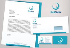
This is my proposal for your new corporate identity.
I am waiting for your feedback
Sincerely
Stephen
Hi Stephen,
Thanks for your designs. It looks really great.
Is it possible to make the designs in different colors?
further i have some feedback points:
- Can you make the "S" more rounded so that it looks more like a real "S". But don't delete this design, so we can compare the two different designs.
- The logo color is now faded from grey to black, can you make it one color? The light grey you used know
- In the second image there is a watermark behind the logo can you make a new image without the watermark? In all the other designs you can leave it the way it is.
Greets,
Rino
Hi Rino,
Thank you very much for the feedback. I am glad you like my logo.
Just on thing, I don't understand what you mean in the second point on your feedback. About grey to black ...
I will give you soon another design with different colors, and one with a different letter "S".
The NSE at the end of QwikSense have a darker grey color then the WIK part.
Oh ok, It is normal because I made a graduate effect. I will change that if you want to.No problem
yes please.
 Nederland
 France
 Deutschland
 Österreich
 United Kingdom
 International
