 Nederland
 France
 Deutschland
 Österreich
 United Kingdom
 International
How about this brother?
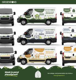
Ontwerp de nieuwe bus voor een duurzaam energiebedrijf!
Datum start: 11-06-2021
Datum einde: 28-07-2021
Totaal budget: € 519.00
Nieuwste inzending
Het begon allemaal met een idee...
Een korte, interactieve gids hielp hen hun ontwerpstijl te ontdekken en legde precies vast wat ze nodig hadden.
Brandsupply is een platform waar creatieve professionals en bedrijven samenwerken aan unieke projecten en ontwerpen.
Klanten die bijvoorbeeld een nieuw logo of een huisstijl zoeken, geven een beschrijving van hun wensen. Daarna kunnen ontwerpers via Brandsupply deelnemen aan het project door één of meerdere ontwerpen in te sturen. Uiteindelijk kiest de klant het ontwerp dat zij het beste vinden.
De kosten variëren per type project, van €169 voor een bedrijfs- of projectnaam tot €539 voor een volledige website. De klant bepaalt zelf hoeveel hij of zij voor het gehele project wil betalen.
Designer:
 Mayesha Nugraha
Yes! Better :)
Thankyou. some day we hope can design your car :)
Deze wedstrijd is gesloten. Commentaar geven is niet meer mogelijk.
Geen commentaar
Very cool design, much better than previous ones. Thank you!
Hi Groenpand Team.
I am very enthusiastic about your contest. can you give any suggestions so that this design will not only be cool, but be perfect!
Kind Regards,
Mayesha
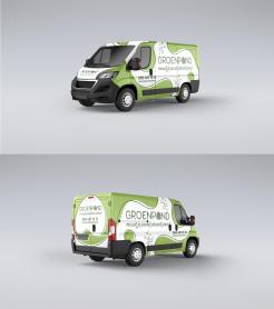
Hmm, tough question! You could try to reduce the white outline effects. Although that might mean you have to edit some of the colors or the design to ensure there's still enough contrast and the readability doesn't suffer.
I will do it!
What I have to reduce is the white line effect
on the text, or on the car body?
Preferably the text wouldn't have an outline at all. If it helps you can invert the logo to white (on the front of the van for example).
Deze wedstrijd is gesloten. Commentaar geven is niet meer mogelijk.
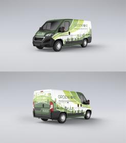
How about this?
Deze wedstrijd is gesloten. Commentaar geven is niet meer mogelijk.
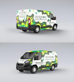
Organic Van Design. How about this?
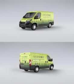
Definitely an improvement on the last one in terms of design, but it doesn't really feel like it has anything to do with making residential/office buildings more sustainable. It could just as well be a soda company (due to the bubbles).
Deze wedstrijd is gesloten. Commentaar geven is niet meer mogelijk.
Hi Groenpand Team.
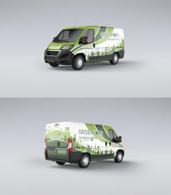
My name is Mayesha, how about this design? please give me feedback. Thanks
Regard,
Mayesha
I'm definitely getting the "organic" vibe, but perhaps you went a little overboard with the shapes. Sometimes less is more. Some of the colors are a little too saturated (almost neon-like) as well.
Deze wedstrijd is gesloten. Commentaar geven is niet meer mogelijk.