 Nederland
 France
 Deutschland
 Österreich
 United Kingdom
 International
Geen commentaar
Nieuwe homepage voor Rentair.be
- Wedstrijd van: Rentair
- Categorie: Webpagina design
- Status: Beëindigd
- Bestanden: Bestand 1, Bestand 2, Bestand 3
Datum start: 01-04-2014
Datum einde: 17-04-2014
Totaal budget: € 499.00
Nieuwste inzending
Het begon allemaal met een idee...
Een korte, interactieve gids hielp hen hun ontwerpstijl te ontdekken en legde precies vast wat ze nodig hadden.
Brandsupply is een platform waar creatieve professionals en bedrijven samenwerken aan unieke projecten en ontwerpen.
Klanten die bijvoorbeeld een nieuw logo of een huisstijl zoeken, geven een beschrijving van hun wensen. Daarna kunnen ontwerpers via Brandsupply deelnemen aan het project door één of meerdere ontwerpen in te sturen. Uiteindelijk kiest de klant het ontwerp dat zij het beste vinden.
De kosten variëren per type project, van €169 voor een bedrijfs- of projectnaam tot €539 voor een volledige website. De klant bepaalt zelf hoeveel hij of zij voor het gehele project wil betalen.
Designer:
 demetriax
prefer the first version
Deze wedstrijd is gesloten. Commentaar geven is niet meer mogelijk.
Geen commentaar
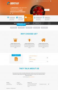
menu is less clear and "catchy" so prefer first versions
Deze wedstrijd is gesloten. Commentaar geven is niet meer mogelijk.
Geen commentaar
Deze wedstrijd is gesloten. Commentaar geven is niet meer mogelijk.
Geen commentaar
one of the best...merci
cordialement<
Frans van Woensel
Hi Demetriax, are you able to program the homepage of this design using joomla, youtheme template, jce and k2?
pls send ur answer to frans.vanwoensel@rentair.be
Deze wedstrijd is gesloten. Commentaar geven is niet meer mogelijk.
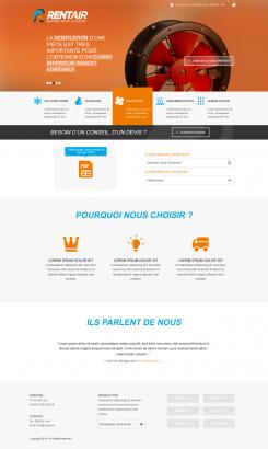
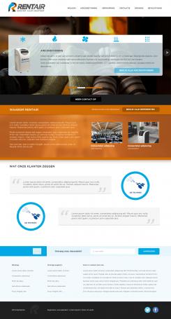
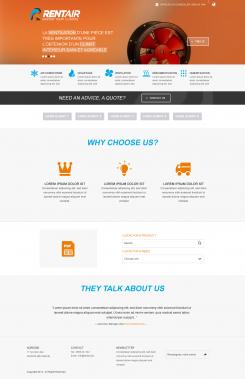
Bonjour,
voici ma proposition de page d'accueil.
Le header est un slider qui défile automatiquement en illustrant les produits. Le menu est mis en évidence en fonction du produit du slider.
J'ai volontairement omis de mettre le formulaire sur la page d'accueil parce qu'il me semble que c'est trop agressif donc le bouton call to action permet soit de basculer sur la page contact soit d'ouvrir via un effet tiroir le formulaire sous le bouton en question...
Cordialement
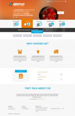
Dear Demetriax: definately a professional design. Two remarks: on the first impression I would like the potential client to see the "pourquoi nous choisir" and "client 1,2,3,4,5,6"sections without having to scroll. I want the reputation of Rentair and the reasons why a client should choose Rentair to be immediately intuitively visible. The way I see it: we only get one chance to make a first impression...on the other hand..I do understand why you chose for the navigation section first...
Finally would like the eye of the customer to be immediately and first notice the call to action..think the banner is nice but a little too dominant..Also would love to see images of the product groups embedded in the design...
Thanks,
Frans
Thx for your comment.
The products will be visible in the banner which is a automatic slider with a fading effect so u'll see 5 products from 5 items of navigation.
Ok i understand what u mean about "why choose us" and "clients" section. I'll do it.
Regards
Deze wedstrijd is gesloten. Commentaar geven is niet meer mogelijk.