 Nederland
 France
 Deutschland
 Österreich
 United Kingdom
 International
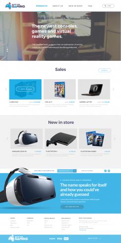
Hi Tim,
This is the updated design. I have changed the things you asked me:
"1. The logo i want futher to the left so that the menu comes more in the middle."
- I have placed the logo to the left, and centered the menu. This was what you meant?
"2. A shopping cart to the far right is what i miss in the top header."
- I have added a shopping cart to the far right. Also added a search icon.
"3. Can you align the social media button in bottom footer to the middle."
- Yes, I have done that.
"4. Missing a subscribe content. (email - newsletter - subscribe button)"
- Subscribe content is now in the footer of the webpage. Is this how you want it?
Hope to hear from you.
Kind Regards,
Jev
Webdesign for online shop
- Wedstrijd van: Tim89
- Categorie: Webpagina design
- Status: Beëindigd
- Bestanden: Bestand 1, Bestand 2, Bestand 3
Datum start: 10-04-2017
Datum einde: 07-05-2017
Totaal budget: € 399.00
Nieuwste inzending
Het begon allemaal met een idee...
Een korte, interactieve gids hielp hen hun ontwerpstijl te ontdekken en legde precies vast wat ze nodig hadden.
Brandsupply is een platform waar creatieve professionals en bedrijven samenwerken aan unieke projecten en ontwerpen.
Klanten die bijvoorbeeld een nieuw logo of een huisstijl zoeken, geven een beschrijving van hun wensen. Daarna kunnen ontwerpers via Brandsupply deelnemen aan het project door één of meerdere ontwerpen in te sturen. Uiteindelijk kiest de klant het ontwerp dat zij het beste vinden.
De kosten variëren per type project, van €169 voor een bedrijfs- of projectnaam tot €539 voor een volledige website. De klant bepaalt zelf hoeveel hij of zij voor het gehele project wil betalen.
Designer:
 gnl6331
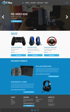
Hello Jev,
Looks good.
1. This is what i meant indeed, thanks.
4. This is how i want it yes, except the content text is not aligned. Keep the same space between all content text.
- I prefer the social media buttons somewhere else instead of the far bottom footer.
- New Products, i prefer to have it a white background instead of blue.
- Also i want the item with there text smaller, to make place for another 2 products.
- Same for 'Sales' products, also 4 products and smaller then they are now.
Looking forward!
Kind regards,
Tim
Hi Tim,
Many thanks for the compliment.
Also thanks for the feedback. I'm going to process it and make the design more perfect for you.
Kind Regards,
Jev
Deze wedstrijd is gesloten. Commentaar geven is niet meer mogelijk.
Hi Tim,
I made a very simple and basic design for your online shop. Please feel free to reply/give feedback.
Regards,
Jev
Hello Jev,
Thanks for your design!
1. The logo i want futher to the left so that the menu comes more in the middle.
2. A shopping cart to the far right is what i miss in the top header.
3. Can you align the social media button in bottom footer to the middle.
4. Missing a subscribe content. (email - newsletter - subscribe button)
Looking forward to your design!
Kind regards,
Tim
Hi Tim,
Thanks for the feedback. Im going to do the changes in the early tommorrow morning.
1. The logo - Going to put it further to the left and try to center the menu more as you want.
2. Shopping cart - Going to add that aswel.
3. Social media - Of course I can.
4. Subscribe content - Going to find a sollution for that. Will be addes.
Send the design tommorrow morning.
Kind Regards,
Jev
Ps. I also speak dutch.
Deze wedstrijd is gesloten. Commentaar geven is niet meer mogelijk.