 Nederland
 France
 Deutschland
 Österreich
 United Kingdom
 International
Exemple of navigation
Digitale Architectuurgids Almere
- Wedstrijd van: D-Byte
- Categorie: Website design
- Status: Beëindigd
- Bestanden: Bestand 1
Datum start: 11-06-2015
Datum einde: 08-07-2015
Totaal budget: € 599.00
Nieuwste inzending
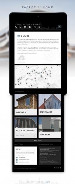
Het begon allemaal met een idee...
Een korte, interactieve gids hielp hen hun ontwerpstijl te ontdekken en legde precies vast wat ze nodig hadden.
Brandsupply is een platform waar creatieve professionals en bedrijven samenwerken aan unieke projecten en ontwerpen.
Klanten die bijvoorbeeld een nieuw logo of een huisstijl zoeken, geven een beschrijving van hun wensen. Daarna kunnen ontwerpers via Brandsupply deelnemen aan het project door één of meerdere ontwerpen in te sturen. Uiteindelijk kiest de klant het ontwerp dat zij het beste vinden.
De kosten variëren per type project, van €169 voor een bedrijfs- of projectnaam tot €539 voor een volledige website. De klant bepaalt zelf hoeveel hij of zij voor het gehele project wil betalen.
Designer:
 MB&G
MB&G
Here i see that the navigation comes from the pink icon, young people are used to navigation like that on there mobile but older people may not understand it at first.
Deze wedstrijd is gesloten. Commentaar geven is niet meer mogelijk.
Hi, here is my proposition.
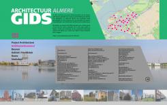
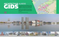
I chose to focus on the interactive map wich is very usefull to navigate on your site; it is very intuitive so i decide to make it as a part of the header.
Then a large background photography, maybe a diaporama. A standard menu by category, and a clear alphabetical presentation of the content.
Hope you'll enjoy.
I like the interactive map in the header and the big picture on the opening screen. I miss a easy navigation and the colours are a maybe to harsh.
Deze wedstrijd is gesloten. Commentaar geven is niet meer mogelijk.