 Nederland
 France
 Deutschland
 Österreich
 United Kingdom
 International
The left side (dark) will not move. The part on the right is where the content will show up. If you scroll down, this is the part that will scroll. It's the same as the layout I uploaded before this one - I did this so you can see the top in detail.
Website for Energetic Medicine Company
- Wedstrijd van: di_ezgo
- Categorie: Website design
- Status: Beëindigd
- Bestanden: Bestand 1
Datum start: 24-02-2017
Datum einde: 03-03-2017
Totaal budget: € 499.00
Nieuwste inzending
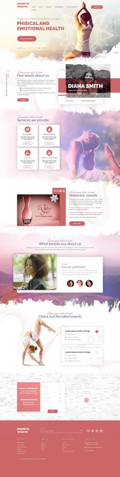
Het begon allemaal met een idee...
Een korte, interactieve gids hielp hen hun ontwerpstijl te ontdekken en legde precies vast wat ze nodig hadden.
Brandsupply is een platform waar creatieve professionals en bedrijven samenwerken aan unieke projecten en ontwerpen.
Klanten die bijvoorbeeld een nieuw logo of een huisstijl zoeken, geven een beschrijving van hun wensen. Daarna kunnen ontwerpers via Brandsupply deelnemen aan het project door één of meerdere ontwerpen in te sturen. Uiteindelijk kiest de klant het ontwerp dat zij het beste vinden.
De kosten variëren per type project, van €169 voor een bedrijfs- of projectnaam tot €539 voor een volledige website. De klant bepaalt zelf hoeveel hij of zij voor het gehele project wil betalen.
Designer:
 84wendy
Deze wedstrijd is gesloten. Commentaar geven is niet meer mogelijk.
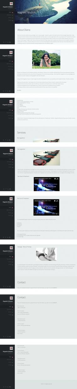
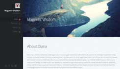
It's a bit hard to show you in 1 image like this how to website looks. The left side of the layout (the dark grey area with the links etc) doesn't move - when you scroll down the page only the content will scroll. On the image here there are white breaks between pages - this is only to show that the left side of the page will stay put, it will not move so the links are always visible. The right side will scroll down (without gaps of course). I hope that made sense. It looks really good promise! I'll also upload an image of just the top so what will show up on the screen.
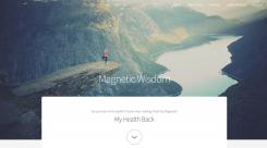
You can view the website here (so you can see how it works as the image doesn't do it justice: http://nanniesontour.com/p2/
Deze wedstrijd is gesloten. Commentaar geven is niet meer mogelijk.
Clean cut layout with beautiful imagery. Text very clear to read.
Deze wedstrijd is gesloten. Commentaar geven is niet meer mogelijk.
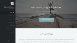
I kept the layout clean and clear as a cluttered layout isn't that pleasant on the eyes of the viewers. Everything is on 1 page so you can scroll down through everything. You can also click on a link in the menu on the left which will make you jump to that part (so you won't have to scroll through everything if you don't want to). Everything on 1 page means that it's easier for you to edit / add or delete text etc.
The links on the left can of course be changed, as well as for the text. I started with the About You bit but can change that to however you would want to start the page.
The image on the site on top can also be changed if you prefer another one.
Deze wedstrijd is gesloten. Commentaar geven is niet meer mogelijk.
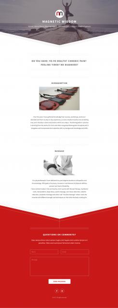
Page of the website. The top and bottom will be the same on every page. In the middle as much text can be added. I only added two of your services on this example. You will of course receive all files of all the pages with all the text added that you currently have on your old website. If you ever need help with adding things to a page, I am happy to help.
I have another idea for a layout so I'll go work on that now.
Deze wedstrijd is gesloten. Commentaar geven is niet meer mogelijk.