Hej hej,
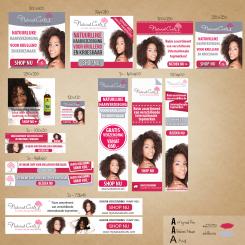
here is banner pack with Mobile Ad (320x50) and 120x120 for prospective affiliates.
Image is too large and might not be displayed correctly. Then visit this alternative link:
http://video-filmy.cz/wp-content/uploads/2013/12/banner-pack-mynaturalcurls.jpg
Regards,
Denise
Banner voor webshop in natuurlijke haarverzorging voor krullend en kroeshaar
Datum start: 29-11-2013
Datum einde: 23-12-2013
Het begon allemaal met een idee...
Een korte, interactieve gids hielp hen hun ontwerpstijl te ontdekken en legde precies vast wat ze nodig hadden.
Brandsupply is een platform waar creatieve professionals en bedrijven samenwerken aan unieke projecten en ontwerpen.
Klanten die bijvoorbeeld een nieuw logo of een huisstijl zoeken, geven een beschrijving van hun wensen. Daarna kunnen ontwerpers via Brandsupply deelnemen aan het project door één of meerdere ontwerpen in te sturen. Uiteindelijk kiest de klant het ontwerp dat zij het beste vinden.
De kosten variëren per type project, van €169 voor een bedrijfs- of projectnaam tot €539 voor een volledige website. De klant bepaalt zelf hoeveel hij of zij voor het gehele project wil betalen.
Hello again,
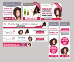
here are another banners. I would like to hear again your opinion, or what do I need to change.
Just to clarify - all the banners I created in Photoshop; their current format is jpg, but if you'll need animated banners, then the final format will be GIF.
In case of interest, I can supply you all PSD files, then you can edit anything as you want (color, font, background, color lines..actually all you can see on your desktop). I am not working in AI, but I can convert all PSD files into AI, if you'll like.
I tried to use Arial font, but it look very ordinary, so I combined more fonts.
Have a nice weekend,
Denise
P.S. I haven't any experience with uploading GIF files on brandsupply. Do you think it'll work here?
Ohh, my bad, sorry! I found that I can only upload jpg and png files. Ignore the previous P.S. :)
Hi Denise,
Thank you again for the banners! For some banners I see that you used the logo with the grey slogan. I prefer the logo with the pink slogan because the background is already grey.
For the second square banner could you make an animated text banner. You can use this text: 'Dé online shop voor krullend en kroeshaar' and 'Ruim assortiment van verschillende internationale topmerken' instead of only showing those two products.
For the third horizontal banner maybe you could put an animated text as well.
Uhm I not sure about the 4th horizontal bannerI think the tree with the grey background doesn't look nice. Maybe you could put the tree at the beginning of the banner and with a white square background.
Can you also make a Small Skyscraper (120x600)?
P.S. If I choose your design I prefer having those files in psd. Thanks!
Best Regards,
Jennifer
Hej hej,
thanks for your feedback. I will post another banners (animated as well) soon. And yes, I am working only in Photoshop, so PSD is the best choice.
I forgot on 120x600. I'm used to supply clients around 8-10 images; 5x banner of one dimension, then 5x of other dimmension. In the final package are always all the files in JPG, PNG, PSD and fonts.
I was wondering..if you'll use ads on Google Adwords, it would be good to create a 320x50 banner that is suitable for mobile devices. Not all ad formats are compatible with these devices.
Regards,
D.
Hi Denise,
Thank you! I do use google adwords. Thanks for the advice. If you could make one that would be great!
Greetz,
Jennifer
Hi missjj84,
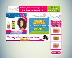
here is my very first pack of the banners. I have no idea how do you exactly imagine banners for your e-shop, and so I created it how I feel it.
I created these banners just to show you how's my graphic design style - I'd like to hear your opinion (feedback) and possibly I'll adjust the banner(s). During the next days I'll upload more banners.
Have a great evening!
Denise
P. S. Apologize my mistakes in Dutch language - I am Czech/Swedish native speaker, not Dutch.
Hi Denise, thank you for the banners! Your Dutch is just fine:-) I like the bright colors you used for the banners they really stand out like that. However, I would like to see the banners in the colors of my website. I like the square banners. The left one I would like to see in the pink color of my site. The pink color is: #d22753 and could you change the blue is this color: #b8bcca. The fonts I use for the website is: Bebas Neue and Arial. Maybe you could put this animated text in the square banner: ''Natuurlijke haarverzorging voor krullend en kroeshaar'' and 'Ruim assortiment van verschillende internationale topmerken''. The products can be animated as well. If the text is to long just let me know. For the second square banner maybe you could play with font colors so it can match the website colors. If possible you could use one of the models in it. I'm not sure about the horizontal and vertical banners. The logo is not in proportion. Maybe you could change that a little more. For the second horizontal banner I like that you used one of the models. Maybe you could change the color in this pink color: #d22753 and change the text in: ''Dé online shop voor krullen en kroeshaar''. Maybe you could use the tree from the logo in the banner. ''Lees meer' should be changed in 'shop nu'' or Bezoek nu''. If something isn't clear just let me know. I also have the logo's in .ai format. So if you need them let me know.
Best regards,
Jennifer
 Nederland
 France
 Deutschland
 Österreich
 United Kingdom
 International


