 Nederland
 France
 Deutschland
 Österreich
 United Kingdom
 International
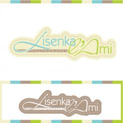
New stationery + 6 different logo versions :)
een nieuwe huisstijl voor mijn werk als fotograaf.
- Wedstrijd van: lisenkalami
- Categorie: Huisstijl
- Status: Beëindigd
Datum start: 03-07-2012
Datum einde: 03-08-2012
Totaal budget: € 100.00
WINNAAR
Het begon allemaal met een idee...
Een korte, interactieve gids hielp hen hun ontwerpstijl te ontdekken en legde precies vast wat ze nodig hadden.
Brandsupply is een platform waar creatieve professionals en bedrijven samenwerken aan unieke projecten en ontwerpen.
Klanten die bijvoorbeeld een nieuw logo of een huisstijl zoeken, geven een beschrijving van hun wensen. Daarna kunnen ontwerpers via Brandsupply deelnemen aan het project door één of meerdere ontwerpen in te sturen. Uiteindelijk kiest de klant het ontwerp dat zij het beste vinden.
De kosten variëren per type project, van €169 voor een bedrijfs- of projectnaam tot €539 voor een volledige website. De klant bepaalt zelf hoeveel hij of zij voor het gehele project wil betalen.
Designer:
 Alpi
Alpi
yes! perfect, thanks!
Deze wedstrijd is gesloten. Commentaar geven is niet meer mogelijk.
Geen commentaar
Deze wedstrijd is gesloten. Commentaar geven is niet meer mogelijk.
Geen commentaar
Like it too! :-) But not with the zigzag but as one line. So a big line and a small for example with the structure. You are making it hard for me, so many possibilities! ;-) Please email me then hopefully I can explain you exactly what I would like. thanks!
Deze wedstrijd is gesloten. Commentaar geven is niet meer mogelijk.
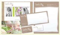
Here's another one.
I like this colour the best! Still doubting about the wood texture.
Deze wedstrijd is gesloten. Commentaar geven is niet meer mogelijk.
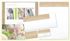
Hello Lisenka,
here is changed stationery for you. I replaced the logo and made the wood texture lighter.
this colour is pretty but a bit too pink. The other colour I like!
the design for this stationery I like the best so far. I want to postpone the competition, because I would like to buy the design from you but it needs a little bit more finetuning.., and I'm sure we can work it out together! agree?
Deze wedstrijd is gesloten. Commentaar geven is niet meer mogelijk.
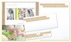
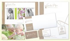
And here's the one with another logo you liked. This one's simple.
i don't like the font anymore haha. but the design is nice! can you try this design with the font I like and can you use another (a bit more light) beige colour?
Deze wedstrijd is gesloten. Commentaar geven is niet meer mogelijk.
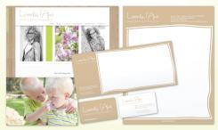
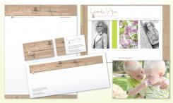
And here's another one, with a different L in the logo and a different wood texture. If you think I can do anything to improve my design, please, let me know.
Regards,
Aleksandra
Can you make another one with the font of below, without the polaroid and with this wood texture? thanks!
the business cards are really cool too like this! one colour for the front and a small wood texture at the back, I LIKE!! :-) but a little more beige, this colour is a bit to dark for me, more fresh/pastel colour. I will try to send you some colour numbers that you can use ok?
Deze wedstrijd is gesloten. Commentaar geven is niet meer mogelijk.
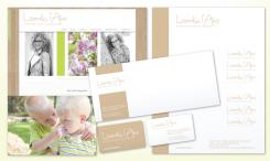
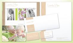
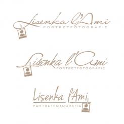
Hello Lisenka,
Here is the first theme for your stationary. I used the wood texture, like the one on your web site.
Aleksandra
I like this font a lot, its simple and not so curly and suits me! I think I like this font with this L as original but then without the polaroid. Only text.
I Like wood texture a lot but this one is a bit too messy with the spots. The other wood texture i like too.
Deze wedstrijd is gesloten. Commentaar geven is niet meer mogelijk.
Hello Lisenka,
Here we have some different fonts. Let me know if there's any you like better than the original one I used, so I can adjust other design elements.
Thank you,
Aleksandra
Thanks Aleksandra! I like number 7 the most, that's also the most readable one ;-)
Deze wedstrijd is gesloten. Commentaar geven is niet meer mogelijk.
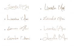
Here are some different fonts.
The last one I like too! that's a bit more business but also playfull! :-)
Deze wedstrijd is gesloten. Commentaar geven is niet meer mogelijk.
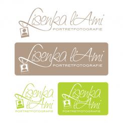
Here's the logo in both horizontal and vertical positions and in positive and negative. I also used two colors, but this is adjustable.
I like it a lot Aleksandra, I will let you know as soon as possible.
Deze wedstrijd is gesloten. Commentaar geven is niet meer mogelijk.
Geen commentaar
leuk!
Thank you! Is there anything else you would like me to try?
I want to send you a private message but I don't know how.. Can you send me a PM?
aleksandrapi@gmail.com
Deze wedstrijd is gesloten. Commentaar geven is niet meer mogelijk.
Geen commentaar
Deze wedstrijd is gesloten. Commentaar geven is niet meer mogelijk.
Geen commentaar
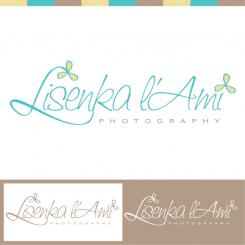
Leuk! Mooi lekkertype! zonder de bloemetjes op de L en de I vind ik het denk ik mooier, vind dat wat te druk nog
Deze wedstrijd is gesloten. Commentaar geven is niet meer mogelijk.
Geen commentaar
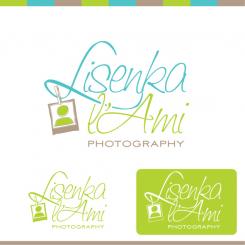
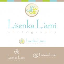
dit ontwerp spreekt me van alle inzendingen tot nu toe het meeste aan, qua sfeer en kleur. mijn initialen in de ronde vorm vind ik niet zo werken, ook omdat het 2 dezelfde letters zijn. wellicht een andere vorm daarin? (en l' Ami is het met een kleine l en hoofdletter A) en het lettertype mag van mij ook nog wel iets strakker. wel mooi met het woord photography voluit zo onder mijn naam!
Deze wedstrijd is gesloten. Commentaar geven is niet meer mogelijk.