 Nederland
 France
 Deutschland
 Österreich
 United Kingdom
 International
With LetterHead logo aligned to the right
INC-Brand Development zoekt strak eigentijds black & white logo design!
- Wedstrijd van: I.Nagtzaam
- Categorie: Huisstijl
- Status: Beëindigd
- Bestanden: Bestand 1
Datum start: 14-03-2018
Datum einde: 21-03-2018
Totaal budget: € 269.00
WINNAAR

Het begon allemaal met een idee...
Een korte, interactieve gids hielp hen hun ontwerpstijl te ontdekken en legde precies vast wat ze nodig hadden.
Brandsupply is een platform waar creatieve professionals en bedrijven samenwerken aan unieke projecten en ontwerpen.
Klanten die bijvoorbeeld een nieuw logo of een huisstijl zoeken, geven een beschrijving van hun wensen. Daarna kunnen ontwerpers via Brandsupply deelnemen aan het project door één of meerdere ontwerpen in te sturen. Uiteindelijk kiest de klant het ontwerp dat zij het beste vinden.
De kosten variëren per type project, van €169 voor een bedrijfs- of projectnaam tot €539 voor een volledige website. De klant bepaalt zelf hoeveel hij of zij voor het gehele project wil betalen.
Designer:
 Axel Sonnet
Briljant! Thankx!
Deze wedstrijd is gesloten. Commentaar geven is niet meer mogelijk.
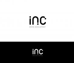
@I.Nagtzaam, here is the variation with different dots placement
let me know which version you prefer.
can be either in black & white or multicolor if you want
Thx! I think I prefer the original design, especially the -n- looks better with the dot on the right side. What type font do you use for Brand Development?
I agree, first version is more balanced.
I made myself the Font for the logo, for the rest of documents it is "comfortaa" ( very similar to the logo ) and NSJames ( linear and classy simple font )
Deze wedstrijd is gesloten. Commentaar geven is niet meer mogelijk.
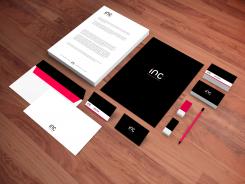
@@I.Nagtzaam , forgot to send the stationery exemple, here it is. I'll upload a logo variation as i said earlier.
again very nice! What about the logo on the right side of the letterhead?
Yes sure it's possible, do you want me to do this modification?
Deze wedstrijd is gesloten. Commentaar geven is niet meer mogelijk.
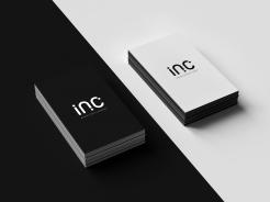
Exemple on verso card
Deze wedstrijd is gesloten. Commentaar geven is niet meer mogelijk.
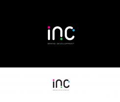
Can also be set with 3 colors theme
Deze wedstrijd is gesloten. Commentaar geven is niet meer mogelijk.
Design can be used with touches of colors ( colors can be set according your preferences )
Deze wedstrijd is gesloten. Commentaar geven is niet meer mogelijk.
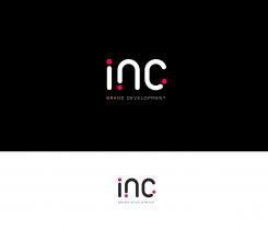
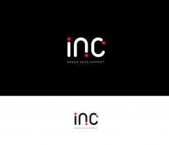
Hello @I.Nagtzaam, here is my design with very minimalist font composition ( and symbolic ink droplet )
Shapes are smooth and soft to emphasis the feminine and creative aspect.
Let me know if you like the main concept, i'll make some branding exemples
I like your design! straight forward, smooth, very creative! very nice to see how the design even gets more powerful with colours. Thank you!
@I.Nagtzaam , thanks for your feedback! Do you want me to try other variations, for exemple ,with dots placed differently ( dot of the "n" to the left and dot of the "c" at the bottom ) ?
Yes please! Could you also show how it works on stationary (briefpapier)? many thanks
Deze wedstrijd is gesloten. Commentaar geven is niet meer mogelijk.