 Nederland
 France
 Deutschland
 Österreich
 United Kingdom
 International
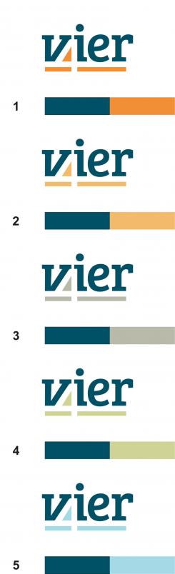
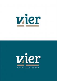
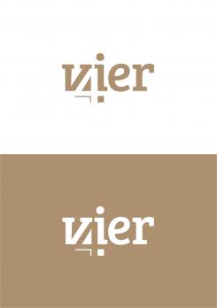
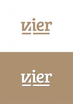
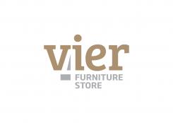
The font used in the logo is Bre Sheriff with small modifications with the letters "V" and "I".
Greeting
Ontwerp een huisstijl voor een interieurwinkel in interieurmerk
Datum start: 17-10-2016
Datum einde: 07-10-2016
Totaal budget: € 329.00
WINNAAR
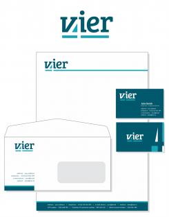
Het begon allemaal met een idee...
Een korte, interactieve gids hielp hen hun ontwerpstijl te ontdekken en legde precies vast wat ze nodig hadden.
Brandsupply is een platform waar creatieve professionals en bedrijven samenwerken aan unieke projecten en ontwerpen.
Klanten die bijvoorbeeld een nieuw logo of een huisstijl zoeken, geven een beschrijving van hun wensen. Daarna kunnen ontwerpers via Brandsupply deelnemen aan het project door één of meerdere ontwerpen in te sturen. Uiteindelijk kiest de klant het ontwerp dat zij het beste vinden.
De kosten variëren per type project, van €169 voor een bedrijfs- of projectnaam tot €539 voor een volledige website. De klant bepaalt zelf hoeveel hij of zij voor het gehele project wil betalen.
Designer:
 mikidejanovic
Sory, not Bre Sheriff - Bree Serif
Sory, not Bre Sheriff - Bree Serif
Thanks for your nice designs. We would probably have some extra small changes made in the end, but it looks great already.
Could you tell me if it's possible the get the letter paper and envelope as a pdf but also as a word document?
Further we would like to receive the the logo and all documents as an esp, psd and png.
Final details and contactdetails for the business card, envelope and letter paper will follow.
Of course. In case you choose my design as you get all the best as you requested, with the changes that you want
Deze wedstrijd is gesloten. Commentaar geven is niet meer mogelijk.
Geen commentaar
Thanks!
We like the blue version the best. But probably than #5fa4b4 (that's a bit less baby-blue ;-))
Also wanted to ask you, are you using aan existing font, or combined/designed font?
I'asking because I need to know if it's a usable webfont for our website.
Deze wedstrijd is gesloten. Commentaar geven is niet meer mogelijk.
Geen commentaar
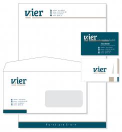
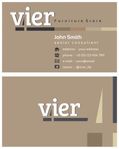
Could you move the contactdetails to the footer on 1 line.
Vier | adress | telephone | email adress | website
And maybe try on a second line
VAT number | Chamber of commerce number | bank account number
In the header no details. Keep the complete/long line for now.
On the envelope only the icons or only words. (same contact details as on business card)
The business card a explained in a former reaction.
Deze wedstrijd is gesloten. Commentaar geven is niet meer mogelijk.
Geen commentaar
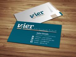
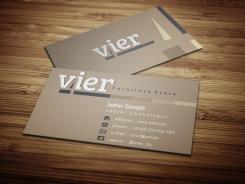
We like the 4 in the corner at the back of the card. Maybe move the logo a bit to the left?
And make the back of the card 'blue' and the front with the contactdetails white.
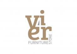
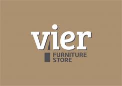
We do not want the 'furniture store' on the card. Just use the regular logo, without the extra line in different color tones.
Also, if you use the contact-icon, we don't need the icon explained in words after it. So only icons, or only words.
Keep it very clean and simple ;-)
Items on business card can be:
Name
titel
Address
Telephone
Email adress
Website
Deze wedstrijd is gesloten. Commentaar geven is niet meer mogelijk.
Geen commentaar
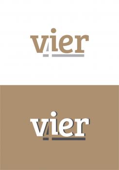
Hi, we like this one with the 'blue' color. But are not crazy about the brown/beige. Could you make some versions with a differtent second color, so we can see the difference? So the 'blue' stays, but some different colors for the brown/beige.
Also, we don't like the shade anyway. sorry. We wanted to see if it could mak a nice detail. But we like it more without a shade.
Deze wedstrijd is gesloten. Commentaar geven is niet meer mogelijk.
Geen commentaar
Deze wedstrijd is gesloten. Commentaar geven is niet meer mogelijk.
Geen commentaar
Deze wedstrijd is gesloten. Commentaar geven is niet meer mogelijk.
Geen commentaar
Deze wedstrijd is gesloten. Commentaar geven is niet meer mogelijk.
Geen commentaar
Deze wedstrijd is gesloten. Commentaar geven is niet meer mogelijk.
Geen commentaar
Is it possible to also put in a shadow in the white background version?
Maybe a version in color #315a6c (or simular)
Deze wedstrijd is gesloten. Commentaar geven is niet meer mogelijk.
Geen commentaar
Deze wedstrijd is gesloten. Commentaar geven is niet meer mogelijk.
Geen commentaar
Deze wedstrijd is gesloten. Commentaar geven is niet meer mogelijk.
Geen commentaar
This one whith the small font is also nice. Looks a bit more friendly.
Deze wedstrijd is gesloten. Commentaar geven is niet meer mogelijk.
Geen commentaar
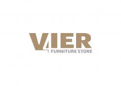
Hello! Thanks for your designs. I like this one the best. But we do not want a subtitel in the logo. Also the letters are bolder than the 4. Can't promiss this is the wat to go, but there might be something there. Jaimy
Deze wedstrijd is gesloten. Commentaar geven is niet meer mogelijk.