Geen commentaar
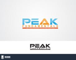
Help ons door een logo te ontwerpen dat professionele atleten de juiste indruk geeft over ons!
Datum start: 16-11-2016
Datum einde: 08-12-2016
Het begon allemaal met een idee...
Een korte, interactieve gids hielp hen hun ontwerpstijl te ontdekken en legde precies vast wat ze nodig hadden.
Brandsupply is een platform waar creatieve professionals en bedrijven samenwerken aan unieke projecten en ontwerpen.
Klanten die bijvoorbeeld een nieuw logo of een huisstijl zoeken, geven een beschrijving van hun wensen. Daarna kunnen ontwerpers via Brandsupply deelnemen aan het project door één of meerdere ontwerpen in te sturen. Uiteindelijk kiest de klant het ontwerp dat zij het beste vinden.
De kosten variëren per type project, van €169 voor een bedrijfs- of projectnaam tot €539 voor een volledige website. De klant bepaalt zelf hoeveel hij of zij voor het gehele project wil betalen.
Like these?
different 'E's
Yes good i will discuss with my partner and come back to you
Hi good evening, i think we will probably go with the very last design the letters are great now. Spot on. Paul sends his regards :) ok so there is one final thing we would like to see and if it doesn't work we ll go for this top one.
Can you make a thin blue line on the inside of the triangle, taking some space off the orange and not from the white if you understand what i mean. We just want to see if they're is any improvement there.
Thanks
Regards
Bryan
Never mind the last adjustment. We want to go for the clean A, the top one from these two designs, with the squarish E, rounded off at the back. So if we choose your design, what will you deliver to us? What kind of format, files?, for use on website, business card(do you have a template for this?? To send to the printer, with this logo? ) , ecard email etc?
Thanks!!
I deliver these files :
- ai file
- eps file [ for printing ]
- jpeg
- png
I also do stationery designs / business card designs but this project is for a logo design budget alone. Anyway, you will have the print files (eps) so you can print them in. other files are for websites.
All files will be delivered as colored - monochromed - transparent
Any updates? :D
Is this it?
Well almost, what i meant was only the inside of the triangle, so the blue line stops at the bottom
Geen commentaar
Is this it?
Not exactly, i meant the blue line on the inside of the orange, so exactly on the border between orange and white. You have made it in the middle of the orange. I hope im making sense.
Thanks!
Not exactly, i meant the blue line on the inside of the orange, so exactly on the border between orange and white. You have made it in the middle of the orange. I hope im making sense.
Thanks!
Not exactly, i meant the blue line on the inside of the orange, so exactly on the border between orange and white. You have made it in the middle of the orange. I hope im making sense.
Thanks!
Not exactly, i meant the blue line on the inside of the orange, so exactly on the border between orange and white. You have made it in the middle of the orange. I hope im making sense.
Thanks!
Im confused at the moment. sorry, could you send me an email regarding the image you want to see? :)
Geen commentaar
Like these?
Let me know if I get the 2 triangle oranges right and a blue inside
Its probably too busy for the eye, but its what i meant for you to do yes. The original is still best
Geen commentaar
Nice man thanks for your new designs, i like the top one, can you try it with just two clean orange triangles and the blue one in the middle, so without the connections, thanks! Ill discuss with my partner in a few minutes
Ok in addition. I have talked to my partner. We want to try sometging else as well.
- can you close the P
- can you use a lettertype which is less square, have a look at Yozana last design, its more rounded,it can be more square and straighter than that one, but just a little more rounded. still fluent. and can be just slightly slimmer, not too fat letters. can you try a couple, just to see mainly the E a more rounded version. Just use the basic open A for this one.
thanks A LOT!
Should I delete the others?
1 - 2 or 3?
Any thoughts on these? :)
I like the second one best.its good. But for the alternative,try to forget this A maybe. Its ok but im really looking for something new. Have a look at what 1K did. That is interesting because it has an upward arrow which can be used in the pitch to describe what our training will do. Im not saying to exactly copy his one but see what you can come up with. Maybe use elements.
For example a blue triangle in the middle with an orrange arrow making a bigger one around it. But im not a designer, dont know if that works.
We would like an A to be proud of, which is beautiful on its own just to look at. because it will be the symbol of our business.
And dont worry we are not talking to other designers any more. So really give it your best please :)
Geen commentaar
Is this it?
Any updates? :D
Hi Artamand. Look you are our favourite. We will go with your design but, We only have one more thing. The A. Let me explain, we give training to athletes so they can have a higher peak. Normal training would give a small peak (small effect) (small blue triangle, for example) and our training will give a better fundament and a higher peak. (big orange triangle)
We want to use this A example in our pitch, so it would be great if these two elements are in the A, to explain.
So we would like you to try and make a new alternative A, one that if you look st it its a nice logo on its own.
It would be nice if you can combine the two colours to give the impression i described above.
We have two more days, try to make it work, we have faith in you :)
Ps this all aplies on your last design, slanted peak, without red line
Alright thank you, will do. will send it today for any more changes in the upcoming days. THANKS!
alternative A
Updates?
Any changes you need?
Great thanks! Can you make one modification on the one before the last one. Can you make it with a normal E like you did in the beginnen, when its slanted it doesn't look like a block. And can you take the point off the P to see how that looks? The rest is good.
Please check recent design. Any changes?
Geen commentaar
Adjusted the 'E' anymore changes?
Thanks. I will discuss with my partner, I think yours is the best so far
Alrighty, will wait for further instructions to be able to send more revisions
Any updates before the project ends?
No slant.
Great thanks, i will discuss with my partner. Can you bring the subtekst out even more? Thicker line and thicker letters so they really stand out?
On this design? Cause we are only allowed to send 15 designs. I might fill them if I do all the revisions and not have enough more to make you satisfy. Should I revise this one with different letters?
Yes on this one, they're is no other way to send me designs right everything goes through the website
Also could you do something with the E, to make it look less a block, just a tiny change, to see if it works, like a corner off the bottom
Geen commentaar
All letters slanted to define movement
Ok can you do a modification on this one, How many do you have left? We would like to see , Onlyh PEAK slanted, than fundamentals and the subtext normal. can you make fundamentals a little bigger, as well as the blue stripe with the subtext a little bigger, and the letters of the subtext thicker so the text stands out better in white. Also the colour. Can you make the orange, a bit darker, slightly more red and fluerescent? and the blue just very slightly darker blue? thanks so much! I think were getting close now.
and the A pointy and not rounded please
Could you please unrate to 0 the otherdesigns.that.you dont like so I can delete them pls, thank you. If not, i think I can send in 4 more
ok sure i will delete some
Btw, i can only delete the ones with 0 ratings and no comments by you. Thanks, will send the revisions later on. Have a nice day!
Thanks! you have a nice day too!
Geen commentaar
Any updates?
Do you need any changes?
Hi! Thanks for your designs, we like this one, can you do some modifications?
For the colours can you look at aditasingh, she is close on that.
Can you let the E be without the space,
Maybe you have another suggestion, to give the tekst some movement, just subtle, don’t go overboard. Maybe just by edging of the letters somehow like you did with the front upperside of the E, just to see if there is some improvement possible here.
Could you remove the wave in the background
Could you make the stripe below , thicker, and blue, maybe a darker blauw than the tekst above, so the white letters in the subtext will “jump” out. The letters of the subtekst can be a few notches bigger.
Thanks looking forward to the update!
Cheers,
Bryan
 Nederland
 France
 Deutschland
 Österreich
 United Kingdom
 International
