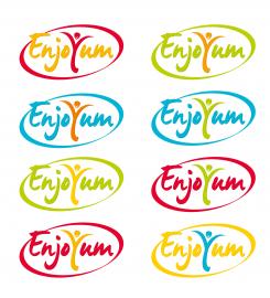
Another batch with the oval ring.
Logo Enjoyum. A fun, innovate and tasty food company.
Datum start: 04-05-2014
Datum einde: 22-05-2014
Het begon allemaal met een idee...
Een korte, interactieve gids hielp hen hun ontwerpstijl te ontdekken en legde precies vast wat ze nodig hadden.
Brandsupply is een platform waar creatieve professionals en bedrijven samenwerken aan unieke projecten en ontwerpen.
Klanten die bijvoorbeeld een nieuw logo of een huisstijl zoeken, geven een beschrijving van hun wensen. Daarna kunnen ontwerpers via Brandsupply deelnemen aan het project door één of meerdere ontwerpen in te sturen. Uiteindelijk kiest de klant het ontwerp dat zij het beste vinden.
De kosten variëren per type project, van €169 voor een bedrijfs- of projectnaam tot €539 voor een volledige website. De klant bepaalt zelf hoeveel hij of zij voor het gehele project wil betalen.
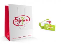
And here are samples of the logo on a bag and on a business card.
Please let me know what you think!
Many thanks.
Hi,
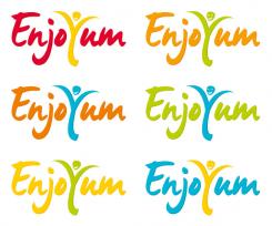
Here's the batch with the modifications and the colour combinations you asked for.
Thanks again for your comments and for your advice. This is really helpful! Here's the evolution you requested.
Thanks again Java!
Can you make more (quick)samples and play a bit more in;
- colours
we would like to see (both ways --> text and Y):
blue with yellow
red with yellow
yellow with green
orange and blue
orange and green
and more...?
Fun is what we want to convey!
- the head and smile
Can you make the head more round?
Can you make the smile more obvious?
Maybe eyes?
- the arms
little less overhanging. Its really important that people are seeing the "Y" immediately.
We would like to see above in (quick) samples. We are going to choose the final, perfect, design based on that.
We hope that this will be the last round of feedback ;) haha
Thanks heaps!
Can you also add a oval ring around the text please?
In full red
Hi, thanks for the detailed feedback!
I'll focus on the project over the weekend (I don't want to rush on this because I'd like it to be perfect) Then I'll send you a new proposal based on the above requirements.
Thanks again!
All good Java!
And here's another proposal according to what you've liked in the contest...I'm getting inspired by others, I can't help it!
Your comments would be much appreciated. Cheers !
copy!!!
http://www.brandsupply.fr/design_logo/logo-enjoyum.-a-fun-innovate-and-tasty-food-company/35307/designs/26117
Hi liloo, I know. That's actually what I said my post if you read it... I wouldn't say that's a pure copy since the font and the motion of the design are very different, but that's indeed very inspired from the design you mentionned. And FYI, I did provide another original design (please see below).
Hi java86, it looks great! Could you point 'the hands' of the Y outward. As if the person is putting its hands out. Second, Could you make a smile in the face? And Third, could you show us some different colour combinations? The text one colour, and the Y another colour.
Almost there!
Hi,
Here's a new proposal with a grain of folly!
Thank you for your comments!
Here's the updated design.
Great design. We are getting closer to a final one!
Some small adjustments:
- First, could you make only 1 dot on the 'J' rather than two?
- Second, could you add some small creative element? The text and style is perfect now, but we miss some little spark!
Bring it up!
Hi,
I understand that you might have found the previous design a bit too childish so here are a new proposal. Cheers.
Looks great! Especially the red one. We like the letter style a lot! Could you take away the tongue in the y?
Hi,
Here are new plain color proposals with an integrated illustration. I tried to play around with the legs of the "j" and the "y" but it does really confuse the readability of the company's name...
And I can take off the chef hat if that's too much.
Your comments would be really appreciated! :)
Geen commentaar
Hi Java,
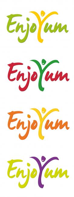
Thanks again. Can you show it in different plain colors as well?
And we would like to see what is going to happen if you do something with the legs of the "j" and the "y". think of under- and upperlines
Hi Java,
Thanks again. Can you show it in different plain colors as well?
And we would like to see what is going to happen if you do something with the legs of the "j" and the "y". think of under- and upperlines.
Please feel free to make any comments!
Hi Java86,
Thanks for your designs! We have some suggestions as options:
- Can you edit the capitals "E" into your design?
- Can you make a different colorcombination in the same style?
Thanks,
Barnhoorn
Hi Barnhoorn,
Yes, sure. Thanks for your feedback!
I'll update the designs tonight and will give it a try with different color gradations.
FYI, this is a unique typo (it cannot be found anywhere on the web!)
Cheers
 Nederland
 France
 Deutschland
 Österreich
 United Kingdom
 International
