Hi,
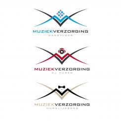
This is my work for your new corporate identity.
I am waiting for your feedback.
Sincerely
Wilko
Logo ontwerp muziek- en entertainmentbedrijf
- Wedstrijd van: hugoderooij
- Categorie: Logo
- Status: Beëindigd
Datum start: 18-02-2014
Datum einde: 18-03-2014
Het begon allemaal met een idee...
Een korte, interactieve gids hielp hen hun ontwerpstijl te ontdekken en legde precies vast wat ze nodig hadden.
Brandsupply is een platform waar creatieve professionals en bedrijven samenwerken aan unieke projecten en ontwerpen.
Klanten die bijvoorbeeld een nieuw logo of een huisstijl zoeken, geven een beschrijving van hun wensen. Daarna kunnen ontwerpers via Brandsupply deelnemen aan het project door één of meerdere ontwerpen in te sturen. Uiteindelijk kiest de klant het ontwerp dat zij het beste vinden.
De kosten variëren per type project, van €169 voor een bedrijfs- of projectnaam tot €539 voor een volledige website. De klant bepaalt zelf hoeveel hij of zij voor het gehele project wil betalen.
Dear Wilko,
Thanks for your effort on a new logo.
I like it but I have to discuss it with others.
We do have another thing we would run into with this design:
We have 6 different market targets with our company under 6 different names (we are a smalle company but we have some very good domains for marketing purposes). With an icon that is related to the target (like a headphone or a cd or a music note) we would be able to re-use a logo just by replacing the icon with another icon for a different target. However with your M-V creation this would be a little hard. The reson why we would want to have similar logo's for all websites is because we would want people to recognize the style (maybe different color of the website and different icon in the logo for each target)
For your information, we also have a website 'Enlighted Events', 'Dansvloer.com' (LED dancefloors), 'Djhuren.com' (rental of dj's) and 'huwelijksdag' (which means weddingday).
But I do like the creation you have made very much (hope the others like it too).
If you have other suggestions or suggestions for a similar logo that could be used for all our 'brand names' I would be very happy with your input.
My wife likes it very much which is very good :-)
:-)
And this one?
Unfortunately this is my last design because we can't give you more than 15 proposal on brandsupply . But if you need more you can send me a private message and I will give you a personal link.
Sincerely.
Wilko
Hi Wilco,
I think we are almost there. This hand is a bit to much like a 'shooting gun' if You understand what I mean. Can you please give it one more try? My email is hugo@muziekverzorging.nl
Thanks!
Like this?
Better but not yet what I mean. Maybe more like this:
http://www.jungleminds.nl/upload/public/image/2007/Magic.jpg
A pointing finger as the magic of Disney. You know what I mean?
Hand icon with stars
Much better, only the way the hand is shown gives a bit a high five feeling instead of a touch feeling.
Maybe two hands (almost) touching looks better like this:
http://thumbs.dreamstime.com/z/het-helpen-van-handen-die-op-wit-bereiken-15819783.jpg
Or an open hand like this:
http://www.latexsens.com/Hope_s_Helping_Hand.jpg
or this: http://upload.wikimedia.org/wikipedia/commons/e/ee/Left_Hand_-_Kolkata_2011-04-20_2351.JPG
or 2 open hands like this:
http://images.ientrymail.com/stumbleondesigns/www/Designingtips/glowhands/hands-large.jpg
and the entertainment logo
First is best.
The icon mabye a little smaller.
Hi Hugo,
I give you 2 different design for the enlighted event logo. One with the color you choose and one with a rainbow color with more impact !
What do you think?
A dark background is better with the light effect.
Hi Wilco,
This muddied the picture a alittle. I think it is a sleek design if you keep the MV as is and use a icon like in the others. Sorry, that is my personal flavour. And the hand just gave it more magic.
Geen commentaar
Hi Wilco,
I got some Ideas. Can you make something like this for Enlighted Events (A touch of magic):
https://www.google.nl/search?espv=210&es_sm=122&biw=1680&bih=959&tbm=isch&sa=1&q=magic+light&oq=magic+light&gs_l=img.3..0l2j0i24l8.11296.11471.0.11725.2.2.0.0.0.0.84.158.2.2.0.stareocdw...0...1.1.35.img..0.2.157.pCGCfN-04vU#facrc=_&imgdii=_&imgrc=FCbrChSmSISiDM%3A;r28dUfvxgK7IYM;http%3A%2F%2Ffc08.deviantart.net%2Ffs46%2Fi%2F2009%2F170%2F5%2Fc%2Flight_magic_by_Paciocco.jpg;http%3A%2F%2Fpaciocco.deviantart.com%2Fart%2Flight-magic-126489862;900;563
And for entertainmentgids something like this (please go with your mouse over 'Entertainment' on this website to see the icon I mean:
http://www.thecookinggroup.com/
Do you have any suggestions yourself? For 'Muziekverzorging' I think we will only use the MV and no small icon in it. The MV itself is good for our main brand.
I look forward to your reply and wish you a good weekend!
And here is 6 logos for the 6 activities. But I didn't really get the difference between "Dansvloer" and "enlighted events"
Can you explain me?
Thank you
We find it very difficult to suggest a good icon. I don't like a music note, it is to obvious. A camera is also not suitable (sorry). If we have any bright ideas ourselves I will let you know.
We are working on it too to get good suggestions.
We have made some examples ourselves with the colors I send you so these colors I send should be the right colors.
Best wishes,
Hugo
Maybe now that we have the slogan's we can think of something that is better related.
I am happy to explain, I understand it is strange.
We use the name 'Enlighted events' for international rental of our dancefloor. In our own country we have a very good url (dansvloer.com = dancefloor) so in our own country we use the name 'dansvloer' as brand.
Please note you have both enlighted events with the text 'a touch of magic' while the one for the dancefloor should be 'life is a dancefloor'.
We will get a closer look for the icon's because I still have some doubt on the microphone, the play sign and the bend stripes in enlighted events. This last one should be something 'magical'.
It is quite difficult so we will get some ideas to.
I do believe we are very close to what we are looking for.
Hi Hugo,
Here is 4 different icon with smaller lines for M and V.
Dear Wilco,
Thanks for your reply! We like the old longer most so please keep it as it was. This seems most beautifull after all.
Ok I Think I understood what you meant.
What do you think about this type of icon?
We can play with colors for each services in order to have the same logo base.
I will show it to everyone here. My wife and I are very excited. I think you understand exactly what I mean :-) Give me a day or so to get some feedback from our team. Thanks!
Thank you, this is a very interesting project and I look forward to know the opinion of your team :)
I am still at your beck and call
Sincerely
Wilko
Hi Wilko,
The people I got feedback from are very enthousiastic.
By the way, everybody 'loves' the silver version you have made!
In our case the text under the 'icon' would be different for the different divisions.
So:
Muziekverzorging
Great Music Xperience
[A suitable icon for music in general]
[Main color: RED since this has always been the company color]
Dansvloer
Life is a Dancefloor
[The icon of the dancefloor]
[Main color: Yellow or another bright color]
Enlighted Events
Life is a Dancefloor
[The icon of the dancefloor]
[Main color blue we think might be nice]
Djhuren
You're the Music
[The icon with the headphone]
[Main color we are still considering, suggestions are welcome]
Huwelijksdag
Alles voor je bruiloft
[The icon with the bow]
[Main color we are still considering, suggestions are welcome]
Entertainmentgids
[We are still thinking about a good slogan for this one]
[A suitable icon for artists, live music and entertainment]
[Main color we are still considering, suggestions are welcome]
Enlighted Events
[We are still thinking about a good slogan for this one]
[A suitable icon for high quality dj's]
[Main color blue we think might be nice]
I look very much forward to any suggestions/input you have on our ideas!
Best wishes,
Hugo
Even our most critical person here is enthousiast. He mentioned it would be wise to use websafe colors.
He only suggested to make the lines of the M and the V a little shorter so the icon will be more compact.
This might be a good idea, I'm not sure.
Dear Wilco,
We came to the following details. I hope you can give me your feedback and let me know if you can create this with the design you allready have made.
Title: Muziekverzorging
Slogan: You are the music
Main color: 990000
[A suitable icon for music in general?]
Title: Dansvloer
Slogan: Life is a Dancefloor
Main color: 0066cc
[The icon of the dancefloor you have allready made]
Title: Enlighted Events (dutch market)
Slogan: A Touch of Magic
Main color: 660066
[A suitable icon for top quality dj's]
Title: Djhuren
Slogan: Great Music Xperience
Main color: ff99ff
[The icon with the headphone you have allready made]
Title: Huwelijksdag
Slogan: Puur genieten
Main color: cc9900
[The icon with the bow you have allready made]
Title: Entertainmentgids
Slogan: Feestelijk compleet
Main color: cccccc
[A suitable icon for artists, live music and entertainment]
Title: Enlighted Events (international market)
Slogan: Life is a Dancefloor
Main color: 660066
[The icon of the dancefloor you have allready made]
I look foward to your reply.
Best wishes,
Hugo de Rooij
Ok I will work on it ! I already have made something but the colors are not the good one ! so I will give you something new this afternoon.
Geen commentaar
Nice and recognizable
 Nederland
 France
 Deutschland
 Österreich
 United Kingdom
 International
