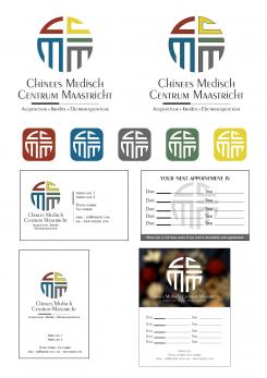
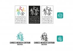
Hi, here's a two versions of the logo with the colors you have selected. I also worked on different cards. My preference is that with a blurred background.
Het begon allemaal met een idee...
Een korte, interactieve gids hielp hen hun ontwerpstijl te ontdekken en legde precies vast wat ze nodig hadden.
Brandsupply is een platform waar creatieve professionals en bedrijven samenwerken aan unieke projecten en ontwerpen.
Klanten die bijvoorbeeld een nieuw logo of een huisstijl zoeken, geven een beschrijving van hun wensen. Daarna kunnen ontwerpers via Brandsupply deelnemen aan het project door één of meerdere ontwerpen in te sturen. Uiteindelijk kiest de klant het ontwerp dat zij het beste vinden.
De kosten variëren per type project, van €169 voor een bedrijfs- of projectnaam tot €539 voor een volledige website. De klant bepaalt zelf hoeveel hij of zij voor het gehele project wil betalen.
Great Cedric! thank you so much. Like the blurred one a lot too. I assume besides the jpg and pdf I will also get the .ai files for all these correct? Just in case I want to change the position of the logo or something like it. I also need to make logo + name big to create a window sticker. Just let me know and then I will close the design challenge and pick you as the winner. Do you design websites? with or without the html? What would the cost be of that?
We can also talk about the latter question via mail or so
Sure, i'll send .ai files and high resolution jpg and PDF (black, white and color versions) for the logo, app icons and an additional .ai file with logo+name for your window sticker. Also two .ai files for the business card (front and back) and a print ready pdf. Besides, if you need any slight changes afterwards, no problem.
thank you
I am trying to end the challenge...don't see an option for that, just sent the brand supply a message to see if the enddate can be today so I can pick you as winner
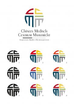
Hi, the logo geometrical and hand drawn with a thinner right C
Ok so I want to go with the geometrical logo but with a small black line outlining each letter (see the new file I uploaded under "relevant files"). The colors I want to use are as follows: 983620 for the red, E5D222 for the yellow, 0B638A for the blue, 567A57 for the green, 666766 for the grey. Also how would business cards look, any ideas? Back side of the card would have date and time lines for appointments
also in your very first design you showed the design white with different background and a picture, can you show that with the new one too? Thank you
Hand drawn is a good idea. I like the 7th. I also tried different shades of the colors and I think a orange/red like the 3rd one is good but it's quite a matter of taste.
I like the set up on main example. Also hand drawn number 1. When you look at the right C the vertical line and curved line could be a bit thinner. Like the colors on main image but want to play a bit more with those, have to think about it but will let you know about the colors
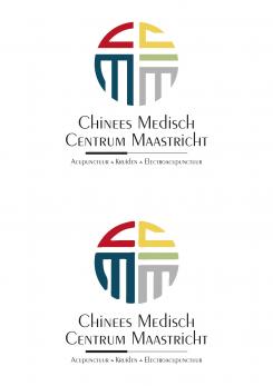
Hi. Here are several color variations on the two versions of the logo. Regards,
Hi Cedric, this is most certainly the design that I would pick to win. I like the design on the right side, so want to stick with that. The colors in the top right design I like the most. Now I do not know what combination works best together there but I would like to replace the orange with a red color and the bottom right blue with a grey (like the one below but no gradient). In this link is the example of what I mean by a more "hand drawn" form of the logo. http://csymbol.com/chinese/fu_blessing.html
I like the font you chose for top right, also would like to see the Peignot font with one. And below the needle write Acupunctuur Kruiden Electroacupunctuur without the & but maybe a dot or something in-between the words.
Here it is
thank you
Now that I see it I do not like the red and blue together at all...I will look at the other ones with green, much better, although a different green
so I like one of these logo versions but not the coloring, the concept is great and symbolism also, it is definitely my favorite so far but need to work on the color combo (half and half I like, or the 5 different but then with different shades of those colors) and the font I want to look at..."Peignot" is a bit more interesting I think and font color just black
Do you have a knowledge of chinese writing? I would have never thought about the similarity between Fu and the letters of my clinic. Thank you for that inspiration!
Geen commentaar
on the top one could you also make the right "C" in red? thank you for your help!
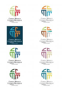
Three versions of the logo project , closer to the " fu" symbol. The colors of the second release are those of the five elements.
The 5 element colors make it too busy. I like the one half one color and the other half the other color like in the original design. Can you make the blue more dark (not too dark), more like the ocean? Or more blue/grayish tint?
Now that I look at it longer...I think I like the original design (so not the stripe for the 5th element of Fu) but with the left "M" open like you did in the new design...I would love to see those two side by side...
A new project based on the first letters of your medical center ( cmcm ) and the Chinese symbol " Fu"
that is very interesting!
I definitely want red in it, maybe a brighter one. And can you play with blue instead of green? (blue from the element Water)
Also since Fu has 5 elements, can my letters be made with 5 characters? see this link http://csymbol.com/chinese/fu_blessing.html
Oh and the left M like the one in Fu in the link
Hi, here's a logo proposal for your medical center. it evokes the five elements present in the heart of traditional Chinese medicine . Regards,
the top 3 are interesting, just seems a bit busy to me though...can 5 elements be expressed in a different way? but something abstract/modern
 Nederland
 France
 Deutschland
 Österreich
 United Kingdom
 International
