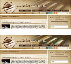
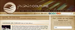
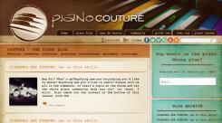
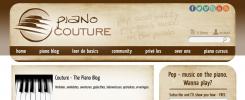
Two variants in light brown color.
Piano Couture Logo + header + geschikt font en kleuropmaak / background voor homepage.
Datum start: 03-01-2013
Datum einde: 17-01-2013
Het begon allemaal met een idee...
Een korte, interactieve gids hielp hen hun ontwerpstijl te ontdekken en legde precies vast wat ze nodig hadden.
Brandsupply is een platform waar creatieve professionals en bedrijven samenwerken aan unieke projecten en ontwerpen.
Klanten die bijvoorbeeld een nieuw logo of een huisstijl zoeken, geven een beschrijving van hun wensen. Daarna kunnen ontwerpers via Brandsupply deelnemen aan het project door één of meerdere ontwerpen in te sturen. Uiteindelijk kiest de klant het ontwerp dat zij het beste vinden.
De kosten variëren per type project, van €169 voor een bedrijfs- of projectnaam tot €539 voor een volledige website. De klant bepaalt zelf hoeveel hij of zij voor het gehele project wil betalen.
Geen commentaar
maybe more like this, but the different colours in the rest of the page do work good I think.
(though as said in the other comment I'd very much like to see a version with no extra colours above the menu at all if possible).
Geen commentaar
I think some color other than brown gives a fresh look.
(my suggestion)
Love it. Thanks could I see it without the colours in the header? (so all brown tints above the menu)? Change the overall brown to all lighter shades to make keep it fresher maybe?
Geen commentaar
Really cool, love this one.
Although, to be fair, I told you to look at SteSa, I meant to let yourself be INSPIRED, but now I feel you almost copied.. Could you maybe throw in a little more originality of your own creativity?
Tips at this point:
- Keep the font of the menu, the same as in the logo (I'd say as 'couture').
- I love 'shadows' and 'fold' effects behind area's (also for post previews).
- Lose the jazzy, poppy.. ..etc text.
- Keep in mind too keep / making it fresh and inviting.
- I'm not sure what to make of the brown 'surface' behind the header. I think this might make it too dark / uninviting.
- Be creative, I'd love it if you could make me a couple of different variants maybe? (maybe one with newsletter sub above the menu for instance? go wild! :)).
You're my current no 1.
Thanks for great work so far, I feel we're getting really close.
I just wanted to add an apology for the 'copy' comment, that might have come off harsh in a way I totally didn't mean to. Now that I take a second look at it I don't know why I even used that word in the first place.
Guess I am just 'fishing' for even more originality and maybe some kind of surprise that would totally blow me away.
However, now I think it's not fair to use the word copy, since this in itself is truly great already, so: sorry.
Just looking to make it mind-blowing :).
However, you and SteSa are going for first place at this moment.
I'm starting to feel truly happy with both of your designs!
Thanks!
One more logo with brush effect.
This might get to grunge... (see my other comment).
Since you might be going for number one with the logo (really love the first one of last batch), could you maybe give it a try with the header / site layout as well? See SteSa in this contest for an example.
Thanks so much, great work.
Geen commentaar
Logo with more combinations of fonts (the first is my favorite).
Like the first one best as well. Liking that one very much in fact, but.. and this seems to be a tricky case... I feel it might not be 'fresh' and 'inviting' enough. I know I said to want an oldschool feel (vintage, soul, jazz) which is really going in the right direction (-again- I really like the first one) but in a way it's important that it also has to stay fresh and inviting.
Think you could give it one more shot bearing that in mind.?
Minor detail: maybe move the text a tiny bit down from the image?
Geen commentaar
Very, very nice. I especially like the 'drawn keys', not sure about the font yet. If you would be so kind to take some inspiration from designer SteSa, the brown designs from him / her I like very much.
So maybe a circle around the image again (liked that about your first designs) you made and text right from that, also if you could give me a few more font options that'd be great. Other than that, great shot!
This is the second version of the logo with vintage and retro details.
Ok, thanks!
Not quite it though... the 'retro'-feel here is to 'austin powers'-meets-80's (sorry if this might sound a bit vague, but I'm trying to explain it's not quite it. Actually feels quite 'futuristic' (but then seen from the 80's or so)).
Also I see it a bit as if blood is dripping of the logo... :s.
If you're willing to retry: take a look at (trailers) of the movie Ray and let yourself be a bit more inspired by that.
70's, vintage, soul, blues, smokey jazz, motown.
Also I would love a bit more 'organic'. I recently saw the movie 'men in black 3' that has a really cool, organic-like font for the .. watchacallit.. where they show the names of the actors, director etc.
Really appreciate your try! thanks.
Geen commentaar
Nice work, really different from what it used to be (good) but:
1. I'd prefer is there is no reference to sheet music whatsoever (now in the background) because this refers to 'classical piano'
2. The overal feel is to classical and not enough 'hip', 'vintage'. Think more 'Ray' (movie about Ray Charles).
 Nederland
 France
 Deutschland
 Österreich
 United Kingdom
 International
