Geen commentaar
Huisstijl + Logo - praktijk psychosociale hulpverlening + coaching
- Wedstrijd van: BLOOMING
- Categorie: Logo & Huisstijl
- Status: Beëindigd
- Bestanden: Bestand 1, Bestand 2
Datum start: 31-08-2018
Datum einde: 10-09-2018
Het begon allemaal met een idee...
Een korte, interactieve gids hielp hen hun ontwerpstijl te ontdekken en legde precies vast wat ze nodig hadden.
Brandsupply is een platform waar creatieve professionals en bedrijven samenwerken aan unieke projecten en ontwerpen.
Klanten die bijvoorbeeld een nieuw logo of een huisstijl zoeken, geven een beschrijving van hun wensen. Daarna kunnen ontwerpers via Brandsupply deelnemen aan het project door één of meerdere ontwerpen in te sturen. Uiteindelijk kiest de klant het ontwerp dat zij het beste vinden.
De kosten variëren per type project, van €169 voor een bedrijfs- of projectnaam tot €539 voor een volledige website. De klant bepaalt zelf hoeveel hij of zij voor het gehele project wil betalen.
Geen commentaar
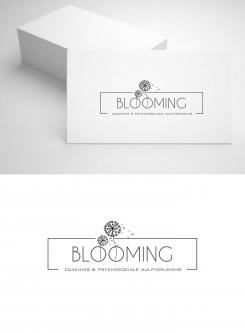
Hello, I think like you that the first is the most suitable for a wider audience. I took up the idea of theirs and seeds using a subtle and classy color. hoping to meet your wishes
regards
MM
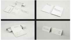
I think this the best design you made so far! I like the flower and steeds very much! I love the logo, but I don't know if it is 'warm' enough for my clients. The logo must be inviting and personal. It is a little bit distant and commercial. I try to imagine how the total branding would look like. On paper and businesscards. Still love to see this logo in different colors. Just to see what it would look like. Thanks so much!
Geen commentaar
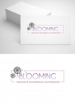
This looks great! Love the way you played with the colours! Very original! Maybe you can give the flowers also some colour? Could you also create a total branding maybe? Thanks!
And maybe with a different flower?
I think with this design, a more elegant flower would maybe fit in better. What do you think?
The last design is not exactly what I am looking for. I like the original design much better. But maybe you can try to give the flower also some color? I like the colors of your last design better. I will have not only woman as clients but also man as clients. So the design needs to be something that both man and woman feel attracted to. Does the feedback help you in any way? Thanks!
Geen commentaar
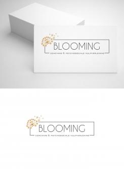
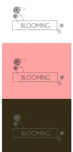
here are the modifications by lightening theirs by keeping the seeds and placing them in a way to balance the logo while including them. At your disposal
regards
MM
Thanks so much linkmastermind1. This looks already better. I like the fact that it is modern and elegant. Lettertype is ok. Love the little seeds! Don't know about the position of the flowers. Still not convinced how it would look like. Maybe I am missing some colour? Regards, Charlotte
Nice! Much better indeed! Could you maybe experiment a little bit more with some colouring? The name BLOOMING means; alive, growth, colour etc. How would a corporate design or branding look like? I hope you know what I mean? Thanks so much! Charlotte
Geen commentaar
Hoi Nicole, here are my proposals. This logo can adapt to all media. I remain at your disposal for any changes and suggestions you would like. You do not have to choose a background color all the ones that you would sew you will be available.
Regards
MM
Hi Linkmastermind1, Thanks so much for your designideas and effort. I like the lettertype; it's fresh and elegant. I think however that there are a little bit to many flowers in this logo. I like the little seeds though.It's more subtle. Maybe you can do something with that instat of the flowers?
 Nederland
 France
 Deutschland
 Österreich
 United Kingdom
 International
