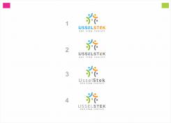
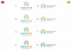
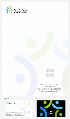
Here is the Final changes according to your last feedback, If anything more change needed please tell me.
Sorry to say that, I can't send the files untul and unless you declare my design as Winner, according to sites rules. hope you understand what i saying
Logo en huisstijl voor een nieuwe, kleinschalige zorginstelling
- Wedstrijd van: janluesink@mac.com
- Categorie: Logo & Huisstijl
- Status: Beëindigd
Datum start: 23-12-2016
Datum einde: 20-01-2017
Het begon allemaal met een idee...
Een korte, interactieve gids hielp hen hun ontwerpstijl te ontdekken en legde precies vast wat ze nodig hadden.
Brandsupply is een platform waar creatieve professionals en bedrijven samenwerken aan unieke projecten en ontwerpen.
Klanten die bijvoorbeeld een nieuw logo of een huisstijl zoeken, geven een beschrijving van hun wensen. Daarna kunnen ontwerpers via Brandsupply deelnemen aan het project door één of meerdere ontwerpen in te sturen. Uiteindelijk kiest de klant het ontwerp dat zij het beste vinden.
De kosten variëren per type project, van €169 voor een bedrijfs- of projectnaam tot €539 voor een volledige website. De klant bepaalt zelf hoeveel hij of zij voor het gehele project wil betalen.
Hi Whitecat (or what is your name???),
Thanks! We like it and we will make you the winner. I made a print screen for now. We would like to finish the design so we can close this contest. We would like to have:
A4 paper
A5 paper
PPTX master sheets
Business card
All designs / components In original format (AI probably)
We are very pleased with the result! Thank you again.
Jan
I the original description we asked for:
- PDF A4 letter main page and following pages
- businesscard which can be changed for new personal
- logo. When in color, also a mono color version
- design items like bullets, lines, logo parts, etc for use in presentations and other marketing materials
I don't know how to select a winner. I asked Brandsupply.
I can choose a winner after the end date of.this contest. I will try to change the end date
Hope it is according to your feedback. Did you get my private message . Do you need more, less space between " IJ ' then it will touch to each other.
THANK YOU.
#1. Maybe the iJ a little bit more space.
Only blue and orange in the name. No grey stripes on the E.
THANK YOU.
#1. Maybe the iJ a little bit more space.
Only blue and orange in the name. No grey stripes on the E.
The style for the payoff from #4 we like the most.
Please sent me the latest version by mail so we can start using the logo. A JPG or PNG version is ok for now.
Jan Luesink
janluesink@mac.com
We would like this version with the name and payoff under and to the right of the logo. Also we would like to have a black and white version (for pad printing)
Geen commentaar
Thanx! Almost there!
We think #3 is the right color. Some small changes:
- The text "Wonen en leren" is replaced by "een stap vooruit". In lowercase is fine.
- The grey detail in the letter "E" can go. I think it is a little bit to much when we do "IJsselstek" also in 2 colors.
The letters I and J together are like 1 letter. IJ. Can you place this 2 letters more close to each other
Geen commentaar
Can I sent you mail directly? So I can sent you the info?
Probably only the name / logo needs to be on the paper. the rest we can print.
Geen commentaar
I like the colors of #2. Could you do some samples with variations in "saturation/brightnes)?
The name has changed!!! It is deffently:
IJsselstek
wonen en leren
The name IJsselstek has 2 words:
IJssel = river nearby
Stek = place / home / to be were you need to be
The payoff will probably change into "een stap vooruit"
Geen commentaar
Hi there,
Thanx for the update. I like # 3. We would like to have the version with the name next to the logo also. I discussed the logo with the team. We would like to have al the "4 persons" a different color. Not so colorful as before but we would like to "see" them as individuals. Maybe more muted/desaturated. Also the payoff is to small in relation to the name.
Your feedback is always welcomed and will improve my creativity to your contest
Hi there,
We would like to focus on your design. It's not ready but we think we can come to a satisfying end result based on this design. We would like to ask you to think with us about the following considarations:
1) In the black and white version the "individuals" are to much "conected" / "blended" into each other. Also it looks a little bit to "heavy".
2) Is it possible to make a version with less colors?
3) Can you make a few options with different fonts?
4) When 1-4 are ok: can you make the other "items" for the corporate identity like printing paper, business card, presentation sheet...
Thanks in advance,
Jan
This one :) Four stars. The logo with "4 persons" on the outside. I the middle it becomes a house.
Goodmorning,
Here is my work for your new visual identity. You can see the files in good quality by clicking on the images.
I bring my experience in graphic design to create a powerful and distinctive logo. I hope you will enjoy my work as much as I enjoyed working on your project.
I await your feedback and I remain at your disposal.
Best regards
VIJAY
Hi,
Thanx for your design proposal. I like it. Maybe the person in the centre is a little bit enthousiastic?
 Nederland
 France
 Deutschland
 Österreich
 United Kingdom
 International
