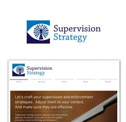
much better this refreshing blue thanks aute. if there's anything comment.
hope you like it. thank you
logo & huisstijl voor niche strategieconsultancy
- Wedstrijd van: Aute
- Categorie: Logo & Huisstijl
- Status: Beëindigd
- Bestanden: Bestand 1
Datum start: 13-11-2017
Datum einde: 27-11-2017
Het begon allemaal met een idee...
Een korte, interactieve gids hielp hen hun ontwerpstijl te ontdekken en legde precies vast wat ze nodig hadden.
Brandsupply is een platform waar creatieve professionals en bedrijven samenwerken aan unieke projecten en ontwerpen.
Klanten die bijvoorbeeld een nieuw logo of een huisstijl zoeken, geven een beschrijving van hun wensen. Daarna kunnen ontwerpers via Brandsupply deelnemen aan het project door één of meerdere ontwerpen in te sturen. Uiteindelijk kiest de klant het ontwerp dat zij het beste vinden.
De kosten variëren per type project, van €169 voor een bedrijfs- of projectnaam tot €539 voor een volledige website. De klant bepaalt zelf hoeveel hij of zij voor het gehele project wil betalen.
hello aute
here's your request thank you for feeback
hope you like my design.
thank you and more power
Thanks philart. seeing this, I think the previous blue-on-blue design looks more professional, thanks for showing me this though! :)
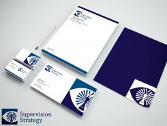
sample of stationery and cards hope you like it
Looks good, philart, thanks.
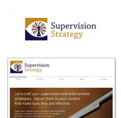
One final request, could you see what it would look like if you would replace the lighter blue color with the brown (towards orange) colour I use on my website? Might not work, but who knows?
hello aute
here's the different font you want to choose clean logo design.
if there's anything improvement and changes let me know thank you and more power
I prefer font 4, thanks philart!
yeah i will do the stionery and cards thank you aute
hey aute here's you request a light beam with eye on king chess.
see post from one minute ago, I prefer that design
this design is all in one indicated a light beam, lighthouse, king chess and eye focusing to you. clean logo design. hope you like it
This is really good! I like how the light beams make for a quite 'natural' iris. The white background (top one) makes the eye look more natural as well.
I think the overall design is done, the only thing I would request further is trying out some different color and font combinations. See my website for an impression of my taste and what I am currently working with, but I am very much open to improvement of course. :) Would be much appreciated.
this design has a crown chess and in the middle there's an eye i put rays on the eye to make the eye more look at you.
hope you like it
if there's anything improvement let me know. thank you
Thanks philart, I think the eye works well in this design, both the eye itself and its placement. I also like the King figure, and using it also like a lighthouse, which matches the supervision theme. I linke the lighthouse beams as idea, but the visualisation of the lighthouse beams seem in this design seems a bit traditional/old-fashioned to me, somehow. Perhaps you could try tweaking this? Would be much appreciated. :) Best, Aute
yup i will do the revision thank for feedback
the logo has a stylish eye with knight chess
clean logo design.
I think the chess piece is well recognisable, but you don't feel the eye is actually looking at you, so you lose some of the alert effect of the eye, I feel?
this design it's like a puzzle to create a knight chess meaning solution, strategy, supervision.
hope you like it
I think it's creative, but I don't think the puzzle aspect is very intuitive: If you don't know that that's what it represent (as my clients won't), I reckon you might not guess what it represents. Thanks for the proposal though philart, I do appreciate it.
 Nederland
 France
 Deutschland
 Österreich
 United Kingdom
 International
