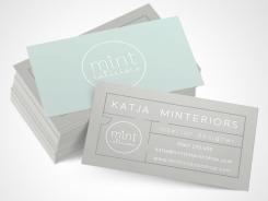
Hello! I am progressing a little slowly, sorry for that. I used a darker gray for the logo to give it more contrast, but the lighter version presentations with other type combinations will soon follow. The house plan idea for the business card was my most creative one I think, I'd like your thoughts about it. It's not very simple anymore, but I think it still works.
If you'd prefer it to be more simple, please say so.
Otherwise I've used the golden ratio proportion for most pages to give a sense of spaciousness and harmony, but please tell me your impressions, if it comes through or not.
Standard symmetric layout seemed a little rigid to me.
Waiting for your feedback..
All the best and take care
Tünde
Mint interiors + store zoekt logo voor al haar uitingen
- Wedstrijd van: mint interiors
- Categorie: Logo & Huisstijl
- Status: Beëindigd
- Bestanden: Bestand 1, Bestand 2, Bestand 3
Datum start: 29-04-2014
Datum einde: 27-05-2014
Het begon allemaal met een idee...
Een korte, interactieve gids hielp hen hun ontwerpstijl te ontdekken en legde precies vast wat ze nodig hadden.
Brandsupply is een platform waar creatieve professionals en bedrijven samenwerken aan unieke projecten en ontwerpen.
Klanten die bijvoorbeeld een nieuw logo of een huisstijl zoeken, geven een beschrijving van hun wensen. Daarna kunnen ontwerpers via Brandsupply deelnemen aan het project door één of meerdere ontwerpen in te sturen. Uiteindelijk kiest de klant het ontwerp dat zij het beste vinden.
De kosten variëren per type project, van €169 voor een bedrijfs- of projectnaam tot €539 voor een volledige website. De klant bepaalt zelf hoeveel hij of zij voor het gehele project wil betalen.
Hi Tunde,
I really love it! The style works very wel together and I love the fact that the logo can be used everywhere. On paper, as stickers on the business card and also on the window of my shop. Well done!
I only have one more option I really would like to see if that might work for the business card. Can I ask you for that? I have a phot of a business card I really love. And I would like to see if we could incorparetd that with the beautiful logo you designed for me. On the business card they make use of embossed 'written" golden letters for the personal name and the other details are also embossed but in a different color and just a lettertype from the computer. Coudlyou please email me so I can email you the picture? my email is katjavolmerink@me.com. thanks so much so far for the great work!
KR, Katja
Here's a white text version of the business card
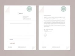
Here are more clear sample pages.
I would love to have your actual information to work with! And photographs would be wonderful to get the mood of your work. I think I found some of it, but you didn't disclose much information here so I thought you might want to do that in private. It might be easier to discuss designs in private, too.
What do you think?
Regards, Tünde
Geen commentaar
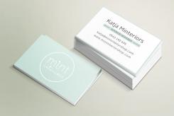
I am still working on some variations and color combos. In the meantime, here's a business card. These are the simplest that can get, I'm beginning here and trying to implement some branding elements. Lots of thanks for your feedback! I'll be close!
Hi! I made op my mind and really like the logo, so that will be my choice. Other people like it as well. I like that is is soft yet simple. I would really much like the business card to have that same look and feel. Now to me it doenst realy go together if you catch my drift... What I do like however is that is is quit simple. BUt if it is possible I would like it to be more in line with the beautiful logo you suggested. Maybe a change of lettertype? Thanks! Katja
Hi! One more thing I need as mentioned in the contest. I would also need small round stickers with the logo. And I would need the logo in black/white for my moodboards. so white background and black logo so it doesnt clash woth the colors on the mooboard. would that be possible to send me as well? thanks so much!
Yes, of course, I'm working on those as well. Thank you for your patience.
Hi! I've read in the comments that you preferred embossed gold and don't really like green... so I tried a more elegant, luxurious approach.
I would appreciate your feedback, i'm very curious what you think.
Thanks!
Tunde
thanks Tunde, and thanks for reading the comments. But I do really like your firs toption best, also wth the green in it. Maybe you could make a variation on that one with other colorschemes?? Thanks so much in advance! Katja
Hi! This is my second design proposal. Please feel free to criticize and share your thoughts! Thanks!
Hello! Thanks for viewing my design.
My goal was to create a very clean, subtle design with personality.
I hope you like it, and share you're thoughts.
I like this one! thank for the submission. this is my favourite so far! could you make a set-up for a business card, so i can get an impression? (name, adress, phone, email, www). preference again for simplicity ;). thanks do much! kind regards, Katja
 Nederland
 France
 Deutschland
 Österreich
 United Kingdom
 International

