Geen commentaar
Ontwerp een logo en huisstijl voor Belief!
- Wedstrijd van: Sten2005
- Categorie: Logo & Huisstijl
- Status: Beëindigd
Datum start: 28-08-2017
Datum einde: 11-09-2017
Het begon allemaal met een idee...
Een korte, interactieve gids hielp hen hun ontwerpstijl te ontdekken en legde precies vast wat ze nodig hadden.
Brandsupply is een platform waar creatieve professionals en bedrijven samenwerken aan unieke projecten en ontwerpen.
Klanten die bijvoorbeeld een nieuw logo of een huisstijl zoeken, geven een beschrijving van hun wensen. Daarna kunnen ontwerpers via Brandsupply deelnemen aan het project door één of meerdere ontwerpen in te sturen. Uiteindelijk kiest de klant het ontwerp dat zij het beste vinden.
De kosten variëren per type project, van €169 voor een bedrijfs- of projectnaam tot €539 voor een volledige website. De klant bepaalt zelf hoeveel hij of zij voor het gehele project wil betalen.
Hello Natasja,
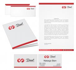
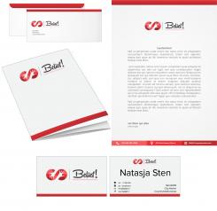
I have done the changes you wanted. I think that the light shades of grey are looking better too.I have fixed the font on BC. Don't worry I'll send you the files in formats for printing shop so you will be able to adjust and move the logo, text, dashes... and print the logo where you want it. Of course you can customize phone numbers and texts too. The two images of the business card are the front and back.
Until you don't designated me as a winner,I can't upload the right files to you only for preview. So if you are sure that my design is the winning design select me and we can still fine-tune the design in handover stage. When you are satisfied with files you will release the payment for me and that is it :)
I hope I have explained well to you.
Thank you
Kind regards
Marysu
Geen commentaar
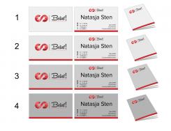
Now please take a look and select which one is the best grey for you?
Hi Marysu,
Thank you again!
-I want the dashes between Financiële Planning, Vermogen and Advies in the same dark color as the dash between the logo and the name. I think they are too light now.I want these dots to really stand out.
-Different fonts are used on the business card. So I see now that the email and internet address are used in small and big letters. I think it's more beautiful if all text is in the same font.
- i would like the logo in the right upper corner of the writing paper. And smaller.
-Is it possible to place the logo at the print shop right and then in the middle? Or is the design static? Can I print the logo where I want it?
-on the envelop i want the logo on the right upper side and smaller.On the left is a window on the envelope.
-Are the two images of the business card the front and back?
-If I see the business card in grey, I think I'll find a verry light shade of grey more beautiful than the darker ones. What do you think?
-can I, after receiving the files from you, customize phone numbers and texts? I want to place more information in the red bar at the bottom of the letter paper.
-On the business card I would like to name my name smaller and the logo bigger.
-If I have designated you as a winner, can we still fine-tune the design? Or should all of this happen before I show you a winner?
Thank you very much. Unfortunately, I'm not so technical. That's why I have so many questions ...
Kind regards,
Natasja
Geen commentaar
...or one fountain fill with two shades of grey?
i can't see the grey color. Did you send the same immage as earlyer?
No, this one is combination of light grey and white. Is it maybe to light?
Then the one before is darker.
i mean the backround of the folder and the bc. Not the letters. Sorry for not being clear.
Ok, I have an idea, wait a minute....
Geen commentaar
Little darker shade of grey backgrounds and lighter color of the dash. I think this one looks better.
What do you think?
Geen commentaar
Better?
I think it's very light. I looked at the RAL colors grey. Would RAL 7030 be nice?
No, no it is darker grey that previos design that you said is too dark. I'll try something a middle between the last two.
One more thing did you mean in previos message that the dashes are dark too or just a grey background on folder and BC?
Geen commentaar
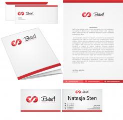
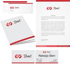
I have make the dashes between Financiële Planning, Vermogen and Advies in the same color as the dash between the character and the name as you asked. Is this too dark grey for BC and folder or not?
I have make the dashes between Financiële Planning, Vermogen and Advies in the same color as the dash between the character and the name as you asked. Is this too dark grey for BC and folder or not?
I have made the dashes between Financiële Planning, Vermogen and Advies in the same color as the dash between the character and the name as you asked. Is this too dark grey for BC and folder or not?
Hi Marysu!
Thank you! Ik like the straight lines. The logo on the envelop is quit big. I think the color of the dash is too dark for de BC en folder. Can you make these lighter grey?
Thank you again!
Kind regards,
Natasja
Ok, of course, thanks. In a minute.
Geen commentaar
Did you meant the character through a dash like this?
Hi Marysu,
Thank you for replying so fast!!
Ik liked the previous character more. Let's just keep it the way it was. The dashes between Financiële Planning, Vermogen and Advies. Can they be in the same color as the dash between the character and the name? Thank you!
Kind regards,
Natasja
Hi Marysu,
Thank you for replying so fast!!
Ik liked the previous character more. Let's just keep it the way it was. The dashes between Financiële Planning, Vermogen and Advies. Can they be in the same color as the dash between the character and the name? Thank you!
Kind regards,
Natasja
Geen commentaar
Hi Marysu,
Thank you!!
I would like to have de folder en businesscard in grey. Not too dark. Sorry, but i don't like de rounding in red. Ik would like that more straight.
Kind regards,
Natasja
Hi Natasja,
don't worry I'll do as you want until you are satisfied.
Kind regards
Marysu
Geen commentaar
Dear Natasja, thank you!
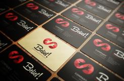
This is an example of the business cards. I don't have the real informations about you but still I think you can see how they could look like.
Kind regards
Marysu
I sincerely thank you for your effort and thinking about it and am very curious about the result.
Sorry for the 5 posts... My computer did not react.
Geen commentaar
Hi marysu,
I have asked Brandsupply to extend the contest. They did this until September 11th.
I have a strong preference for your design. Really amazing! I love it!
In the competition I asked for a logo and corporate identity for Belief !.
Before I finish the contest, I would like to make some adjustments and ask you some questions.
My questions:
-I think the logo is the most beautiful if the logo is left next to the name with a dash in between. The dash may be a little clearer. Because of this color he falls a bit away with the white backround.
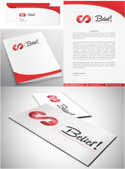
-Would you be so kind to design a letterhead, envelope, and a folder in which I can send reports? I do not want the folder to be white. I think your design in black is too dark. Would it be nice to make the background gray? And this also for the business card?
-the texts "Financiële Planning | Vermogen | Advies is in 2 colors. I would like to like it in 1 color with clear lines in between.
-The hands interrupt the infinity sign. Could it be nice to keep the character through a dash? I do not know, I trust your creativity! Now people think it's an s. Maybe this is not beautiful, I was wondering if this could be beautiful.
I sincerely thank you for your effort and thinking about it and am very curious about the result.
Kind regards,
Natasja
Ok, thank you! I'll do my best.
Kind regards
Marysu
I agree with you that the most beautiful if the logo is left next to the name with a dash in between.
I'll design what you been asking as soon as possible.
Hello, The meaning behind an infinity sign is actually quite beautiful - it symbolizes eternity, empowerment, and everlasting love. With human hands in it, it has a second meaning - like helping, change and trust between people. If you like my idea for representing your work I'm here for you.
Regards
Marysu
Dear Marysu,
I love it!!
Would you be so kind to:
-let me se the logo with a red sign?
-put the tekst: Financiële planning | Vermogen | Advies in stead of financieel adviseur?
-how would a business card look with mij name, number, website, etc on it?
Thank you!
Kind regards, Natasja
 Nederland
 France
 Deutschland
 Österreich
 United Kingdom
 International
