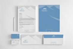
STATIONERY SET 'de Tabernakel'
Ontwerp een Logo en Huisstijl voor onze nieuwe-stijl-kerk
- Wedstrijd van: fharmusial
- Categorie: Logo & Huisstijl
- Status: Beëindigd
Datum start: 15-07-2013
Datum einde: 15-08-2013
Het begon allemaal met een idee...
Een korte, interactieve gids hielp hen hun ontwerpstijl te ontdekken en legde precies vast wat ze nodig hadden.
Brandsupply is een platform waar creatieve professionals en bedrijven samenwerken aan unieke projecten en ontwerpen.
Klanten die bijvoorbeeld een nieuw logo of een huisstijl zoeken, geven een beschrijving van hun wensen. Daarna kunnen ontwerpers via Brandsupply deelnemen aan het project door één of meerdere ontwerpen in te sturen. Uiteindelijk kiest de klant het ontwerp dat zij het beste vinden.
De kosten variëren per type project, van €169 voor een bedrijfs- of projectnaam tot €539 voor een volledige website. De klant bepaalt zelf hoeveel hij of zij voor het gehele project wil betalen.
Hi Lyra,
Very happy with the end result,
The 'look and feel' continued to grow with business card,
Letterhead and folder after you were announced as the winner.
If you look at the set as a whole, then the design is well balanced!
Enjoyed working together,
Kind Regards,
Ferry
Hi Ferry,
Thank you for your comments and the 5 stars! I am very glad you like the stationery as well. It was a real pleasure to work with someone like you who always gives a very clear, useful and inspiring suggestions and comments.
Kind regards,
Lyra
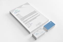
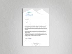
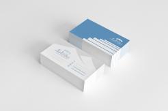
letterhead and b.card presentation
(corrected b.card back side)
... as mentioned, here is the legally mandatory information, including some other useful information:
Christengemeente 'De Tabernakel'
Postbus 287
4140 AG Leerdam
KvK-nummer: 50727877 (i.e. chamber of commerce reg. number)
IBAN: NL09 RABO 0343 0692 02 (i.e. International Bank Account Number)
BIC: RABONL2U (i.e. Bank Identification Code)
We will not need a phone number to be included.
website name and info mail address are correct.
Regards,
Ferry
Hi Ferry,
All remarks are clear and I will send you the corrected versions together with the rest of the stationery.
I herewith confirm that I will deliver as below:
- both SVG and AI format
- Font, size and kerning* details separately
- Pantone and their matching CMYK and RGB colour values separately.
* I used some tracking for the "christengemeente" and I'll give you the values, no problem, of course. I'll also send you all the details such as the opacity of the colors used, gradient info etc, if needed.
"de Tabenakel"- kerning: de "kerning" function of Adobe Illustrator didn't give me the desirable results so I don't have a specific "kerning"-value because I adjusted the space between the letters manually moving each of the letter separately (here and there) until I got a visually pleasing result.
There is just one technical issue now, which hopefully can be easily solved: the Brandsupply has a limit of 15 submissions per contest and I have only two submission-possibilities left which is probably not enough for the changes you asked me to make.
Therefore I've sent a message to the Brandsupply moderator today asking him to extend a bit the 15-submission limit if possible (since my design is already chosen as a winner, otherwise I wouldn't do it because of the other participants of the contest). I also asked him would it be ok to ask you to remove the stars beside some of my submissions (like those with a bible-concept) so that I can delete them and send the new ones instead. I am still waiting for the answer.
The third possibility is that you provide me, if possible, with some email address where I can send my corrected versions to, until you are completely satisfied with the stationery. When everything is "polished", I would upload all the necessary ai, svg and info-files via the Brandsupply website.
Kind regards,
Lyra
letterhead
Hi Lyra,
The top of letterhead is fine.
I also like that you brought in the element of the person with raised hands.
As we would only use the stationarry for official letters, the feel should stay business-like. Nonetheless, I feel that the middle part is a tad boring. Perhaps it is an idea to use a zoomed in part of a person with raised arms to somehow interrupt the big white area below the top.
Perhaps as little as a left arm coming from nowhere entering the middle section of the letter from the right. I'll leave this to your discretion.
It has to be subtle though, because too much interference with text is less desirable.
Finally, there are some obligatory fields (dutch chamber of commerce) that need to be present. I will look up the type of information and provide our details separately.
Regards,
Ferry
PS
As for the final deliverables,
can you confirm that you can deliver as below ...
- both SVG and AI format
- Font, size and kerning details separately
- Pantone and their matching CMYK and RGB colour values separately.
Hi Ferry,
I am very glad that my logo was chosen as the winner. Thank you to everyone who voted for me. Thank you for your helpful and very clear suggestions. It was my pleasure to participate in this contest.
I congratulate the finalists Yanoah and Esther on their excellent designs.
I send you
- the letterhead,
- 4 color versions of the BC back side (without stairs, with a lighter tone thin lines)
- two BC front side versions (both with a darker cloud) with a different color of the contact icons and text. You didn't tell me whether you prefered the blue or the grey version (of the contact icons/text).
For the letterhead I used the logo elements: a tent and the upper side of the human figure i.e. his/her raised arms.
I was planning to send you the complete stationery , incl. letterhead, business card, envelope and folder. I can finish the folder and envelope on Tuesday. (In case you don't need the envelope and folder, please let me know.)
If necessary, for the corrections/fine-tuning of the logo/stationery after the contest closing time, you can reach me at my email address studiolyra@gmail.com.
Kind regards,
Lyra
Hi Lyra,
All three designs had the potential to be a winner,
but I am glad that there was a clear preference through the votes of the congregation.
As we are a relatively young church, the logo is part of the process of building up our own identity and we already see the people starting to embrace it ...
Now on some timing aspects ...
The folder and envelope do not have to be completed today, but the aim is to complete these before the end of the week.
As for the BC ...
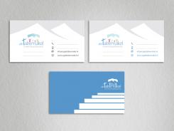
front:
- blue contact items/text is preferred
- please extend the two lines below the logo so they line up with the start of the word 'de' (more space to write down name/role etc.)
back:
- the four lines are preferred over stairs.
- please extend these lines to the beginning of logo (variant a) or to the end of logo (variant b).
we want to use these lines to be able to issue a personal invitation to certain events. as such we would need the space here as well.
I have made some separate remarks next to stationary itself ...
Kind Regards,
Ferry
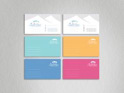
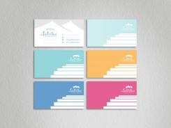
BC- back side color variations
Hi Lyra,
Thanks for darker and lighter versions of the cloud in the below. This allowed us to make a comparison: we found that the darker version makes the logo just a little bit more sparkling, so this has our preference.
Before I continue with further details I wanted to let you know that in the vote that took place during our sunday church service, your logo was chosen as winner over that of esther and yanoah ..
So provided we can get business card and stationary details sorted, I want to congratulate you!!
According to the feedback we received, it was the symbolism (the cloud as presence of God hovering over the tabernacle and the people raising there arms in worship) that gave you the advantage.
Now as for the business card, In general, we do like the front of the card.
As for the colors on the back, all but the one in the upper right corner will work for us. the big area with a brighter color complements the softer tone front in a good way.
I would like to see a variant though without stairs and perhaps just a simple, lighter tone, equally spaced thin lines.
It would be nice to have all the four colour variations of the back as part of the final design.
Tomorrow it happens to be that we will meet with other board member, so I hope we can see the simple line variant then next to a stationary proposal.
Kind Regards,
Ferry Harmusial
Hallo Lyra,
Gefeliciteerd met het winnen van deze wedstrijd!
vr gr Laura (Yanoa)
Hi Lyra, congratulations on winning the contest! Well done.
Greets Esther
Thank you Laura! Thank you Esther!
Congratulations on your excellent designs!
MvG, Lyra
BC presentation (of the lighter version)
The file is 1.7 MB. Please don't forget to enlarge the image for details.
Hi Ferry,
Thanks for you feedback and the stars.
Here is my first proposal for the business card.
I used the logo elements such as the font used for "de Tabernakel" ("l" rotated) for the phone/mobile - lines. There is a tent as well.
For the back side I used the parts of the (logo) human figures to create the space for the notes in the form of the stairs. The stairs refer to to the brief lines "We see the church as ... a place to grow up to who you are".
I send you two versions of the BC front side. The right one is with the lighter blue gradient (both blue colors are 1-tint lighter comparing to the left version).
There are also two color versions of the contact- icons and text.
I am waiting for your comments and then I'll send you the rest of the stationery.
Kind regards,
Lyra
Hi Ferry,
Here are the corrected versions:
Upper design has (a bit) smaller space between the letters than the lower one.
I have one question: do you like the colors of the figures used in all the previous versions (now in the upper version - opacity 66% ) or you maybe prefer intense colors of the figures (now in the lower version - opacity 100%)?
Regards,
Lyra
Hi Lyra,
The smaller space between the letters in upper design looks a little bit better indeed.
As for the colors, the upper version (opacity 66%) is fine. We would plan to use the individual colors e.g. as background of posters or presentation slides. Used as part of larger area's I guess the softer colors would be more suitable.
Would it be possible to see the upper design come back in a business card, business letter design as well?
And could there also be a variant with the cloud one tint lighter?
Kind Regards,
Ferry
I forgot to ask - which version do you prefer: the upper (smaller) or the lower (bigger) one? I corrected both versions.
These are the corrections:
- THE "DE":
nr.1 & 3: the"de" is rotated, font size and distance to the "t" decreased;
nr.2: font size and distance to the "t" decreased; "Tabernakel"- more intense color used to make the "de" less prominent.
nr 2 &.4: font size and distance to the "t" decreased.
- nr 1-4 cloud/tents/people raised by some amount
-"T"-SLANT > TENT-SLANT:
nr: 1 & 2 - the "T"- slant follows the line of the tent-slant. (Therefore I had to raise the cross a bit.)
nr 3 & 4: the "T"- slant" is parallel with the tent-slant (the T-slant is a little bit lower, in order to avoid too high cross).
If you have some other suggestions or wishes, please do not hesitate to ask for changes.
Kind regards
Hi Lyra,
Thanks, no 4. is getting very close to a final design. I wonder what would happen if you can apply some 'kerning´ (perhaps decreasing space between the letters with 1/3 of current space). This will also allow for 'christengemeente'to be kerned a little bit.
Furthermore, I would be interested to see a proposal for the business card and letter as well. you can take a look/google translate my comments to yanoah.
Thanks, Ferry
These are the variations of the original version (with a cloud). The changes were made according to your suggestions.
ps
I have one more concept for your logo. It is coming soon (today).
Regards
Hi Lyra,
Thanks, I indeed think we have a third finalist with your latest design. The proportions are much better now. Also details like the left arm of first and right arm of last person lining up with the edges of the cloud make up for a visually more pleasing design.
Can I ask for one more variation still?
I would like to see
- the 'de' being a little less prominent (eg changing fontsize and/or decreasing distance to the 't')
- perhaps the image of cloud/tents/people can be raised by a tiny amount relative to text.
- finally (and not sure if it will work visually), can the slant of the horizontal beam of the 't' be made to match the slant of the left side of first tent?
... just curious to see if the above would mean a further improvement.
Kind regards,
Ferry
'be raised by a tiny amount' should probably be 'be raised by some amount´
 Nederland
 France
 Deutschland
 Österreich
 United Kingdom
 International
