Good morning,
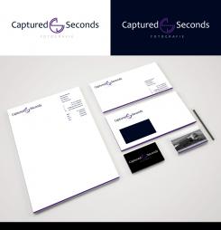
thanx for your feedback ;) Attached the new version for your housestyle with the requested changes. Hope you like it this way, looking forward to your reply & have a nice day, kind regards, Dagmar
Wie neemt de uitdaging aan om voor een startende vakfotograaf een indrukwekkend logo + huisstijl te ontwerpen?
- Wedstrijd van: Captured Seconds Photography
- Categorie: Logo & Huisstijl
- Status: Beëindigd
- Bestanden: Bestand 1
Datum start: 05-02-2016
Datum einde: 27-02-2016
Het begon allemaal met een idee...
Een korte, interactieve gids hielp hen hun ontwerpstijl te ontdekken en legde precies vast wat ze nodig hadden.
Brandsupply is een platform waar creatieve professionals en bedrijven samenwerken aan unieke projecten en ontwerpen.
Klanten die bijvoorbeeld een nieuw logo of een huisstijl zoeken, geven een beschrijving van hun wensen. Daarna kunnen ontwerpers via Brandsupply deelnemen aan het project door één of meerdere ontwerpen in te sturen. Uiteindelijk kiest de klant het ontwerp dat zij het beste vinden.
De kosten variëren per type project, van €169 voor een bedrijfs- of projectnaam tot €539 voor een volledige website. De klant bepaalt zelf hoeveel hij of zij voor het gehele project wil betalen.
Hi Dagmar, looking good! Only thing I would change is putting al the info back on the bottom of the letter. Rest is great! Is there more stuff I need?
No problem to rearrange the letter. What do you mean with more stuff ;)?
I don't know. Regarding the house style like a Facebook header or something?
Good morning ;)
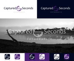
As your contest is going to be finished soon, here's one example for a possible facebook header using the logo as an overlay for an image as well as the icon used as a media button. Hope you like it, kind regards, Dagmar
Geen commentaar
Hi Dagmar, I like this even better, very good idea! Love it! Use these when you work on the house style.
Regarding the business card I like the black side a lot (just change the logo to this one). On the other side I would like to be able to use a black-white photo as a background on the whole card. Could you therefore create a section/footer on the bottom that is semi-transparent and only contains the website, email-address and telephone number? Al the other info people can find online. So all the other stuff you can leave out.
The envelope is Ok. Just use this new logo on it and could you make the black edge in purple?
Regarding the flyer and the letter also use this new logo. You can leave out the watermark. Doesn't add anything. Also here a purple edge in stead of black. Could you show me an example with all the address info etc arranged differently? It's not quite it yet. Thx!!
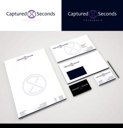
Yes I did as you can see ;) I also made a logo example, that includes the old idea of lense and hourglas, but also the letters C & S. I would like to know what you think of this idea, nice sunday too ;), kind regards, Dagmar
Hi there ;)
Thanks for your feedback, attached the combination of design 1 and 3 ;) Hope you like it, let me know, what else you like to improve, best regards, Dagmar
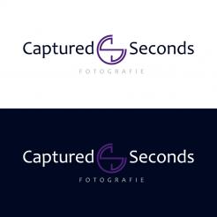
Hi Dagmar, Can you put the word fotografie in the middle under the logo? Could you make the hourglass and circle in the purple you are using? At the white background: make the letters of Captured Seconds black, the logo purple and keep the word fotografie in grey (centered under the logo). Change the purple background to black, make the letters of Captured Seconds white, the logo purple and the word fotografie in grey (centered under the logo). Actually, it would be like your first design just with these fonts and this color purple in stead of the other one.
Had je ook al nagedacht over een huisstijl qua drukwerk? Fijne zondag!
Hello ;)
Attached a new idea in the style of asprey, curious what you think about that one. Have a nice weekend, kind regards, Dagmar
Hey Dagmar, love the color and the fonts. Could you use those in your first design? That is, because I would like to keep the circle & hourglass figure in! This logo would be better with fotografie written horizontally.
Good evening ;)
Thank you for your kind feedback, attached a revision with the color code you wanted and a different font for head- and subline. The idea behind the image sign is an abstract mixture of a camera lens and an hourglas, that should visualize the 'captured seconds'. I will try a new design, direction asprey, tomorrow. Have a nice evening, kind regards, Dagmar Lange
But I personally think the purple and grey doesn't work that well, because of too little contrast. So maybe swap back to black?
Hi Dagmar, Thx again!
Strangely enough this purple looked good when I tested it earlier today but in the logo now it's way too bright. For your design tomorrow could you go less bright with the purple? More like the Asprey or Hissah purple from the moodboard. I don't dare give you another RGB code again haha.
You are right about the grey background, and you can switch back to black.
The subline Fotografie was already good in your first design so keep that font and align it in the center as it was in the first design.
The font for Captured Seconds is still not quite it. Looking forward to seeing you try a different one tomorrow like you said. If I had to choose between these two fonts though, I would choose the first one you used.
If you have more questions in the meantime, you can also email me: capturedseconds2016@gmail.com
Geen commentaar
Hoi VirtualLies. Bedankt voor je snelle inzending! Het figuur is erg leuk. Hoe ben je daarop gekomen? Zou je het huidige paars eens willen vervangen voor RGB 118, 45, 200?
Het lettertype van het woord fotografie is goed. Zou je het lettertype van Captured Seconds nog in een ander/een paar andere fonts willen proberen? Heb je onder andere iets wat lijkt op die van Asprey op het moodboard?
Kan je naast zwart en wit ook eentje met een grijze achtergrond maken?
 Nederland
 France
 Deutschland
 Österreich
 United Kingdom
 International
